Using your Sign-up form as a Qualifier
I recently ran across an interesting way to qualify people using sign-up forms at monotask.com.
In many industries people pay lots of money for a qualified lead. A qualified lead is a person who has expressed interest in a product or service and meets general buying criteria. For example, my neighbor told me that in the real-estate business agents often pay 1% of a resulting home sale for qualified home buyers. If someone can send an agent a home buyer who is serious about purchasing and eventually purchases, that referral is worth several thousand dollars.
I recently ran across an interesting way to qualify people using sign-up forms at monotask.com. Monotask is a yet-to-be-released application for simple attention management. It is being developed by Charlie Park, who also built PearBudget, a really simple budgeting and expense tracking service (which also has a strong sign-up process). To help build awareness of Monotask Charlie set up a landing page allowing people to sign up to be reminded when the software is released. Here is what it looks like:
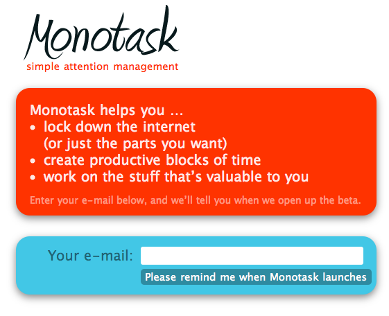
This is a special kind of sign-up page. You’re not really signing up for the service, but you are signing up to be notified when the service is released. This type of page can be used to promote almost anything. It helps build up a little buzz and give you a list of people who are interested in your product. I’m using this same type of page for my new book.
After someone signs up to be reminded, this is what they are presented with.
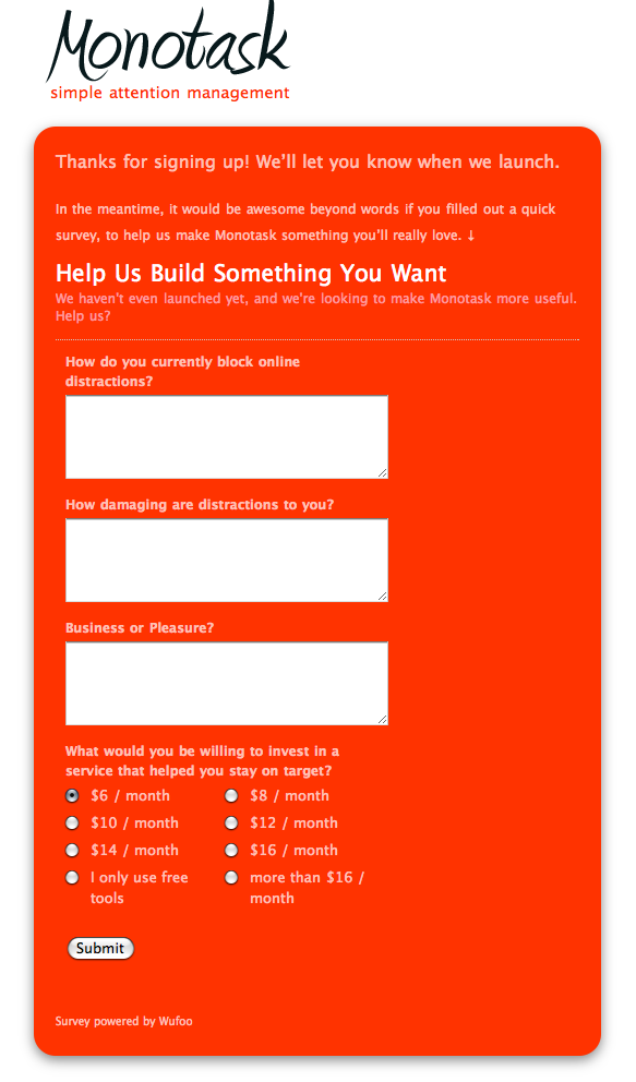
This screen first thanks you for signing up. But then, and this is the interesting part, it asks you to fill out a short survey. This is curious…a hidden survey! So I looked closer at the design.
First off, I love the copy here: “Help us build something you want.” This is a great way to communicate to someone that they are an active part of the product development process. “You mean I can help you build cool software that I will use? Why, I never thought you’d ask!”
Second, I wanted to know the rationale behind the design choice to put the survey here and not on the front page. Surely the designers would get more people filling out the survey if it was on the front page of the site? Why place it here, instead?
Thankfully, Charlie was obliging. I asked him why he put the survey here. Here is his reasoning:
- Less Sign-up Friction
Charlie was tempted to put the survey on the front page as part of the sign-up process. But if he did that the sign-up form would look more intimidating…and seem like a larger commitment. By placing the survey after the submit, he’s not overwhelming people with a long form. He’s keeping the user’s initial attention on a single goal. - Qualified Reponses
Charlie told me that by putting the survey after the sign-up (without telling people it was there) he was putting the odds in his favor that the people who gave him feedback would be the type of person he wanted feedback from. In order to reach this survey they need to first declare their interest in attention management…that’s the qualifying hurdle. If people land on his homepage and don’t sign-up, then its likely they aren’t as interested in attention management.
This second reason is the more interesting one. By placing the survey behind the qualification wall of the sign-up page, Charlie can expect a much better signal-to-noise ratio in the answers. Otherwise, he would have to sift through more responses but not really be sure that they survey taker was all that interested.
Qualifying people like this is a clever way to make your feedback more efficient. You might not get quite as much feedback, but what you do get will be higher quality. And as with real-estate agents, that higher quality might just be money.
If you would like to see this technique in action, visit monotask.com.