
Server-side Responsive Design with ASP.NET MVC and Interchange

Many attempts have been made in the .NET MVC ecosystem to tackle Responsive Design from the server side. Technologies like Browser Capability Detection and Mobile Views were once considerable options, but these techniques are now being dropped in favor of client dependent technologies like Modernizr.
Responsive Design with Server Side Components (RESS) is a powerful concept but, as the aforementioned technologies have shown, implementation isn't always easy or perfect. In this article we'll look at Interchange, an alternative solution from Zurb's Foundation framework that uses a modern web approach to implementing RESS.
Why RESS: Responsive Design + Server Side Components
Client-side techniques such as hiding content with CSS styles and classes can cause page bloat. This is because the UI changes are made solely on the client side. This means that the client receives all markup, images, and other data, regardless of the device’s screen size - even if it is hidden by CSS.
A more proactive approach can be taken by including the server in the process. By using server side code, the application can deliver just the necessary content for a specific device’s needs. Unlike the visible and hidden CSS classes, RESS techniques can utilize the server to alter the page before it's sent to the user.
Introducing Interchange
Interchange is a component from the Foundation framework that uses media queries to dynamically load responsive HTML content or images that are appropriate for different users' browsers. The logic for loading the partials is handled completely on the client side through HTML and JavaScript. This places the browser in charge of requesting the proper content from the server based on the client's needs.
Interchange is initialized by creating a div and adding the data-interchange attribute. The data-interchange attribute contains an array of URLs with a corresponding media query.
<div data-interchange="[../default.html, (only screen)],
                       [../medium.html, (only screen and (min-width: 641px))],
                       [../large.html, (only screen and (min-width: 1025px))]"></div>
There are multiple named media queries available as well to make the code more legible. A list of named media queries can be found in the Foundation documentation.
<div data-interchange="[../default.html, (small)],
                       [../medium.html, (medium))],
                       [../large.html, (large))]"></div>
In addition, default HTML content can be placed inside the Interchange element. This content will be shown when none of the media queries are matched from the data-interchange attribute.
<div data-interchange="[../medium.html, (medium))], [../large.html, (large))]">
    <p>This is the default content.</p>
</div>
Interchange & MVC
Interchange fetches content via an AJAX GET request to the URL when the corresponding criteria are met. Since Interchange is using a simple GET request, any action that returns HTML is valid. This means the Url.Action HTML helper can be used with Interchange to fetch views from the server based on screen size.
<div data-interchange="[@Url.Action("MediumView"), (medium))],
                       [@Url.Action("LargeView"), (large))]">
    <p>This is the default content.</p>
</div>
A unique action can be called per media query or alternatively a single action can be used by passing arguments back to the action.
<div data-interchange="[@Url.Action("RessView", new { Device = "medium"}), (medium))],
                       [@Url.Action("RessView")&Device=large, (large))]">
    <p>This is the default content.</p>
</div>
Interchange In Practice
Let's take a look at how Interchange and MVC based RESS can be used in an application. In this example we'll look at responsive dashboard application. The application uses basic Foundation grid classes to create a responsive client-side experience.
<div class="row">
    <div class="medium-4 columns">
        @Html.Action("EmployeeProfile", new { id = Model.EmployeeID })
    </div>
    <div class="medium-4 columns">
        @Html.Partial("EmployeeQTDSales", Model)
    </div>
    <div class="medium-4 columns">
        @Html.Partial("EmployeeMonthlyAverageSales", Model)
    </div>
</div>
<div class="row">
    <div class="small-12 columns">
        @Url.Action("EmployeeSchedule", Model)
    </div>
</div>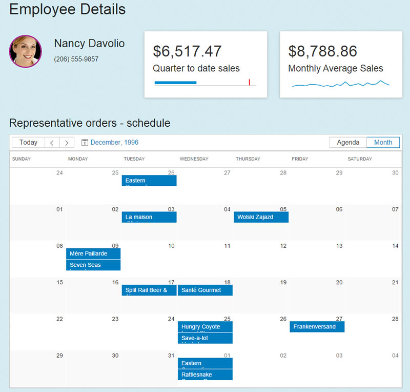
The desktop layout has plenty of screen space to show an overview of the employee's details with a full calendar schedule of sales orders.
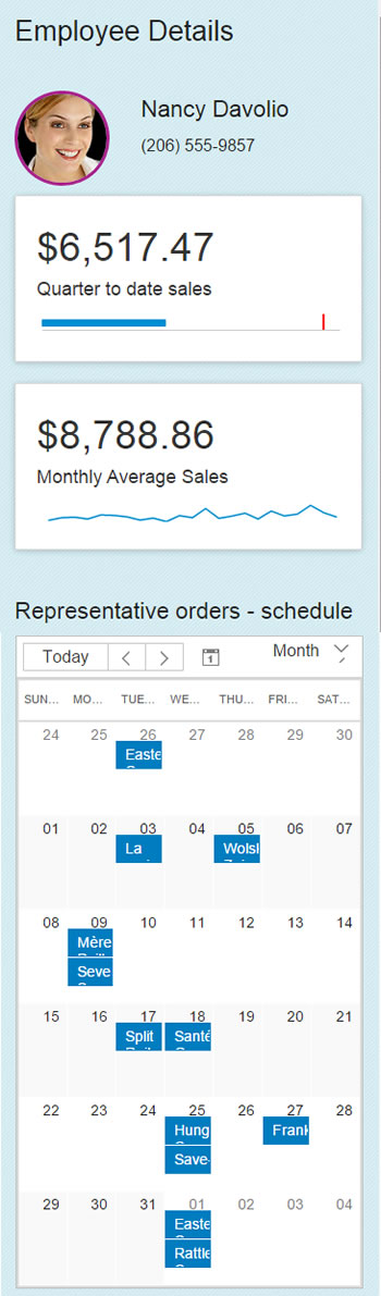
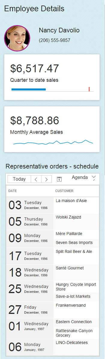
When the screen size is limited, the calendar view control, even though it is responsive, becomes less user-friendly. Using Interchange we can switch to an "at-a-glance" agenda view to provide a better overall user experience on mobile.
The UI for this scheduler component already has an agenda view option, we'll just need to send an argument back to the controller so the rendering can change on the server side.
<div class="row">
    <div class="small-12 columns">
        <div data-interchange="[@Url.Action("EmployeeSchedule", Model)&IsSmall=True, (small)],
                               [@Url.Action("EmployeeSchedule", Model), (medium)]">

    </div>
</div>
Controller:
public ActionResult EmployeeSchedule(EmployeeScheduleOptions options)
    {
        return PartialView(options);
    }
Model:
public class EmployeeScheduleOptions : EmployeeProfileOptions
{
    public bool IsSmall { get; set; }
    public bool AgendaViewSelected { get { return IsSmall; } }
    public bool CalendarViewSelected { get { return !IsSmall; } }
}
Appending &IsSmall=true to the action call for (small) the value will bind to the model and default to the agenda view for small screens. When a larger screen is detected by Interchange the action without the IsSmall (otherwise false) value will be called, dynamically changing the display to a calendar view.
Fine tuning
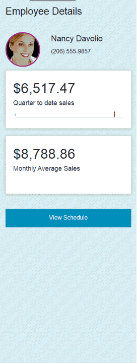
We can take this concept a step further and improve the UX by decreasing the page load time. Let's assume that the agenda view is an expensive resource to load in terms of data bandwidth. We can add lazy loading to the application using Interchange and a few lines of JavaScript. Lazy loading will protect users from the initial hit of loading the view up-front, while giving them the freedom to load it on demand.
First, we'll use Interchange's default content block. We'll remove the (small) action and add a button that will display when no media query matches are made.
<div data-interchange="[@Url.Action("EmployeeSchedule", Model), (medium)]">
        <a class="primary button expand" href="#">View Schedule</a>
    </div>
Next, we'll need to reference the action for small devices. We'll do this by adding our own data-lazyload-url attribute to the button, the value will be the action for small devices.
<div data-interchange="[@Url.Action("EmployeeSchedule", Model), (medium)]">
    <a class="primary button expand" href="#"
    data-lazyload-url="@Url.Action("EmployeeSchedule", Model)&IsSmall=True">View Schedule</a>
</div>
Finally, we can wire up the button using jQuery's load method. We'll call the load method then replace the button with the results from the action defined by the lazyload-url.
var $el = $("a[data-lazyload-url]");
$el.on("click", function () {
    $el.closest(".columns").load($el.data("lazyload-url"));
})
The mobile view will now display a "View Schedule" button that can be tapped to reveal the schedule via Ajax. This arrangement presents the user with the option of loading the hidden data instead of removing content completely from the user's access. In addition, when the same page is visited from a medium or larger screen, Interchange seamlessly loads the full calendar view without user interaction.
Conclusion
With Microsoft changing its stance on browser capability detection, MVC can benefit from an open source solution like Foundation's Interchange. Interchange is a powerful tool when used in conjunction with ASP.NET MVC. The simplicity of setup combined with MVC's Url.Action helper make a natural fit for implementing RESS and lazy loading. The ability to target controller actions based on media queries opens the door to creative solutions using responsive design with server side components.

Ed Charbeneau
Ed
Related Posts
Comments
All articles
Topics
Latest Stories
in Your Inbox
Subscribe to be the first to get our expert-written articles and tutorials for developers!
All fields are required