
The map below should concern you. This visualization, made by James Siddle, shows a single commuter’s journeys using London’s public bicycles in a six-month period between 2012 and 2013. Purple lines indicate round trips while orange lines represent one-way journeys.
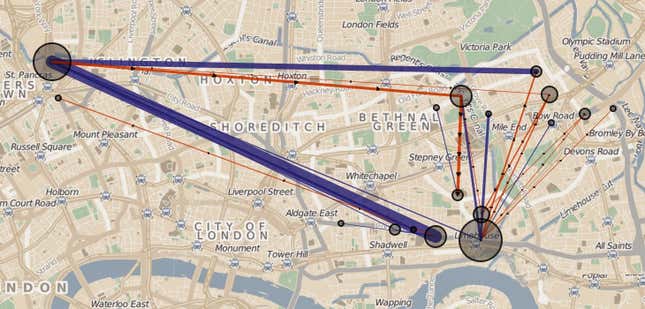
Even without an intimate knowledge of London’s geography, it is hard not to reach a few obvious conclusions. This commuter appears to live in the Limehouse neighbourhood, at the southeast corner of the map, and works at King’s Cross, toward the northwest. She probably has close friends, family, or a partner in Bow, at the eastern edge of the map. Control for time, and that theory gets stronger:
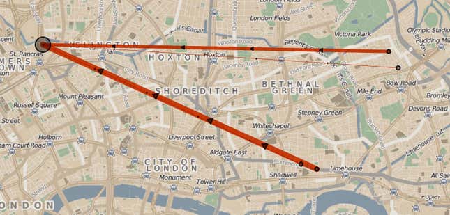
Those are journeys made between 4am and 10am. They head in one direction: towards King’s Cross (in fact, to the only cycle docking station near the Guardian’s headquarters). And they come from two places, suggesting this person spends the night at a location that is not home.
Siddle says he had no desire to dig deeper, but a determined individual with just a little more information—a geocoded photograph, a tweet complaining about full docking stations—could probably identify this supposedly anonymous individual. “All that’s needed to work out who this profile belongs to is one bit of connecting information,” writes Siddle on his blog.
When open data is too open
Siddle obtained this information through datasets made publicly available by Transport for London (TfL), the authority that controls all transport in the British capital. He says he was shocked when he downloaded the data in February. The documentation that accompanied it did not indicate that the data would include customer IDs (TfL says it has now plugged the hole).
“It’s not something you should have in that dataset,” Siddle told Quartz. “Because there is no direct way to tie it to people, it’s kind of in a grey area. But because of the nature of the data, all it takes is a little other data to know who that person is. For prolific bike users that’s their life.”
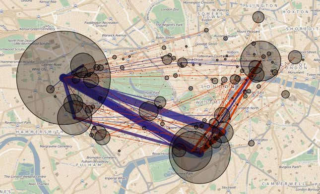
An interactive version of some of his findings, which allow you to filter by time of day and number of journeys per route, shows just how revealing the information can be. Pick morning or afternoon for “random_profile_2” and you can see where the cyclist probably works and lives. Click on “evening” and you know where he socializes.
Urban authorities, countries and international agencies around the world routinely release datasets to the public in the hope that tinkerers such as Siddle will find creative ways to make use of it, and perhaps even help the service improve. In aggregate, such data are harmless. But as Quartz has reported several times over the past year, data linked to individuals can be used to draw detailed pictures of a person’s movements, connections, political beliefs and relationships.
Siddle says he alerted Transport for London before publishing his blog post but didn’t hear back. When contacted by Quartz, TfL’s general manager of cycle hire, Nick Aldworth, said: “We’re committed to improving transparency across all our services and publish a range of data for customers and stakeholders online. Due to an administrative error, anonymised user identification numbers were shown against individual trips made between 22 July 2012 and 2 February 2013. The data, which did not identify any individual customers online, was removed as soon as the matter was brought to our attention.”