Why you need to learn Excel for data visualization
|
Over the years, TechChange has provided several professionals in the international development community with the crucial tech skills needed to make an impact in their work. Oftentimes, learning tech skills means first learning a software as basic as Microsoft Excel. We have all worked with Excel, but few of us really know its power to meet a wide range of data analysis and visualization needs. To fill this gap, we’ve created an interactive TechChange course for those who want to harness the power of Excel for Data Visualization.
Why Excel?
Today, Excel is still a critical digital skill sought for office and administrative positions, among others. Many companies still use Excel to manage their finances and human resources. According to a new report by Burning Glass Technologies and Capital One, knowing Excel can lead to a better paying job: 67% of middle-skill jobs demand these digital skills, and positions requiring these skills tend to pay 13% more than jobs that don’t.
In our Tech for Data Visualization course, participants were introduced to new software and tools to better visualize data, but many were also curious about how to use Microsoft Excel to do even more. Because of this, we decided to make a self-paced course that could be completed at any time and could you get these crucial skills in under two hours.
Intro to Excel for Data Visualization
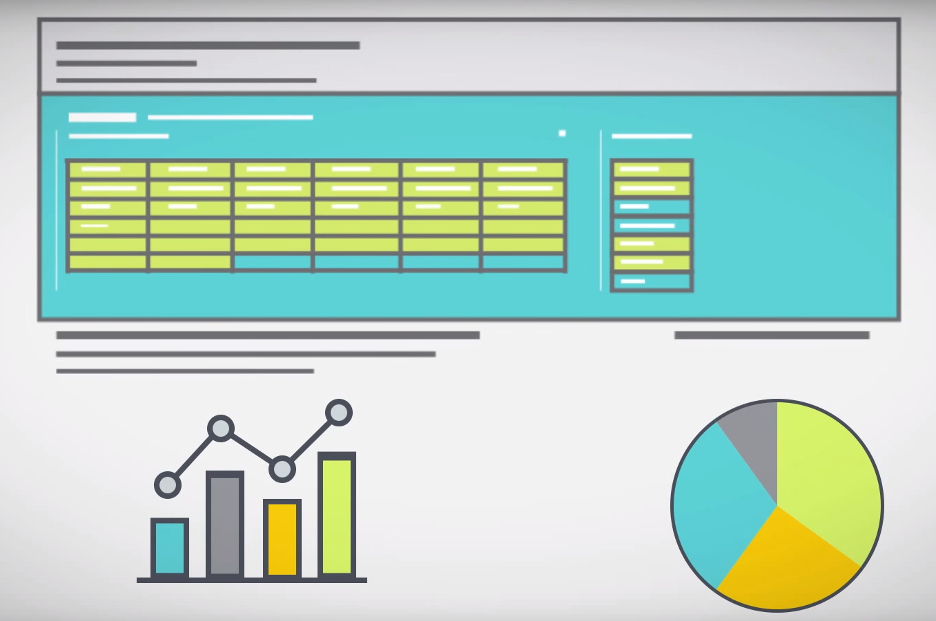
In this course, you will learn the nuts and bolts of how to use Excel functions and features like INDEX MATCH, PivotTables, Slicers, and more.You will also learn key data visualization principles that will help you optimize your data visualizations to best communicate your data.
We spent six weeks creating this interactive course and we’re excited to make it available for you! You can take the course in your own time, and if you have around an hour and a half, you can complete the course in one go.
Along with going over some important Excel functions like VLookup, basic macros, pivot tables, slicers, to create both static and interactive visualizations, the course includes case studies of how two different organizations used Excel for their data visualization needs. You will see how D3 systems used Excel to visualize public opinion data in Iraq, and how JSI used Excel to create a dashboard for global contraceptive security indicators. By interacting with real-world examples, you will be able to see the potential Excel has in your own work.
If you’re interested in learning more, check out the course details here and join the growing learning community at TechChange!
A technological search and find; a social media scavenger hunt. An advanced way to stay connected while being offline or...
Well, it only took us a full year of facilitating online courses, but we’re finally sharing some of our original...

As I look back on the nine wonderful months I have spent at TechChange, first as an Instructional Design fellow,...