With North Korea's growing missile capabilities in the news lately, I thought it would be interesting to create a map showing how far (or close) they are from other parts of the world.
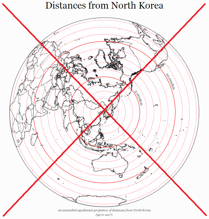
I first did a few searches on the Web, to see what maps are already out there. I found that most people who are creating this kind of map are centering it on North Korea, and then showing concentric circles of certain distances. To do that correctly, they need to use something like the azimuthal equidistant map projection. Here is an example from jasondavies.com:
And here is a less cluttered example that Peter Aldhous posted on twitter:
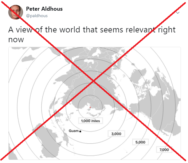
I think most people these days are accustomed to seeing maps in general (what with all the weather maps they check daily, and the the Google and gps maps they use to navigate) ... but the projection used in the above maps is probably something most people have not seen, and might be difficult to mentally grasp. I wanted to use a simpler projection that everyone could easily recognize - but that meant I couldn't use concentric circles.
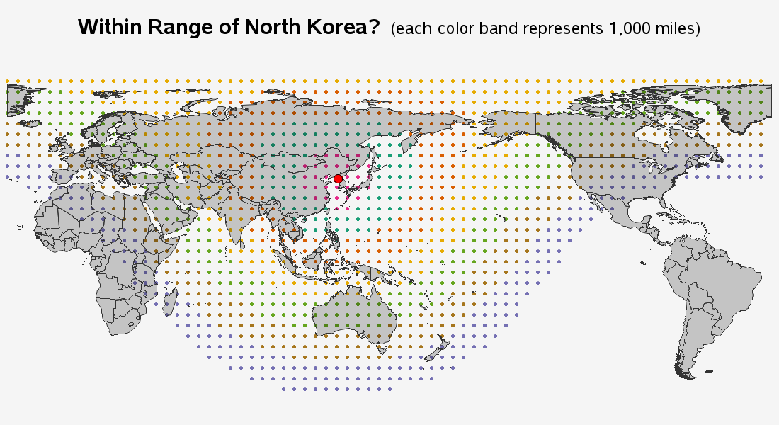
My solution was to use brute force and simple dots instead of circles. I calculated a grid of lat/long points, and then used the SAS geodist() function to calculate the distance each dot was from Pyongyang, North Korea. I then assigned colors to the dots, based on the distance (a different color for each 1000 miles). Here's what the first version of my map looked like, with dots at every 5 degrees of longitude & latitude:
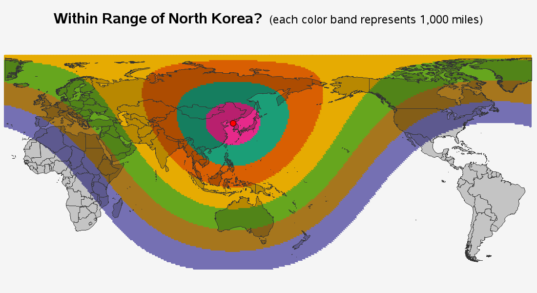
The above map was technically what I wanted, but not visually what I wanted. The dots were just too sparse to see the colors very well. Therefore I cranked up the resolution, and created a grid of dots at every 1 degree of lat/long. Now the dots are so close together that they visually form color bands. I use alpha-transparent colors so you can still see the countries under the color bands. Below is a snapshot - click here to see the interactive version with html mouse-over text showing the country names.
Can you easily find your country in my map? How about in the other maps above? Which one was easier? Are you closer, or farther, from North Korea than you thought?

4 Comments
Clever how you chose a couple of really naff maps to compare yours to.
I note you're choice of equirectangular projection (lat-lons). Or was that not a choice?
I just used the raw lat/long values, with no projection.
Your version is definitely easy to interpret...!
Evidently North Korea has several different missiles that they are testing. It would be interesting to see, on your map, lines showing the distance each is estimated to be capable of flying.