Reading Lists
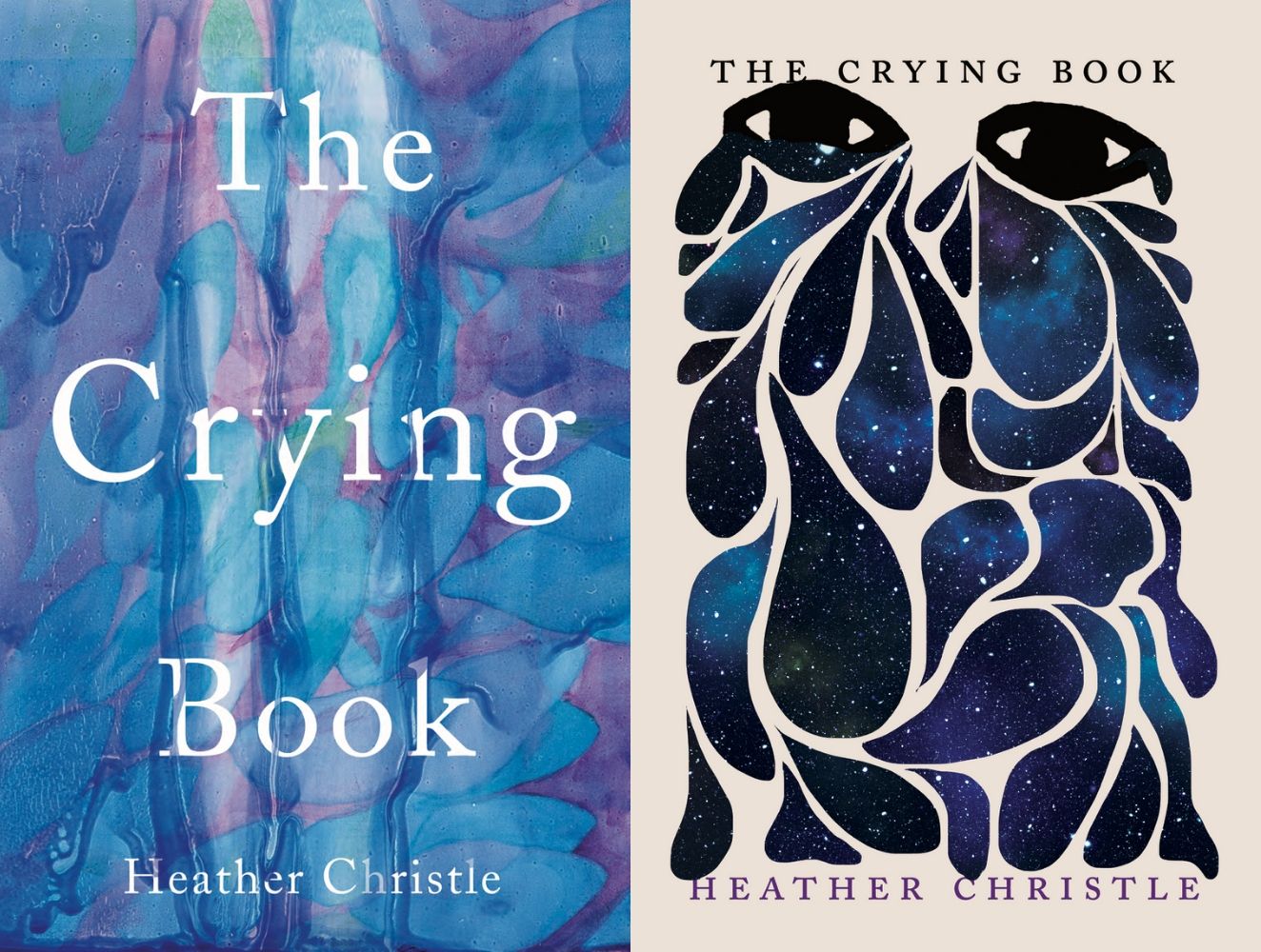
The Battle of the Book Cover: U.K. versus U.S.
Who will win?
Jacket covers are essential—the first line of attack to visually persuade you into purchasing a book, whether through a vibrant, pop-out typeface or a artfully draw illustration you can’t help but notice. Don’t think designing a cover is an easy decision, though. There are a lot of components that affect the process, and the considerations differ country by country. One thing to agree on: these choices make for beautiful books. (Well, when done right.)
We put together a poll on our Instagram of U.K. versus U.S. book covers and here are the results. (We’ve offered justifications, but the votes were all yours!) The left are book covers from our over-the-pond friends, while book covers from the good ol’ U.S. of A are situated on the right. This is a battle where there are no losers: only resigned, yet happy, people with another 20 books to add to the pile.

The Other Americans by Laila Lalami
With a bird’s-eye view of almost identical houses in the suburbs, this U.K. cover alludes to the story of The Other Americans: people brought together through the death of a Moroccan immigrant killed at an intersection. The billowing gold strands of the U.S. version may be beautiful, but ultimately it’s too abstract and doesn’t tell us anything about the book.
WINNER:

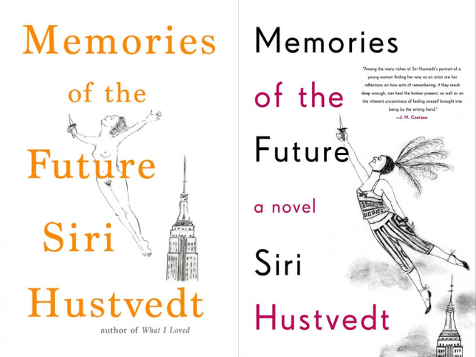
Memories of the Future by Siri Hustvedt
This novel is a work of autofiction about a Midwestern woman obsessed with her New York neighbor. The cover on the right might have more detail and flare (loving the feathered head-dress!), but this is a novel about the self, and I think the self is honest and bare. Let the body fly free, y’all. #FreeTheNipple (and the pubes).
WINNER:
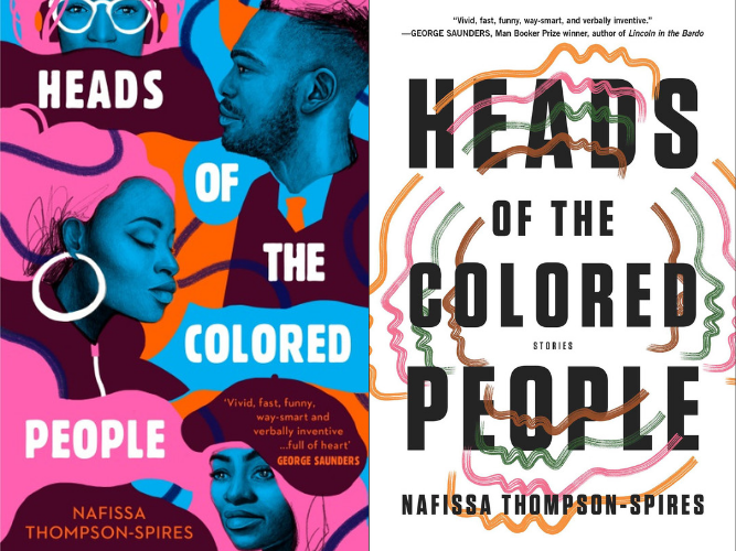
Heads of the Colored People by Nafissa Thompson-Spires
The cover on the left is beautiful, bold, and unapologetically colorful for this short story collection about blackness and middle-class America. This is not to say the right-side simplicity isn’t wonderful in its own way, but the U.K. has knocked it out of the park. (Pardon the American expression.)
WINNER:

Gingerbread by Helen Oyeyemi
Helen Oyeyemi’s modern-day fairytale retelling of Hansel and Gretel is evocative and strange. While I love the emblematic lost-in-the-misted-woods illustration, I’ve seen it before. The American cover wins with its bright yellow font and a striking illustration of a raven holding a branch of orange and in our book, millennial pink always wins.
WINNER:


House of Stone by Novuyo Rosa Tshuma
This debut about a teenage boy’s disappearance in Zimbabwe is so stunning that I would be happy with any cover. If I had to choose, though? There is no question. The U.K. cover on the left looks like a photo hanging in an art gallery and the bright multi-colored typography has my complete attention.
WINNER:
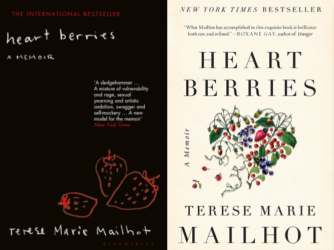
Heart Berries by Terese Marie Mailhot
Terese Mailhot’s memoir speaks poetic on growing up on the Seabird Island Indian Reservation and being diagnosed with Post Traumatic Stress Disorder and Bipolar II Disorder. While both images are stunning, there is something vulnerable about the hand-drawn quality of strawberries found in the dark.
WINNER:

The River by Peter Heller
Bold typography weaved with a psychedelic blue, red and white print? The U.S. version is as striking as the story it contains, about two college students who canoe down the Maskwa River before meeting a man in the midst of a wildfire. The British cover, on the other hand, looks like a cheap thriller sold in airports (right down to the cheesy tagline).
WINNER:

The Great Believers by Rebecca Makkai
A finalist for the Pulitzer Prize, this novel brings us Yale Tishman, a gay man in Chicago during the AIDS epidemic, and his friend’s sister Fiona, who is looking for her daughter in Paris 30 years later. If you’ve bought the U.S. copy already, you chose correctly. The pink and yellow looks stellar on the bookshelf. (I can attest.) The British cover conveys a lot of emotion with the image of two men embracing, but looks too much like a magazine cover.
WINNER:
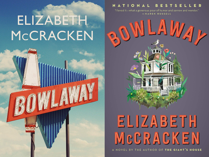
Bowlaway by Elizabeth McCracken
Beginning with Bertha Truitt, a mysterious woman found in a cemetery, Bowlaway features three generations of a family that owns a New England bowling alley. For a novel as curious as this, the U.S. cover is a touch too cute. The U.K. wins with its nostalgic neon signboard.
WINNER:
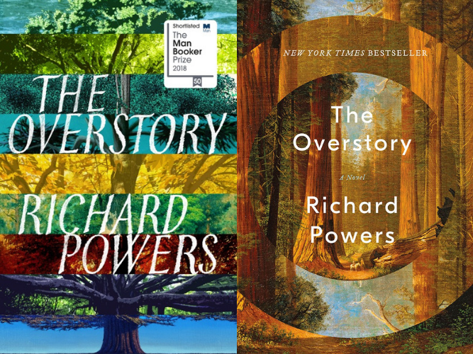
The Overstory by Richard Powers
A Pulitzer prize winner, this novel is a must-read, especially with such a rich, concentric cover from the U.S. that centers us deeper into the forest. This book interconnects the lives of people brought together by communicating trees to save one last, untouched landscape. The British cover, with the rainbow tree layers all screaming for your attention, gave us less of a sense of the book—and more of a headache.
WINNER:

The Confessions of Frannie Langton by Sara Collins
The embroidery on the left image is incredibly appealing. Its gilded thread and menacing imagery have my vote for this book about a former slave accused of murdering her employer. For a novel where Frannie Langton voices truth and condemns English society, do we need another picture of a headless woman?
WINNER:

An American Marriage by Tayari Jones
An American Marriage portrays newlyweds Celestial and Roy after Roy is arrested on a fraudulent charge. Their relationship is shaken further when Celestial takes solace in their friend, but when Roy’s conviction is overturned, what will happen? The U.K. cover is as gripping as the novel, revealing both sides of a shaken marriage through the letters they write to each other.
WINNER:

Lost Children Archive by Valeria Luiselli
Lost Children Archive winds down the Southwest as a family drives to Apacheria, the homeland of the Apaches, while hearing about the immigration crisis on the radio. Each cover filter glimpses of this compelling story, windowing an old photo of two children through orange and grey hues. The solution: buy both.
WINNER: Tie

We, the Survivors by Tash Aw
These covers may be tonally different, but the U.K. version is just too remarkable to ignore, especially for a book like this. We, the Survivors opens to a Malaysian fishing town, where Ah Hock, an ordinary man in an unforgiving world, is lead to murder a Bangladeshi migrant worker. The choice is hard, but whichever jacket you like more, I’m the last to judge.
WINNER:

Ghost Wall by Sarah Moss
The green skull looks like a mouthless imprint that receives the reader in a story where Silvie and her family live like ancient Britons. After they join an anthropology course, Silvie confronts what life could be, while the class builds a ghost wall, a barricade with skulls to ward against enemies. It’s a haunting tale, and it needs an image to match. The winner is clear.
WINNER:

Late in the Day by Tessa Hadley
It was no surprise to us that the U.S. version was the winner. The cover is arresting with the Renaissance painting of an angel cleverly hidden in typography. This novel, about two couples whose relationships devolve when someone dies among them, deserves a cover as vivid as its story.
WINNER:
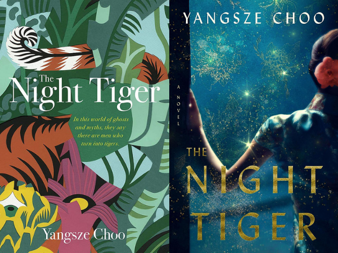
The Night Tiger by Yangsze Choo
The Night Tiger is about a young boy’s mission to find his dying master’s finger, a woman’s secret world as a dancehall girl, and men who transform as tigers in 1930s British Malaya. The British cover is playful and whimsical with its abstract cutouts. The American version, on the other hand, looks like a very stereotypical cover of books written by Asian women with the back of a (yet another faceless) woman dressed in what looks like a cheongsam with her hair in a bun.
WINNER:

The Parisian by Isabella Hammad
Though the U.S. cover is eye-catching with its sharp lines, bright yellow background, and period figure of man in a suite and cane, the British cover, with its stamps pinned into a floral wallpaper, evokes this novel’s long journey. From France during WWI through British-occupied Palestine, a young man discovers what it means to fight for independence.
Winner:

City of Girls by Elizabeth Gilbert
While the right side has the lovely dark teal background and flittering pink, the left side is playful and seductive with the line drawing of a woman, her face coyly hidden. This 1940s NYC love story is about nineteen-year-old Vivian Morris and the Lily Playhouse theater, where she finds freedom in her female self. What better way to show that than come-hither eyes shrouded in a feather boa?
Winner:

Sea Monsters by Chloe Aridjis
Sea Monsters tells the story of two teenagers in Mexico City who don’t know each other but run away together to look for escaped circus dwarfs along a beach town. These covers are oceanic treasures—as captivating as the story they encase.
WINNER: Tie