Preview: Instapaper on iPad
I’m probably supposed to keep this secret and build everyone’s anticipation to hype this up. Oh well. Maybe I’ll do that for the Instapaper edition for Apple’s next revolutionary computing platform.
First: Instapaper is definitely coming to iPad.
Second: Instapaper is coming to iPad very soon. Possibly even on day one – yes, I’m going for it – but that’s optimistic.
Third: Instapaper Pro will be a universal iPhone/iPad application. That means that you only have to buy Instapaper Pro once to have it on both devices, and the iPad edition will be available to all Pro purchasers at no additional charge when it’s released.
You probably have some questions.
What does it look like?
The short answer: It looks like Instapaper Pro, but bigger, and with slight interface tweaks and redesigns where appropriate.
The longer answer: It looks like this.

See? No huge surprises, except maybe that I changed to dark toolbars. No multi-column reading, no fake book-page animations, and no giant newspaper graphics.
I’ll probably move the reading-view toolbar to the top in the future, like most iPad apps, but I don’t yet know how I’ll hold the iPad when reading.
The biggest visual changes were made to the landscape-orientation list screen:
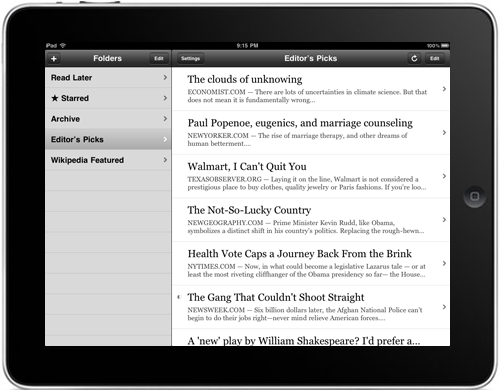
Honestly, I’m not crazy about the iPad’s split-view mechanics from the videos, especially the way they differ between portrait and landscape. But this is how Mail works, and Instapaper has always been navigationally designed like Mail. (Tip: If in doubt, follow Apple’s lead.)
Plus, exposing the folders more obviously in the interface will promote usage and reduce requests to implement features that I already have. (You’d be surprised.)
Everything you’d expect from Instapaper Pro is there, including dark mode, pagination, and adjustable fonts:

Instapaper Pro on the iPad is still the same app: you already know how to use it. It has just been modified in a few places to better fit the form factor and platform paradigms.
Why is it designed this way?
When everyone else was stalling their iPhone development for months in order to redesign entire applications for the iPad, I made the obligatory cardboard prototype and mocked up a bunch of radical interface departures.
Ultimately, none of them were very practical. Some worked well, but only with ideal content (which, in practice, is rarely the case except in the Editor’s Picks folder). And I didn’t want to commit to any huge risks because I don’t have an iPad to test them on.
Once I nailed down a few definite iPad-friendly features, I realized that I could port all of them to the iPhone version of Instapaper Pro. And if I did that, all of my customers (and I) could use these great new features now.
So, rather than rewriting my entire interface for the iPad over the two months that we’ve had, I spent the first few weeks finishing and launching the 2.2 update to my iPhone app, a major undertaking that added a lot of great features, using techniques that would allow me to easily adapt all of the features to the iPad. And I spent the remaining time adapting my interfaces, rewriting or modifying where necessary, for this new platform.
I’ll experiment with more radical interface changes in the future, once I’ve had time to actually use the iPad for a while and figure out what really works on it, what doesn’t, and what the hardware can handle.
Why now?
Developers have been put in a difficult position: if we submit our applications for review and sale before we’ve ever used an iPad, we can be in the App Store on (or near) day one. But we won’t have had a chance to test our applications on a real iPad – we’ll just need to rely on Apple’s reviewers to tell us whether they work. This is risky, since we don’t even know some critical details about the iPad yet, like how much RAM it has or how quickly it will execute our animations and number-crunching.
So we’re left with two options:
- Release the app for day one, but it might be buggy or non-ideal in a few areas.
- Release the app after we’ve had a chance to test extensively on a real iPad, but it may not be available for many weeks after the iPad’s launch, during which time our current and new customers will be clamoring for a native version, and they’ll be stuck using the pixel-doubled version.
The second option seemed more sensible at first. That was my plan at the beginning.
But then I saw the pixel-doubled version of my app in the simulator.
It sucked, and it was completely unusable by my standards. I don’t think I’ll want to run any pixel-doubled apps on my iPad in practice.
As far as I’m concerned, Instapaper isn’t really available on the iPad until it’s native. (This also influenced my decision to make it a universal iPhone/iPad app: I don’t want anyone subjecting themselves to the iPhone edition in pixel-doubled mode.)
While I could have taken the conservative option and waited until a month or two after the iPad’s release before launching Instapaper for it, an iPad without native Instapaper Pro is not a device I want to own.
And I’m buying it on day one.
So I’m doing my best to make the day-one submission deadline. Even if the first version ships with a few edge-case bugs, I’d rather have that on my iPad for a couple of weeks than no Instapaper at all, and many customers have told me that they feel the same way.
This is a risky decision, but I feel that this is the right thing to do for me and my customers, so I’m going for it. If any bugs do crop up in the first version, I appreciate your patience and trust that I’ll fix them quickly. Thank you.


