

 A visualization of 24 hours of flights over North America. (Credit: Aaron Koblin)
On one of the busiest days for air travel in the United States, I thought it would be worth a quick look at one of the more stunning recent visual depictions of the growing human imprint on the Earth — a set of animations built with data from a 24-hour stretch of air travel over the United States a couple of years ago. Watch how the pulses of flights build as dawn sweeps east to west.
A low-resolution version is on YouTube:
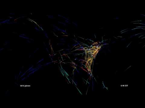
The animations, and a series of equally hypnotic still images, were created by Aaron Koblin, a young “data driven” graphic artist and game designer, originally as part of a broader “Celestial Mechanics” project at the University of California, Los Angeles.
Much sharper views, playing with the flight data in different ways, are on Mr. Koblin’s home page.
I’ve been a sucker for this kind of view of humanity’s ebbs and flows since I saw the time-lapse studies of Manhattan pedestrians by the sociologist William H. Whyte and then, of course, the 1982 documentary “Koyaanisqatsi,” which showed the similarity between a traffic jam and arteriosclerosis.
I’ll be posting a short Q&A with Mr. Koblin — when he’s landed (he’s flying from California to New York).
Any more questions about why LaGuardia and O’Hare are seeing more delays these days?
Safe travels to you all on this crowded little Dot Earth.
UPDATE 11/22, a short Q&A with Aaron Koblin:
Q. What got you focused on the aviation data as an art form?
A. I was going to grad school at UCLA’s Design / Media Arts program learning to write computer software to generate art. I guess a couple of influences converged simultaneously, but the catalyst
was a series of conversations with my classmates about the complexity of man-made systems in the skies. We put together a project called Celestial Mechanics that attempted to visualize a number of these systems
including helicopters, satellites, hot air balloons, and more. I quickly got sucked into flight visualizations as the data was so rich and intense.
//www.cmlab.com/media.php
Q. Which came first, the still images or the animation?
A. Well, due to the nature of the process, rough images were the first thing I saw. From the beginning, though, there was no doubt in my mind that this would be an animated artwork. Sure enough, it’s the ebb and flow of the country that really breathes life into this project for me.
Q. What do these pulsing flows signify to you (beyond the purely aesthetic)?
A. There are two aspects of this kind of work that are extremely rewarding for me. The first is the process of creating the visualizations where I am able to explore the data and make interactive decisions about visualization methods. The second is the variety of feedback that I’ve received from people responding to the visualizations with their own perspectives and opinions.
Where one person sees the majesty of human invention, another sees the excessive gaseous waste being dumped into our skies on a daily basis (some even see it as a nationalistic tribute to our great nation). While some of these perspectives are more intended than others (not so much the latter for instance), it’s very rewarding to begin a dialogue about a system that is otherwise so intangible.
To me, the flows signify pieces of a system beyond the grasp of my mind without visual assistance. I see humanity developing systems at an accelerated pace from a component perspective, often without having any real understanding of the larger emergence. In the past it has been the job of artists to reflect on the choices being made by society, in this age of technology and global issues I see this as one approach to that task.
Comments are no longer being accepted.