Nasa's animators are experts at showing that some information is just more beautiful than others. And it's useful, too.
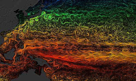
Data scientists at Nasa's Goddard Space Flight Center Scientific Visualisation Studio created the animation below based on data from ECCO2 - Estimating the Circulation and Climate of the Ocean, Phase II - which models global ocean and sea-ice at high-resolution. This just shows the surface currents and ocean flows. You can get versions to download here - and still images.
It was made to enter in the SIGGRAPH 2011 graphics event competition in Vancouver last year - but bewilderingly refused last minute entry.
ECCO2 models the oceans at all depths and the animation above is based on the same database, but shows surface temperatures. It's a beautiful way of showing
ocean eddies and other narrow-current systems which transport heat and carbon in the oceans
The team recently presented an animated evolution of the moon:
The team's Flickr group is a treasure trove of interesting stills and animations. Each of which presents data in a new way. How do you show a comet diving into the Sun, for instance - without the star blocking everything else? This animation gets round that quite neatly.
And, although this isn't data, I just like it. It shows solar flares and actvity. Right at the end, you can see an X5 flare (X is the largest category) erupt and a "storm of charged particles as part of a coronal mass ejection".
Buy our book
Facts are Sacred: the power of data (on Kindle)
More open data
Data journalism and data visualisations from the Guardian
World government data
Search the world's government data with our gateway
Development and aid data
Search the world's global development data with our gateway
Can you do something with this data?
Flickr Please post your visualisations and mash-ups on our Flickr group
Contact us at data@guardian.co.uk


Comments (…)
Sign in or create your Guardian account to join the discussion