Skip to content
Tech

OS X 10.8 Mountain Lion: the Ars Technica review

Where Lion stumbled, Mountain Lion regroups and forges ahead.

John Siracusa | 276

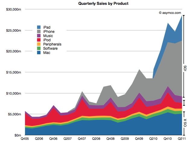
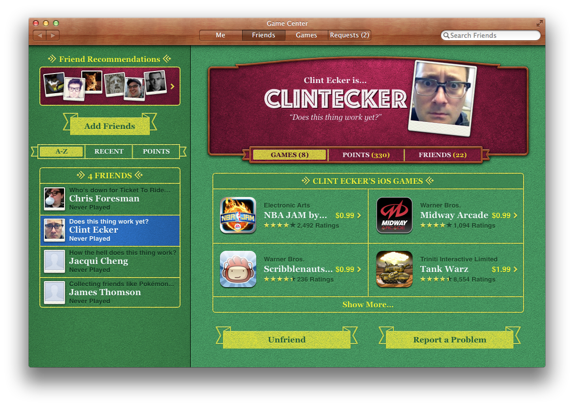
Apple's traditional desktop computing business has suffered many indignities over the past decade. Once Apple's flagship product line, the Mac first found itself playing second fiddle to the iPod—a mere music player—in the early 2000s. Today, matters are worse; on a graph of Apple's revenues, the Mac now appears as a thin strip of earth while iOS devices are the mountain that sits upon it.

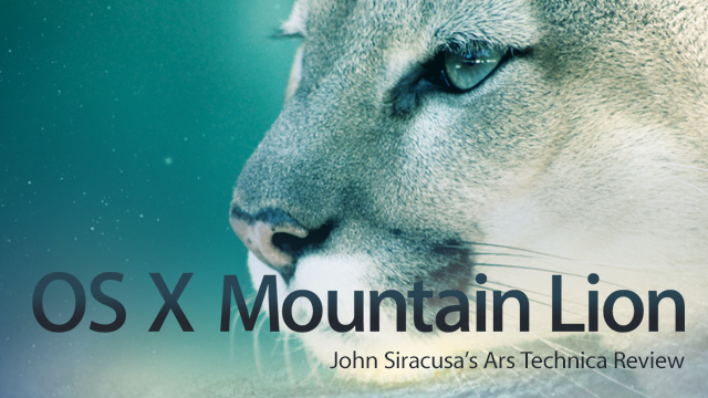
Apple presented last year's release of OS X 10.7 Lion as part of a turn "back to the Mac." Ostensibly, the tagline was Apple's promise to bring innovations from its mobile operating system back to Mac OS X. But more broadly, it also meant that the Mac would receive more of Apple's attention.

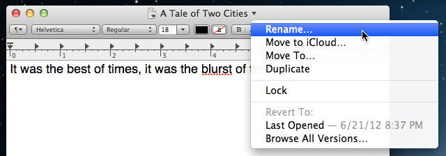
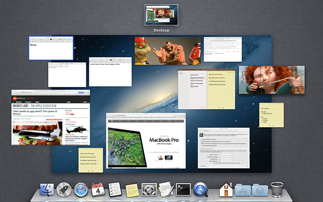
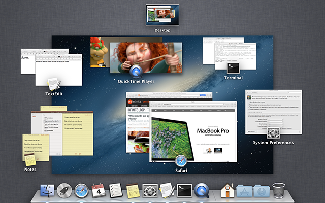
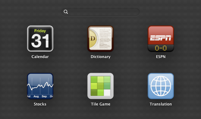
That attention resulted in some dramatic changes to aspects of the operating system that had not been reconsidered in decades: application launching, the document model, process management—even basics like window resizing and scrolling. As Apple's newly refocused gaze fell upon its desktop operating system, many parts of it were deemed archaic and unworthy of continued existence.

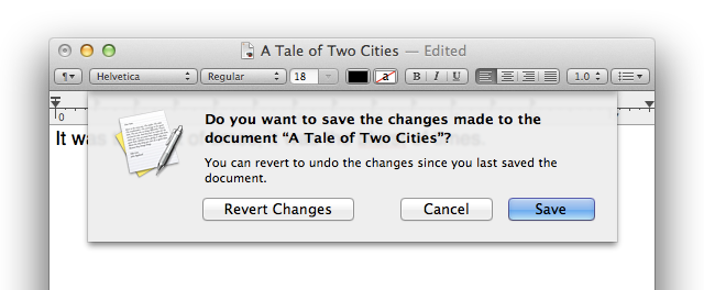
At the end of last year's Lion review, I concluded: "[Lion] marks the point where Mac OS X releases stop being defined by what's been added. From now on, Mac OS X should be judged by what's been removed." Unfortunately, the surgery was not a complete success. There were… complications.

Ars Video


Sins of the father

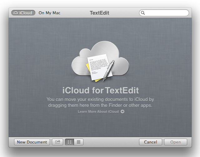
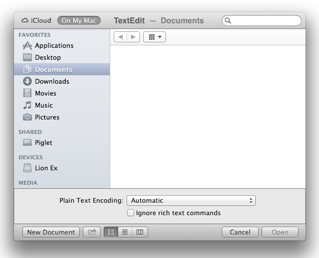
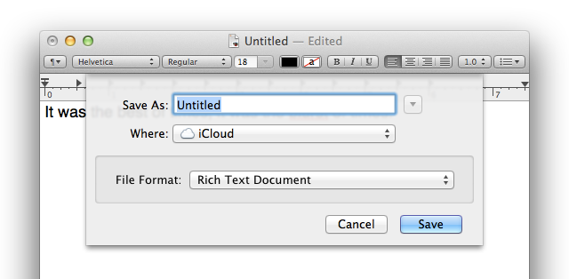
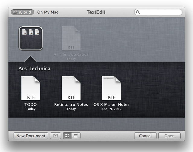
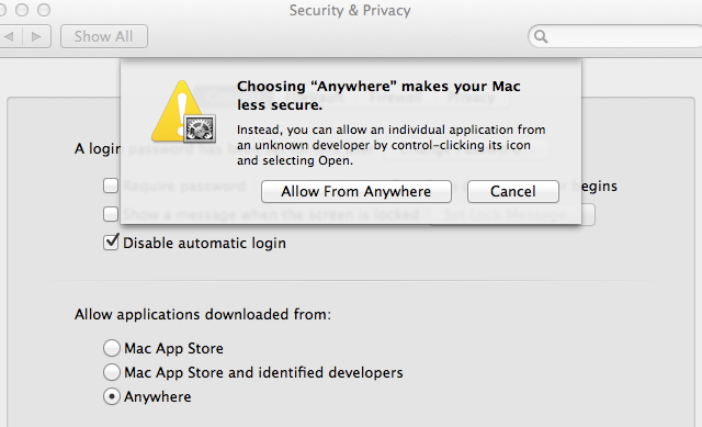
Apple's intentions were noble. Lion's new features said all the right things: "Stop worrying about saving your documents; Lion's got you covered. You don't need to keep track of how many applications are running; let the OS handle those details for you. Don't bother mucking around in the Finder, your applications are only a few clicks away. And scroll bars? Getting them out of your face is like a breath of fresh air. Trust me, this is going to be awesome."

Some longtime Mac users rejected Apple's premise that these things needed to be fixed. I am not among them—nor, I suspect, are the many millions of people who have been introduced to Apple through an iOS device. For most people, the problems Apple tried to address in Lion were real. The solutions, however, had some rough edges.

And then there were the bugs—oh, the bugs! It's been common for 10.x.0 releases of Mac OS X to have bugs related to new functionality. These bugs are usually fixed quickly, with most disappearing in the 10.x.1 and 10.x.2 releases. Lion differed in both the nature and longevity of its bugs. Bugs in basic functionality like WiFi connectivity and Web browser stability bedeviled many Lion users, and it took Apple several releases over many long months to address the worst of them.

The theme underlying nearly all of Lion's changes was that the Mac could learn a thing or two from iOS. This theme didn't just influence the conceptual foundations of the OS (e.g., that users should not have to worry about saving documents or conserving resources by quitting applications), it also reached all the way up to specific details of the user interface and graphical design (e.g., the newly skeuomorphic versions of iCal and Address Book).

These user-visible changes also met with much resistance—again, some of it knee-jerk, but much of it justified, especially in cases where the changes significantly reduced functionality or made features more difficult to find.

Second bite at the apple

Enter OS X 10.8 Mountain Lion. Apple made a half-hearted attempt to brand 10.7 as "OS X Lion," but the "Mac" prefix was far from completely expunged at launch. This is the first of many areas where Mountain Lion aims to succeed where its predecessor failed, so "OS X Mountain Lion" it is—emphatically, universally, with a bullet.

The final piece of Apple's renewed focus on the Mac is the uncharacteristically pre-announced move to annual releases of OS X. So not only did Mountain Lion have to correct Lion's missteps, it had only one year of development time to do so. Furthermore, unlike the last OS X release that just added a modifier to its predecessor's name, Mountain Lion doesn't have the luxury of focusing solely on refinement and internal changes. It has to move the ball forward… hopefully with fewer fumbles than Lion.

But hang on a second. For a desktop OS in the year 2012, which direction is "forward," anyway? The obvious answer is "toward iOS," but Lion proved that it's not quite that simple. And really, there has to be more to it than compulsive imitation, otherwise why continue development of the Mac platform at all?

Mountain Lion is Apple's answer to all these questions. It is the digital manifestation of Apple's belief that the Mac is still relevant, that it can be made better than it was before. In some ways, I feel the same as I did over a decade ago when considering a new version of OS X: I want to believe.


Table of Contents

Purchase and installation

Lion was the first version of Mac OS X to be sold exclusively through the Mac App Store. Well, make that almost exclusively. Anticipating tech-nerd wariness about OS upgrades without physical media (and the legitimate needs of some businesses for a network-free installation procedure), Apple started selling Lion on a USB stick for $69—substantially more than the $29 it cost in the Mac App Store—a month after launch. I've still never actually seen one of these USB sticks in person. That's probably because so few of them were sold. Apple says there will be no equivalent product for Mountain Lion.

By any measure, Apple's transition from physical media to networked OS upgrades has gone smoothly. Perhaps most customers get their OS upgrades by buying a new Mac with the new OS preinstalled, while the few who do want to upgrade an existing Mac are tech-savvy (and bandwidth-endowed) enough to handle a multi-gigabyte download from the Mac App Store. Whatever the explanation, it seems that most people who wanted Lion were able to get it with a minimum of hassle. The same will likely be true of Mountain Lion.

OS X prices, 2007-2012

Unsurprisingly, Apple is following a similar strategy with Mountain Lion. Look for it in the Mac App Store at the low, low price of just $19.99. At this point, it's almost strange that Apple charges anything at all.

As has been the case for all non-server versions of the Mac operating system, Mountain Lion has no serial number, no product activation, and no DRM of any kind. The standard Mac App Store license terms allow customers to install a copy of the software on "each Apple-branded computer […] that you own or control," including two additional copies on each Mac inside virtual machines.

Snow Leopard dropped support for PowerPC Macs (remember those?), while Lion jettisoned Intel Macs with 32-bit processors (the last of which stopped shipping in 2007). Mountain Lion continues the inexorable march of progress by dropping support for 32-bit kernel extensions and requiring a Mac that can run the 64-bit kernel. This currently excludes many Macs that have 64-bit processors, including the Late 2006 iMac and many years of Mac mini and Mac Pro models. In fact, it's easier to just list the models that are supported. (My own 2008 Mac Pro just barely makes the cut.)

The installer has the same radically simplified interface introduced in Lion, and it creates the same recovery partition on the target disk. If a recovery partition exists from an earlier installation of Lion, it will be upgraded to boot Mountain Lion instead.

The Mountain Lion installer.

Having lived with this Mac-App-Store-centric purchase and installation regime for operating systems for a year now, its advantages are abundantly clear to me. Slinging around OS installers just like any other type of application is incredibly liberating, as is the ability to install the operating system on any volume without first rebooting from another volume. Not coincidentally, these installers are a perfect fit for Apple's increasingly optical-drive-bereft hardware. Installing from a hard drive is also a hell of a lot faster than installing from an optical disc.

Like any other application purchased from the Mac App Store, these OS installers are updated in-place as part of the normal Mac App Store update process when new versions are released. It's as if your Mac OS X 10.6.0 installation disc gradually morphed into a 10.6.1 installer, then a 10.6.2 installer, and so on. This eliminates the tedious two-step process of installing an operating system from your original media and then immediately downloading hundreds of megabytes of updates.

The combination of the recovery partition, the ability to re-download any Mac App Store purchase at any time (including OS installers), the many ways to create your own bootable recovery USB thumb drive, and the last-ditch network-based recovery system available on most modern Macs means that it is nearly impossible to find yourself with no way to repair or reinstall your Mac's operating system.

For recent Mac converts, especially those accustomed to iOS, none of this may seem particularly special. But for longtime Mac users, it (still) feels like the future.

The OS X first-run setup is not quite as streamlined as the installer. Of note is the growing list of legal agreements that must be accepted in order to continue: OS X License Agreement; iCloud Terms and Conditions; Game Center Terms and Conditions; Privacy Policy. At least they're all presented in a compact single-screen interface.

If you answer in the affirmative to all of Apple's prompts, you'll end up with a Mac and a user account that is tightly integrated with iCloud, including Location Services and Apple's surprisingly handy and reassuring Find My Mac feature that's built on it. ("Did I leave my MacBook at the coffee shop or is it on my desk at work?")

Apple's Migration Assistant for transferring user accounts and data from another Mac continues to impress with its thoroughness, but the future clearly belongs to iCloud. Rather than storing your data locally and schlepping it from one Mac to the next over the years, Apple would prefer that you store all your data in iCloud.

The idealized OS X setup process of the future consists of a few legal formalities followed by a prompt to create or sign in to your iCloud account. From there, the OS can take over, setting up your user account, configuring all your settings, and downloading all your applications and data. We're not there yet, but Mountain Lion is the first big step in that direction.

Interface changes

As befits its [modifier]-cat name, Mountain Lion includes several subtle but welcome visual and functional refinements to the comprehensive interface overhaul introduced in Lion.

The Dock

The glassy Dock appearance introduced 5 years ago in Leopard has finally been retired. In its place is a very handsome semi-gloss metal finish. The blurred reflections of windows and icons appear on its surface. Though the competing vanishing points and edge treatments of the Dock and the icons that sit upon it still make for a somewhat incongruous visual design, this is still the best the 3D Dock has ever looked. (The look of the Dock when it's on the right or left screen edge has not been changed, as far as I can tell.)

The Dock's new look in Mountain Lion.

In Lion, Apple flirted with the idea of eliminating the visual distinction between running and non-running applications in the Dock. In the end, cooler heads prevailed and the traditional indicator lights below running applications in the Dock remained on by default.

The Dock's new indicator lights under running applications. Look closer; they're there, I swear

Mountain Lion keeps the same conservative defaults, but practically speaking, it takes a bold step in the opposite direction by making the aforementioned indicator lights below running applications extremely subtle. The indicators now appear as thin rectangular lights, as if the front edge of the Dock has white LEDs embedded in it.

At first glance or at a distance, it's now much more difficult to tell which applications are running. Perhaps Apple is just trying to ease us all into its brave new world.

Progress bar for downloads and file copy operations.

When items are copied (or downloaded by Safari) into a docked folder, a small progress bar appears below the folder in the Dock. As we'll see later, the same kind of feedback is also shown during copy operations between items in the Finder.

Apple continues to steer the Dock squarely toward the needs of novice users by making it much harder to accidentally drag an item out of the Dock in Mountain Lion. An icon must be dragged about an inch (~60 points) away from the Dock—and held there for some minimum amount of time—before the cursor will gain its "puff of smoke" badge. End the drag any closer to the Dock and the icon will zoom back to its original position, unchanged.

Scroll bars

After more than a decade of candy-colored Aqua scroll bars, Lion brought some radical changes to scrolling in OS X. Two changes were particularly controversial: reversing the mapping between touch-based input and scroll direction, and hiding the scroll bars entirely by default when using only a touch-based input device, displaying so-called "overlay scroll bars" instead. Both changes were easily reversed with preferences, but the defaults clearly expressed Apple's wishes.

After a year of use, it's clear to me that Lion's scroll-direction reversal is the kind of change that users get used to very quickly. Given a week or two of use, setting the preference back to its pre-Lion behavior can cause just as much confusion as Lion's original reversal.

That said, I still have my scroll direction set to the pre-Lion direction, mostly because my primary pointing device is a mouse with scroll wheel. Scrolling to reveal more of the bottom portion of a document (see? I can't even say scrolling "up" or "down" anymore) is, by far, the most common direction, and curling my scroll-wheel finger toward me feels much more mechanically efficient than the opposite action.

Lion's hidden scroll bars, on the other hand, tend to become more problematic over time, not less—for a certain class of users, anyway. If you are the kind of person who finds yourself consciously or unconsciously glancing at the scroll bar to get a feel for document size and position, the tiny pricks of annoyance due to absence of that visual feedback tend to accumulate over time. The end result is often a trip to System Preferences and an exasperated surrender to the increased "visual clutter" of always-visible scroll bars.

In Mountain Lion, Apple has shrewdly triaged the scrolling situation. The default scrolling direction is the same as it was in Lion, though the setting to reverse it remains. (In a few short years, dear reader, you'll be able to regale incredulous youngsters with tales of how scrolling on the Mac used to work.) To help make the land of overlay scroll bars more hospitable to those currently in self-imposed exile, Apple has added the ability to explicitly request document size and position information. Simply place two fingers on a Mac's trackpad, without moving them, and the overlay scroll bars on the frontmost window will fade into view. (This works only on a trackpad; Apple's Magic Mouse is excluded because users are more likely to idly rest their fingers on the surface of a mouse.)

Will it be enough to lure the exiles back? Perhaps not, but it's a boon for the vast majority of Mac users who never touched the scroll bar preferences. In Lion, I've seen users put two fingers on the trackpad and give a little shake just to coax the overlay scroll bars out of hiding. Mountain Lion has made the shake unnecessary, making it that much more likely that this new double-touch gesture will become an unconscious part of a user's computing vocabulary.

Mountain Lion comes with more small changes to scrolling. Overlay scroll thumbs are now allowed to overlap in the corners. This eliminates the awkward no-fly zone in the corner of the window, trading it for an awkward collision of two transparent interface elements instead.

Lion's non-overlapping scrollers on the left, Mountain Lion's overlapping scrollers on the right.

Hovering the cursor over one of the scroll tracks now causes a greatly enlarged incarnation to appear. Trying to grab and manipulate the extremely skinny scroll thumbs in Lion's overlay scroll bars was always frustrating, so the new, fatter scroll thumbs in Mountain Lion are a welcome change.

They do, however, introduce a bit of visual awkwardness. A single window may have a "fat" scroll thumb on one axis and a "skinny" scroll thumb on the other, simultaneously. On the bright side, the scroll track no longer blurs what's behind it, an effect that often looked more like a "smear" in Lion. The track now appears as a semi-transparent, non-blurred overlay. It's a much cleaner look.

Lion's mouse-over overlay scrollers on the left, Mountain Lion's on the right.

Finally, Apple has added iOS-style accelerated scrolling to Mountain Lion. The first three swipes on the trackpad scroll as they did in Lion, but on the fourth swipe, the distance traveled within the document greatly increases. This magnified ratio of finger movement to scrolling distance continues as long as the user keeps swiping repeatedly.

All of these changes are quite subtle. Once the OS has been out for a while, try asking a Mac-using friend who is not obsessively reading multi-thousand-word operating system reviews on the Internet if he has noticed anything different about scrolling in Mountain Lion. I confess that even I didn't notice the scroll thumb overlap in the corner before I was told about it at WWDC.

But subtle though they may be, the net effect of the scrolling changes in Mountain Lion is quite positive. The fatter scroll tracks and accelerated scrolling make traversing long documents less burdensome. The two-finger-touch trigger for showing overlay scroll bars is a tiny but satisfying nod toward those of us who could not bear to stick with Lion's defaults. And the firm stance on Lion's switch to a "natural" scroll direction shows that Apple hasn't lost its nerve.

Notification Center

The upper-right corner of the screen is prime real estate in any desktop operating system, but particularly on the Mac, with its system-wide menu bar spanning the top of the screen. In the days of classic Mac OS, it was home to an application switcher menu. Mac OS X was introduced with no permanent resident in the upper-right corner, allowing the first menu extra loaded to claim that coveted spot. Apple seemed to put its foot down in Mac OS X 10.4 Tiger when Spotlight ascended to the corner throne. There it has stayed for seven long years.

Notification Center

In Mountain Lion, Spotlight's reign has ended. Shoving the familiar magnifying glass icon aside is a new monochrome glyph resembling a bulleted list. This is Notification Center, Apple's new system-wide notification interface. Click the icon or swipe to the left with two fingers (starting from the right edge of the trackpad only, which is kind of neat), and everything on the screen except for the menu bar and the Dock slides left a few inches, revealing a gray linen (what else?) strip that contains a vertical list of notifications from various applications.

A new Notifications preference pane controls the kinds of notifications each application is allowed to produce, and where and how they should appear. Notification Center has a public API that third-party applications can use. Only those sold through the Mac App Store can send notifications using iCloud's distributed push notification service, however.

Both the look of the Notification Center sidebar and the kinds of options available in the preference pane should remind iOS users of the notifications feature introduced in iOS 5.

The Notifications preference pane.

The "banner" style of alert folds down from the top-right of the screen, displaying a thin gray box containing the text of the notification—which automatically slides off the right edge of the screen after a few moments. The "alert" style is a dialog box with buttons that slides down from top-right. A "Snooze" button causes the alert to simultaneously fade away and race off the right edge of the screen. A "Close" button causes the box to disappear in a puff of smoke, one more realistic and less cartoony than the Dock's "poof" animation.

After a decade of such cutesy animations, you'd think they would grow tiresome. Indeed, some have. But I'll be damned if I didn't smile a little the first time I saw an alert notification disappear in a puff of smoke. Given the extensive controls on the number and types of alerts that appear in Mountain Lion, the associated animations are less likely to wear out their welcome than, say, the "new window" animation in Lion.

If you need some peace and quiet beyond the per-application settings you've set, just scroll the Notification Center sidebar downward a bit to reveal a global on/off switch that will disable notifications entirely. (Option-clicking the menu bar icon also acts as a toggle.)

When in the off position, the Notification Center icon in the upper right corner dims slightly. This switch will turn itself on again automatically the next day, preventing users from accidentally missing important notifications. (Users who want notifications off permanently can simply disable them for all applications using the preference pane.) Notification Center also automatically disables itself when a projector is plugged in.

Notifications Center's on/off switch.
Send tweets from Notification Center

Tidbits of information that might be considered notifications (if you squint a little bit) can also be created directly in Notification Center. Right now, the elite group of supported services includes only Twitter. Click the button-shaped region labeled "Twitter" at the top of the sidebar and a tiny tweet submission interface appears.

In the fall, Facebook integration is promised. I'm sure third-party applications would love to present similar interfaces, but alas, this aspect of Notification Center is an exclusive club with Apple as the bouncer. Founding your own company and getting a few hundred million users to use your product seems to be the only way to gain admittance, for now.

Reserved space for the settings icon.

Finally, the bottom-right corner of the Notification Center sidebar contains a small "gears" icon that will open the Notifications preference pane when clicked.

This is noteworthy mostly because of the interface concessions made to ensure that this icon is always visible. In Mountain Lion, the Dock is not allowed to span the full width of the bottom of the screen. Space is always reserved for this icon on the right edge (and on the left edge, as well, when the Dock is in its default centered position). In this situation, it seems to me that the Dock could just briefly shrink and then restore itself to its previous size when the Notification Center sidebar appears and disappears. Since when is Apple above a little animation? Strange.

Document model changes

Apple's far-reaching changes to the document model in OS X Lion were meant to reduce the number of things users have to be concerned about when dealing with documents. The Mac document model was developed when loading or saving even a very small file took several seconds and disk space was scarce. In this environment, complete manual control over data persistence decisions made sense.

But to longtime computer users, the failure modes are sadly familiar: accidentally closing a document without saving; accidentally saving an older version of a document on top of the "good" version; an application crashing before you have a chance to save an open document; the barrage of dialog boxes asking what to do about unsaved changes when quitting applications or shutting down the computer.

In Lion, Apple proposed that document persistence be taken out of the hands of users and controlled by the applications and the operating system instead. After all, on today's hardware, files many times larger than the total storage capacity of the original Macintosh can be saved in a fraction of a second. To enable this utopian future, Lion included several new APIs for automatic document saving, document revision management, and open-document restoration. Apple updated its applications to use these new APIs, and it strongly encouraged third-party developers to do the same.

This all sounds great, and is in fact very close to the data persistence model on the wildly popular and inarguably user-friendly iOS platform. But as I warned last year in my Lion review, old habits sometimes die hard.

At this point, a little bit of "geek panic" might be setting in. For those of us who understand the pre-Lion document model and have been using it for decades, the idea that we are no longer in control of when changes to open documents are saved to disk seems insane! What if I accidentally delete a huge swath of text from a document and then Lion decides to autosave immediately afterwards?

Not every change is meant to be saved, after all. The practice of speculatively making radical changes to a document with the comfort of knowing that none of those changes are permanent until we hit ⌘S is something experienced Mac users take for granted and may be loath to give up.

Though there was some grumbling from the power-user set as their favorite Mac applications adopted auto save, it turns out that the biggest stumbling block was not the "auto" part of auto save, but the "saving" part. Specifically, the venerable "Save As…" feature that allows an open document to be saved in a new location under a new name was sorely missed.

In its place, Lion provided a two-step process: select "Duplicate" from the "File" menu, then select "Save…" and choose where to save the new file. To add insult to injury, the "Duplicate" command didn't even have a default keyboard shortcut.

Document restore also put a few noses out of joint. After decades of the "Quit" command being synonymous with "close the application and all of its open documents," some users just could not get used to the experience of launching an application and seeing all of the previously open documents brought back to life.

In Mountain Lion, two new, innocuous-looking checkboxes in the General preference pane bring some blessed relief.

New document saving preferences in the General preference pane

The first checkbox, labeled "Ask to keep changes when closing documents," gives applications permission to resume "nagging" the user about unsaved changes when a document is closed. When this feature is enabled, modifying a document and then closing it causes a sheet like this to appear:

The unsaved changes confirmation sheet makes its triumphant (but optional) return

When the feature is disabled, the modifications are automatically saved to disk (preserving the previous revision using Lion's document versioning engine) and the document closes without complaint.

The "Close windows when quitting an application" checkbox is similarly straightforward. When enabled, quitting an application will also cause all of the open documents to close. But rather than behaving as if each document had been manually closed before quitting the application, potentially spamming the user with confirmation dialogs (depending on the setting of the "Ask to keep changes" setting), a single dialog box appears:

Review unsaved changes before quitting an application. Optionally, of course.

The "Quit Anyway" button causes all unsaved changes to be saved (again, preserving old revisions) and then the application quits. In other words, it behaves the same as it does when the "Close windows when quitting" checkbox is unchecked, but with a single confirmation dialog inserted into the process.

Clicking the default "Review Changes…" button triggers an appropriate confirmation dialog box for each open document that has unsaved changes. It's as if you had manually closed each document before quitting the application.

Mountain Lion also has a little something for fans of the "Save As…" command. No, it's not back, but the "Duplicate…" command now has a default keyboard shortcut: command-shift-S (⇧⌘S). Triggering the command duplicates the document window, as expected, but it also makes the name of the document in the window's title bar editable. It actually looks a little strange.

Inline renaming of a document after duplication.

Entering a new document name (or just accepting the default name with the " copy" suffix) and typing return causes the duplicate document to be saved with the specified name in the same directory as the original document. This workflow actually has fewer steps and requires less thought than the traditional "Save As…" process, but it still lacks the ability to save the new document in an arbitrary location.

That behavior is also available, however, in two different ways. One way is to trigger the "Duplicate…" command immediately followed by the "Save…" command. A traditional Save dialog box will appear, allowing the new document to be saved anywhere. If that's still too cumbersome, just typing command-shift-option-S (⌥⇧⌘S) will trigger a traditional "Save As…" dialog box. (Holding down the option key while looking in the "File" menu will also change the "Duplicate…" command to "Save As…")

The title-bar renaming feature can also be invoked explicitly using the pop-up menu next to the document title. There is also a "Rename…" command in the "File" menu, though (sadly) without a system-wide default keyboard shortcut.

Inline document renaming on demand.

Some confirmation dialog boxes also have slightly improved button labels. Creating a new document and then immediately closing without saving now shows a dialog box whose far-left button is labeled "Delete" rather than the milder "Don't Save." The same button in the dialog that appears after selecting the "Duplicate…" command and then immediately closing the duplicate window is now labeled "Delete Copy" instead of "Don't Save." These changes may seem insignificant, but better aligning button labels with user intent can actually lead to a much more pleasant user experience for everyone, even expert users who were never particularly confused by the old labels.

The "Revert Document…" menu item has been replaced with a "Revert To" menu item that spawns a submenu containing options to revert to the last-opened revision of the document or show the full document version browser.

A new "Revert To" sub-menu replaces the "Revert Document…" menu item.

Finally, the option to automatically lock documents some configurable period of time after they were last edited, which was buried in a sub-screen of the Time Machine preference pane in Lion, has been removed in Mountain Lion.

That's a lot of small changes to features that are only a year old. To those who fundamentally disagree with the document model introduced in Lion, these changes will likely do little to sway them. But for those of us who really believe in the benefits these features are trying to provide, Mountain Lion's thoughtful revisions bring the theory of carefree document management much closer to reality.

Dictation

The Mac has had text-to-speech, speech recognition (for commands only), and even (admittedly rudimentary) handwriting recognition for years, but it was iOS that first gained OS-level support for converting speech to text. Now, a year later, this feature has made it to the Mac.

Mountain Lion supports dictation in any context that accepts keyboard input. Supported languages are three kinds of English (US, UK, and Australian), French, German, and Japanese. The feature is enabled in a new "Dictation & Speech" preference pane. Doing so presents a warning sheet:

This warning appears when enabling the dictation feature.

A button at the bottom of the preference pane provides more privacy information. Here's the first paragraph, which succinctly explains the situation without resorting to legalese.

When you use the keyboard dictation feature on your computer, the things you dictate will be recorded and sent to Apple to convert what you say into text. Your computer will also send Apple other information, such as your first name and nickname; and the names, nicknames, and relationship with you (for example, "my dad") of your address book contacts. All of this data is used to help the dictation feature understand you better and recognize what you say. Your User Data is not linked to other data that Apple may have from your use of other Apple services.

Unlike iOS, OS X cannot magically add a microphone button to the standard keyboard of each Mac it runs on. Instead, the preference pane is used to assign a keyboard shortcut to the feature. (The defaults include hitting the "fn" or the right or left command key twice.)

Triggering this shortcut causes a tiny popover containing what most people now know as "the Siri icon" to appear below the insertion point. That's your cue to speak. When you're done, either click the "Done" button or hit the keyboard shortcut again. A recording of what you just said is sent to an Apple server, which translates the audio into text and sends the result back to your Mac, where it's inserted into the document.

Dictation in action.

This process is undoubtedly familiar to anyone who has used dictation in iOS. And on the Mac, as on iOS, users may experience some difficulty "putting the gazpacho on ice," so to speak. (My attempt resulted in "I just got your nice.") But while server-side speech-to-text translation makes a lot of sense for memory- and CPU-constrained mobile devices, it's a bit harder to justify on a Mac with many gigabytes of RAM and a much more powerful CPU.

This isn't just an implementation detail; it has a profound effect on the usefulness of the feature. Most obviously, dictation in Mountain Lion requires an Internet connection. Arguably, there's little sense in pushing back against that tide. Even some single-player games require a constant 'Net connection, these days. But the much more important result of server-side processing is that no text appears until the user signals the end of the speaking process and then waits for a bit. This is a far cry from the typical dictation process supported by standalone applications like Dragon Dictate—which, incidentally, I'm using right now to input these very words.

Having words appear on the screen while I'm speaking is an essential part of efficient long-form text input. I would find it maddening if I had to pause and trigger a keyboard shortcut or click a button after every few sentences. Worse, there is a chance that the server-side processing will fail, at which point the progress icon in the dictation popover will shake back and forth a few times signaling that the words I just spoke have disappeared into the ether, resulting in no text at all.

I'm glad that Apple is leveraging existing infrastructure and technology to bring new features to the Mac platform, but I'm not sure how useful this dictation feature will be for anything more than small snippets of text. This may be why the feature was demonstrated in this year's WWDC keynote (at around 59:10 in the video) by sending a tweet.

Applications: refinement and realignment

The first OS X release that added a modifier to its predecessor's name had ambitions that mostly matched its title. Snow Leopard looked and felt almost exactly like Leopard; though there were many deep changes, most of them were not user-visible.

Mountain Lion builds on Lion in a different way. It doesn't add a raft of flashy OS-level features, like the dramatic 10.3, 10.4, and 10.5 releases, nor does it focus on internal changes. Instead, Mountain Lion refines existing OS features and adds a few entirely new applications.

These changes are not haphazard—a clear theme runs through both the internal and user-facing changes. Let's start with the applications.

Contacts

At first glance, Contacts (the application formerly known as Address Book) does not appear to have strayed much from its boldly skeuomorphic incarnation in Lion. But there are some important differences.

First, the much-bemoaned loss of the three-pane view that shows groups, the contact list, and the details of a single contact has been reversed. The new incarnation of this view feels a bit like it's been shoehorned into the book design, which dictates that the left and right "pages" be the same width. Still, it's a lot better than being limited to two views of your contact information.

This change also eliminates the baffling red bookmark graphic formerly used to reveal contact groups (with an ostentatious page-turn animation). The double-pane and (decidedly non-book-like) single pane views remain, as do the camouflaged window widgets and the low-contrast custom controls.

Contacts: three-pane view restored, mysterious red bookmark expunged…but it still looks like a book.
The first of many Share buttons

Then there's the Share button, sitting innocuously at the bottom of the contact details pane. You can see it in the screenshot above, just to the right of the "Edit" button. This icon—a rectangle with an arrow leaping out of it—should be familiar to most iOS users. In OS X, a drop-down menu of sharing options appears when this button is clicked.

Share buttons appear everywhere in Mountain Lion. If an application displays any content that can conceivably be shared with another person, there's probably a Share button nearby. The options for sharing contact information are limited—just e-mail and instant message—but as we'll see, more options are available for other types of data.

When sharing an item via e-mail, a new message is created in Apple's Mail application, with the shared item as an attachment (e.g., a vCard file for a contact). In all other cases, a separate application is not launched; the interface for sharing the selected entity is shown as a window-modal dialog box. Here's what sending contact information as an instant message looks like:

Sharing a vCard via Messages from within the Contacts application.

Add one or more recipients and some optional message text to go along with the contact information and click the "Send" button to send the message—all without launching a separate application.

Why does e-mail sharing launch a separate application, while others display their sharing interface within the current application? This dichotomy exists on iOS as well, despite the very strong incentive not to leave the current application in that OS.

iOS will purge background applications from memory if the current application needs more than is available. By the time you return to the original application, it may need to be relaunched, hopefully returning you to exactly the point where you were before sharing.

In OS X, there is far less memory pressure. (Macs still have significantly more RAM than iOS devices.) And despite Lion's strong moves in the direction of the iOS process model, there is still the expectation that switching away from a Mac application does not include the risk that it will have to be relaunched when you switch back.

In both cases, it's possible the decision comes down to the expected capabilities of the interface associated with each protocol. Sharing some information via a tweet or instant message can easily be done from a small dialog box. Composing an e-mail message presents many more options: multiple recipients, different types of recipients (i.e., CC, BCC), text formatting, additional attachments, etc. This makes sense—but it still leaves the feature somewhat hard to predict.

The other possibility is that Apple intends all sharing interfaces to be inline, but it just didn't have enough time to get the inline e-mail sharing interface up to snuff. Stay tuned to possible sharing changes in 10.8.x updates to see which theory holds more water.

Calendar

Calendar (the application formerly known as iCal—noticing a trend here?) retains the leathery exterior introduced in Lion but loses the stitching. Aesthetically, I'd call this an improvement. Functionally, it makes the toolbar area about ten pixels thinner, leaving more room for content.

The gratuitous page curl animation that used to appear when moving to the next or previous month is now blessedly absent when the action is triggered via the navigation buttons or keyboard shortcuts (command-left/right). Two-finger-swipers are still subjected to it, however.

There's one more significant act of UI repentance. The list of calendars, displayed using a modal popover widget in Lion, now appears in a proper sidebar.

The calendar list now appears in a sidebar instead of a popover.

Most of Calendar's non-visual changes are related to integration with new system services and applications. This kind of plumbing work is important and often difficult, but in the case of Calendar in Mountain Lion, it seems to have come at the cost of further usability improvements.

Calendar's "Quick Event" button (the "+" button next to "Calendars" on the left side of the toolbar) accepts an impressive range of natural language event descriptions, but the bar has been raised by applications like Fantastical, which features real-time animation while an event description is being typed to ensure that the user and the application are on the same page about the meaning of the input.

Is it fair to ding Apple for not matching the best of the best third-party offerings with each of its bundled applications? Perhaps not (though only one party in this contest has $100 billion in the bank), but the conspicuousness of the visual changes in an application like Calendar make me wish that equally significant changes were made to the user interface.

Reminders

Reminders have been extracted from Calendar and moved to an application of their own. The Reminders application takes its name, window appearance (dark, textured leather or plastic—I can't tell which), and even its icon design directly from its iOS counterpart.

Does this application remind you of one you've seen before? (See what I did there?)

The most important features of the Reminders application are that it exists, and that it uses the same network-based data store as the iOS reminders app, including support for push notifications. There's a basic priority system (low, medium, high, none) and limited support for repeated reminders (daily, weekly, bi-weekly, monthly, yearly).

Reminders also supports geo-fencing using the Mac's own location services functionality. Note the small arrowhead icon in the "Get Milk" reminder in the screenshot above; that reminder will be triggered when I leave the specified location tomorrow, or by 5:00pm that day at the latest.

There are dozens of "to-do" applications on the Mac App Store, many of which also have iOS incarnations and far more features than Apple's offerings. But for a first release, Reminders is very solid. I think it looks great as well—though it's not particularly "Mac-like," whatever that means these days. (More on this topic later.)

Notes

Notes have been removed from their awkward home in the Mail application and given their own application in Mountain Lion. Notes follows the same playbook as Reminders. It accesses the same iCloud-based data store as the iOS Notes application (as well as local data), and the interface and icon are like expanded versions of their iOS counterparts. (Standard OS X title bars are becoming awfully scarce in Apple applications these days.)

The new Notes application, featuring leather, yellow legal paper, torn edges, and oh yeah, iCloud integration.

The full-screen mode offers another surprise: the triumphant(?) return of stitched leather. There's also a wedge-shaped leather flap overlapping the lower-left corner of the notes list, presumably to ensure they don't slide off the screen and fall to the floor.

Notes in its full-screen mode.

This interface is a dead ringer for the iPad Notes app in landscape orientation. If you saw this image on, say, the screen of an 11-inch MacBook Air, you could be forgiven for instinctively poking the screen with your finger.

Unlike the iOS version, Notes in Mountain Lion can use any font installed on the system, no hacking required. There's also support for bulleted, dashed, and numbered lists, indentation, colored text, multiple font sizes, text alignment and justification, and even inline images. Text formatting created in the Mac application transfers and displays correctly on the iPad version, but inline images appear as inert paperclip icons which cannot be viewed. (Perhaps this will be fixed in iOS 6.)

Notes can be shared by e-mail or instant message using the Share button at the bottom of each note. Double-clicking a note in the list opens it in a separate window. (Don't worry, the Stickies application is still included in Mountain Lion.)

A single note open in a separate window.

As has become tradition, the Notes application icon includes the partial text of the narration ("Here's to the crazy ones…") from Apple's Think Different ad campaign, this time rendered in some of the worst handwriting I've ever seen.

Messages

Another iApp name bites the dust in Mountain Lion as Messages replaces iChat. I'm sure you'll be shocked to learn that it looks and feels like the Messages app on the iPad.

Messages replaces iChat. One window replaces many. Confusion replaces familiarity.

As on iOS, the sidebar holds a list of all conversations, past and present, until they're explicitly deleted. When text is added to a conversation, it jumps to the top of the list. This helps separate old conversations from new ones, but it also means that the click targets in the sidebar are constantly moving. Double-clicking a conversation opens it in a separate window.

The search box filters the list as you type, showing only the conversations that match the text that's been entered. The prominence of the search feature is a big change from iChat, which relied on Spotlight to find old chats.

Unlike Messages in iOS, the Mac version retains iChat's multi-protocol capabilities, with support for multiple AIM, Jabber, Google Talk, and Yahoo instant message accounts. But the big selling point of Messages is its support for Apple's iMessage protocol, a replacement for SMS/MMS that doesn't rely on cell carrier networks (and their text message payment plans) to operate.

The new interface combined with the new protocol leads to an experience that I found confusing. Send a message using the Messages application and a window may appear on one or more Mac screens, a notification dialog (and sound) may appear on iPads or iPod touches, and someone's phone may vibrate in their pocket. Oops, did you just mean to send a message to your colleague down the hall as he sat at his Mac? Or did you mean to send a text to someone's phone and not cause an alert to appear on his iPad which is currently being used by his child to play a game?

There's a strong argument to be made that what we've come to know as "instant messaging" and "texting" are sufficiently different in terms of the expectations of both the sender and the recipient that separate applications are warranted. On the other hand, this may just be a short-term cultural problem caused by the strange financial and technological conditions that gave birth to SMS.

But if all text-based messaging protocols are to be combined into a single application, then more clarity and control is needed. Message senders need more control over where and how they intend their messages to appear. The Messages application gives some control, showing multiple account names and protocols when composing a new message. These can serve as proxies for message destinations (e.g., if you know that a friend runs AIM on his MacBook and Messages on his iPhone) but it's far from an ideal solution.

And really, doesn't Apple want us all to be using iMessage and iMessage alone in the future? (For new, young customers who have never had an ICQ, AIM, Yahoo Messenger, or Google Talk account, this may actually be the case.) In this situation, protocol selection is no longer a useful tool for controlling message targets.

On the other end of the line, message recipients need more control over where and how they are available to receive iMessages. The fact that an application that can receive messages from one or more protocols is running on a piece of hardware has little connection with the current desirability of receiving such messages on that device. A richer notion of presence and availability is required across all platforms before the ubiquity of iMessage protocol support can transition from a periodic annoyance to a clear benefit.

A beta version of Messages that ran on Lion was released back in February. It quickly gained a reputation as one of the buggiest pieces of beta software Apple has ever released. I'd like to say that the final version of Messages in Mountain Lion addresses all the problems of the beta, but I've still seen some strange behavior. Some messages never seem to arrive, or arrive late. Other messages show up twice. Is this the fault of the Messages application itself, or the back-end iMessage service that it's connected to?

This confusion is an inherent problem with evaluating software in a world of pervasive network services. Even if the software on your disk is completely bug-free, it may still behave erratically if the service at the other end of the network connection is sending bad data, performing poorly, or not responding at all. And I may have the GM version of an application, but am I connected to the GM version of the server software?

I suspect that the server side of Messages and Mountain Lion's other network-connected applications will continue to evolve, perhaps even more rapidly than the expected parade of 10.8.x updates. But there may be a rough patch, with Messages in particular, at least in the short term.

Safari

In Lion, Safari switched to the then-new WebKit2 rendering engine, which further separated page rendering from the main Safari application process. This change was meant to enhance security through privilege separation, but it had a nasty side effect: decreased stability.

For a long time, Safari on Lion exhibited a bug that would cause all open tabs to reload spontaneously. For someone just reading a few webpages, this is a minor annoyance. But for anyone using a Web application (e.g., entering information into a content management system or composing an e-mail in Gmail), the sporadic, unplanned reloading of all open tabs could be disastrous.

Bugs in a 10.x.0 release of OS X are expected, but they're also expected to be fixed rapidly. Unfortunately, this bug appeared to be a symptom of the radical architectural restructuring in WebKit2. There was no simple, easy fix to be prepared for the 10.7.1 release. And so, we all waited. It wasn't until the 10.7.3 release, more than six months after Lion's introduction, that I saw this bug (almost) completely disappear.

Around that same time, I started testing the beta release of Safari 5.2, which ran on Lion as well as Mountain Lion. I was pleased to find that, even in beta, Safari 5.2 exhibited much better stability than its ill-fated predecessor.

Thanks to this history, stability turns out to be the most important feature of the new version of Safari in Mountain Lion, now rechristened version 6. Depending on your perspective, this may be a disappointment or a blessed relief.

Aside from the usual cartload of rendering engine enhancements (including some significant updates to the Web inspector), users are likely to notice a few new features. The first is front and center in the default Safari toolbar in Mountain Lion: a button with the now-familiar iCloud icon. Clicking it for the first time reveals its purpose.

iCloud tabs in Safari: availability instead of synchronization.

Rather than automatically synchronizing Safari browser tabs across all accounts on all Macs that are connected to the same iCloud account, Apple has chosen to merely make the tabs open on other Macs available everywhere. This may seem like a more complex solution than complete synchronization, but it actually simplifies the user experience greatly.

Keeping iCloud tabs confined to a popover allows them to be synchronized in real time without disturbing the user's browsing experience. Although an individual user is only likely to be using a single Mac at a time, a Mac used in the past may not have had time to push its browser tabs up to iCloud before, say, the lid was closed and the Mac was put to sleep. Later, when another person opens the Mac and it comes back online, those tabs may get pushed up to iCloud and then pulled down on the Mac that the original user is currently using.

Seeing browser tabs appear unbidden in your current browser window is not a comforting user experience. The iCloud Tabs toolbar button neatly sidesteps all these issues while still providing most of the benefits of cloud-based tab tracking.

And speaking of tabs, they now expand to fill the full width of the browser window, no matter how few are open. Apple experimented with "toppy tabs" in the Safari 4 beta but changed its mind before release. It looks like "stretchy tabs" made it to the big show.

Tabs now stretch to fill the full window width.

I like the larger click targets provided by the new design, but it will take a while to get used to the new layout. There's also the possibility that the new, wider tabs might not even read as "tabs" to some users. We're accustomed to tabs having certain familiar proportions. The new Safari tabs look very different from tabs in Internet Explorer, Chrome, and Firefox—but they look the same as tabs in Safari on iOS, naturally.

Apple has also enhanced Safari's Reading List feature in Mountain Lion. Introduced in Lion, Reading List lets users save webpages for later viewing. Items in the Reading List are synchronized across all installations of Safari, including mobile Safari on iOS devices. In Mountain Lion, webpages are also cached locally for offline viewing.

Reading List, now with offline support.

The inability to read webpages in the absence of a network connection was one of the problems that originally motivated the creation of Instapaper, the product that popularized the concept of saving webpages for later reading on the Mac and iOS platforms. Reading List continues to draw inspiration from its progenitor. And unlike Instapaper, Reading List is directly integrated into Safari's interface, with an icon in the bookmarks bar, menu commands, keyboard shortcuts, and preferences.

As if to balance the added attention given to Reading List, Safari in Mountain Lion has dropped support for RSS. The rudimentary RSS reader that used to be built into Safari is gone. In fact, there's no longer even an RSS badge in the address bar to click and subscribe to a feed for a webpage.

This is quite an about-face. Apple spent the golden era of RSS halfheartedly supporting it by embedding rudimentary feed-reading features into its applications, first Safari and then Mail. Now, RSS features are—spoiler—gone from both. The "RSS is dead" meme aside, there are still plenty of great RSS reader applications for the Mac and iOS. Apple is apparently leaving the RSS market in their capable hands.

Safari's Share button.

And yes, Safari also sports the latest in Mountain Lion fashion: a Share button. Webpages can be shared via e-mail, instant message, and Twitter. The same button also allows webpages to be bookmarked and added to Reading List, neither of which seems much like "sharing" to me.

The separate search field in the toolbar is gone, replaced with a single text input field that accepts both search terms and URLs. Apple is the last major browser vendor to enable the address bar to double as a search field. Safari has also joined other browsers in deemphasizing the path portion of the URL, showing it in light gray instead of black. The "http://" part is also hidden. (An "https" badge is shown for secure URLs.) This makes it harder for phishing sites to hide their identity, but it also makes URL paths less legible.

Apple thinks we should focus on the host portion of the URL, not the path. It's a bummer for Web developers, though.

The Reader button has grown more prominent, and the page loading progress indicator is now a somewhat sickly-looking blue gradient that races from left to right across the location bar's background.

Safari's new aqua gradient page-load indicator in action.
"Show all tabs" button.

When multiple tabs are open, a new icon appears to the right of the "+" add-tab button. Click it (or just perform a pinch gesture on a trackpad) and the content area of the window zooms out, showing each open tab as a slightly smaller version of itself. Swipe left or right or use the arrow keys to move among the tabs. Click on one or hit the return key to make it the current tab and return to the normal view. This interface provides a much more efficient way to search for a lost tab, especially when used with gestures. An app-wide "tab Exposé" feature to show all open tabs in all windows at once would also be useful.

Pinch and then swipe through thumbnails of all open tabs in a Safari window.

Safari 6 also supports the proposed Do Not Track standard for indicating to respectable websites that you would like some additional privacy. This feature is not turned on by default, and it works entirely based on the honor system; disreputable websites can choose to totally ignore it.

There's also a new option to disable search engine query string suggestions. These suggestions are useful, but they can also provide a slightly uncomfortable window into the human mind.

Safari's new privacy settings, both off by default.

A new "Passwords" tab in the preferences window provides direct access to passwords (which are still actually stored in the Keychain database), including the ability to show all passwords in clear text—after authenticating with your account password, of course.

Finally, Safari's preferences window includes a section for controlling websites' access to Notification Center. This feature is based on the Web Notifications standard, which is still in draft form. Websites must first request permission to display notifications; once allowed, the notification appearance is controlled by the settings for Safari in the Notifications preference pane.

Mail

As mentioned earlier, notes have been removed from Mail and given their own application. RSS feeds have also been removed from Mail and have not been given a new home. Compared to the visual overhaul it got in Lion, Apple's Mail application has only a few minor additions in Mountain Lion.

A new "VIP" system allows individual contacts to be marked as especially important. E-mail from VIPs is treated specially, with a dedicated smart folder showing only items from your designated important people.

Mail's new VIP feature: mark all e-mail from certain senders as especially important.

The star icon used to denote a message from a VIP is reminiscent of the seemingly similar feature in Gmail. But while Gmail allows users to tag individual messages with a star, Apple's Mail attaches the importance to the sender, not to the individual message. (Individual messages can still be marked with a flag, regardless of the sender.)

The VIP system makes sense for a certain class of e-mail senders—spouses, children, bosses, etc.—but it's a shame that the same star graphic and grouping can't also be applied to individual messages without also promoting the sender to such an exclusive class.

The star icon itself also looks confusingly similar to the inactive star icon in Gmail. I kept thinking that I had to click on the outlined star icon in Mail to mark the sender as a VIP, but that star outline is the actual indicator.

Apple's star indicator looks a lot like Gmail's star button. (None of these messages in Gmail are starred.)

As expected, Mail integrates with Notification Center, including a preference to show notifications only for VIPs. Mail rules can also send notifications for matched messages.

Share and share alike

The new focus on sharing data from within applications in Mountain Lion is laudable. This is an extremely common use case that previously required some surprisingly deep knowledge. Most people reading this probably don't give a second thought to dragging an image out of a webpage and onto the desktop, or even command-tab-ing mid-drag to drop the image into another application without a layover in the file system. But any interaction with file management can be fraught with peril for casual users. And complex, multi-stage drag-and-drop operations are surely the exclusive domain of more experienced users.

Apple has provided many features over the years to make all aspects of data sharing easier. The Mac has a powerful file system search feature. The Finder's "All My Files" view effectively flattens the user's portion of the file hierarchy. Lion's Launchpad provides a way to launch applications that are not in the Dock without resorting to search or manual file browsing. But as iOS has shown, the ultimate in ease of use, discoverability, and convenience is to have data sharing functionality built into the application itself.

As in iOS, the sharing features in Mountain Lion's updated applications are limited. Apple has not (yet) built a system that allows arbitrary applications to declare their intention and ability to send and receive data types—something akin to Windows 8's Contracts or Android's Intents. (OS X's venerable Services feature is close, but the user interface is not as simple or as discoverable as the Share button.)

Any application can add a Share button in Mountain Lion, and an application can insert custom sharing services into its own Share button. But there is currently no public API that allows an arbitrary third-party application to appear in Share buttons across the entire system.

The options in the various Share-button menus probably cover the most common protocols and services, but the lack of easy extensibility means that some users will inevitably be disappointed, either by the application choices (e.g., if a user maintains his buddy list in Adium instead of Messages) or transport mechanisms that are missing entirely (e.g., Skype). I'm sure third-party developers would love to be able to enhance their applications to participate in a global data sharing system.

And even within the scope of the limited sharing options Apple does provide, it would be nice if each sharing protocol had both a simplified inline interface and an associated full-fledged application, with the user in control of which is used.

Both of these ideas add complexity, and are likely beyond the scope of the very first release of a feature like this from Apple. But I wouldn't put either concept outside the realm of possibility. Just look at the extremely configurable notifications systems in both iOS and Mountain Lion. Maybe next year.

What's in a name?

The synchronization of application names between iOS and OS X in Mountain Lion may cause some short-term confusion, but the long-term benefits of cross-platform consistency are well worth a small bump in the road ("cross-platform" meaning "iOS and OS X," in Apple's world). The particular manner of synchronization is even more revealing. All of the OS X applications have adopted the names of their iOS counterparts—despite the fact that OS X's names and brands far predated iOS. The venerable iCal becomes Calendar; iChat surrenders to Messages, and so on.

The names are just the tip of the iceberg. The interfaces, features, and even the specific art styles and graphics of Apple's most commonly used OS X applications now eagerly mirror their iOS incarnations. The very souls of the familiar OS X applications of yore have been overtaken by the spirit of iOS.

And why not? For the vast (and growing) majority of customers, Apple is synonymous with iOS (though they may not know the name). A new customer's first Apple hardware purchase will almost certainly be an iOS device rather than a Mac. The sales numbers speak for themselves.

When it was first introduced, one of the hallmarks of the Macintosh was its user interface consistency. Though the Mac required strange new skills and knowledge to navigate its mouse-based graphical user interface, the lessons learned could be applied across the entire system. Once a user learned how a scroll bar worked in one Macintosh application, he didn't have to learn it again for the next application, and so on for each new interface element.

Today, consistency within a single platform is mostly a given. The new frontier is making each platform an ever-larger tent by broadening the scope of interface consistency. For example, widespread familiarity with the design language of the Web has led to many Web-like interface elements in desktop applications: underlined "links" in Activity Monitor dialog boxes and the Screen Savers preference pane; forward/back navigation buttons in the Finder, iTunes, and App Store, and so on.

The Web is big, but in terms of influence within Apple itself, there's even more pressure from another direction. In a world where Apple is selling over four times as many iOS devices as Macs, "consistency" has started to mean "looks and works like iOS."

iCloud

Apple revealed iCloud at WWDC 2011, more than a month before the release of OS X 10.7 Lion, so it might seem strange to be discussing iCloud in a review of OS X 10.8 Mountain Lion.

It's actually a bit strange to discuss iCloud in the context of any operating system review. iCloud is not, strictly speaking, a local software feature. It's a set of network services running on some nebulous swarm of Apple servers. But these services only become useful when developers access them using APIs Apple has added to its operating systems.

Apple used iCloud extensively in iOS 5, finally freeing Apple's mobile devices from a mandatory tether to iTunes running on a Mac or PC. In Lion, iCloud replaced MobileMe as Apple's recommended method for sharing application data between Macs and iOS devices: contacts, calendars, bookmarks, e-mail, and so on.

What place, then, does Mountain Lion have in the iCloud story? To borrow one of Tim Cook's favorite phrases, Apple is doubling down on iCloud in Mountain Lion. But before we get to that, let's review what iCloud actually is, from an API perspective.

A cloud in three parts

In the broadest sense, iCloud is a shared location for data. Apple's iCloud APIs work together to maintain the illusion that any data placed into iCloud is present "everywhere"—on all your Macs, all your iOS devices, and in any other context where you are signed in to your iCloud account. The use of the word "ubiquitous" in the names of functions and objects in the iCloud API reinforces this idea. "Make this document ubiquitous" means "make this document appear on all my devices."

From a developer's perspective, things are slightly less magical. Apple provides three different kinds of iCloud data storage APIs, with very little overlap between them in terms of functionality and intended purpose. For all we know, these three APIs were developed by three entirely different teams within Apple and run on three entirely different sets of servers. They all just happen to fall under the "iCloud" umbrella marketing term.

Key Value Storage

The first iCloud storage API is called Key Value Storage. It's used to store small amounts of data structured in simple key/value pairs. Each application in Mountain Lion is allowed to store up to 1024 key/value pairs totaling a maximum of 1MB of data. (This 1MB of key/value data storage per application does not count toward the user's iCloud storage quota.)

Though this might not sound like much, these limits are significantly increased from their levels in Lion. Also, applications can now make more service requests before being throttled—up to 15 requests every 90 seconds. This enables applications to be more responsive, helping changes made on one device to be reflected more quickly on other devices.

Key Value Storage is ideal for things like user preferences, simple application state information (e.g., open documents, window and scroll positions, selection state). Its conflict resolution strategy is tailored to its expected data granularity and set size. Put simply, the last change wins, where "last" is determined by the iCloud service's view of when changes took place on the various participating devices. Applications are encouraged to keep a local copy of this data set just in case they want to ignore how the iCloud service has resolved a conflict and declare their own local data set as the real "winner" based on ongoing user activity.

For example, imagine a user playing a game on a device that has yet to pull down the high score list from iCloud. The user sets a high score and the application sets the value in Key Value Storage, which is then pushed up to iCloud. Another device that has previously synchronized with iCloud knows that this new high score it just received from iCloud is actually lower than the old high score. In that case, the application can reject the latest changes from iCloud and substitute what it knows to be the real high score from its local copy of the previously synchronized data.

Key value storage is actually available without an iCloud account. But like all APIs Apple places under the iCloud umbrella, it is only accessible to applications sold through the Mac App Store.

Document storage

Document storage is what most users probably think of when they think about iCloud. The document storage APIs allow files and file packages (i.e., things like .rtfd files that are actually directories full of files) to be stored on Apple's servers instead of just being stored locally on a Mac's hard drive or in an iOS device's flash memory.

Behind the scenes, document data pulled from or pushed to iCloud is actually stored locally on devices, of course. Each application has something Apple calls a "ubiquity container" (located under ~/Library/Mobile Documents/..., but you're not supposed to know that).

When an application places a document into its ubiquity container, the ubiquity document service on the machine will break the file into chunks and then push those chunks up to the iCloud servers. Later, when the document is modified, only the chunks that have been changed are pushed up to the iCloud servers. (To readers with a good memory, this might sound a lot like the mechanism introduced in Lion that's used to manage local document revisions. This is not a coincidence.)

The iCloud document services daemon is very aggressive about pushing file metadata (e.g., the file's name, size, creation date, etc.) up to the cloud, and to other iCloud-client devices. This can happen before the actual file data (which may be large) has been pushed up to the cloud.

The file data itself is pulled down automatically by all Macs that are signed in to the same iCloud account, while iOS devices will only pull the file data on demand. iOS devices will be told about the files thanks to the automatic propagation of all file metadata, but it's up to each individual iOS application to decide when to request the actual file data (e.g., in response to a user's request to view a document's contents).

The policy difference is based on the expected storage capacity of each platform; Macs tend to have much more storage than iOS devices. But once a file's data has been pulled down by an iOS application, subsequent changes to that file's data are automatically propagated to the iOS device.

File data transfer is also peer-to-peer, when possible. For example, if a Mac uploads a new file to iCloud, an iPad that's on the same local network as the Mac can request the file data from the Mac itself, rather than pulling it down from iCloud over an Internet connection.

Conflict resolution for iCloud document storage follows the document model introduced in Lion. For each file conflict, the iCloud storage service will pick a "winner" automatically. The "loser" in each conflict will be saved as an earlier revision of the document, remaining accessible to the user via the document revision browser. The winner is presumably chosen based on modification dates, but the exact details are not under an application's control.

This process will happen even if the application isn't running, but the conflict is not considered "resolved" until the application either accepts or rejects the winner chosen by iCloud. Applications have access to the details of the conflict, including the metadata for the chosen winner and loser, such as the name of the device where each was created and the names of the files (in case part of the conflict is based on the file being renamed). This could be used to present the user with a conflict resolution interface, or the application could resolve the conflict internally based on this information, without bothering the user.

This division of labor between conflict detection, automatic winner selection, and final resolution ensures that some reasonable, complete version of a file is available on disk as soon as possible, without requiring any user intervention and without requiring the application to be running, while still allowing applications to have the final say over conflict resolution.

The iCloud document storage APIs also provide a way to generate a URL for a particular revision of a document. These URLs are tied to a specific version of a file, so subsequent changes to the file will not alter the content that's downloaded from the URL. These URLs offer a possible alternative to things like e-mail attachments, but they're not a permanent solution for cloud data hosting; they will expire after some as-yet-unspecified period of time.

Core Data

Core Data, originally introduced in Mac OS X 10.4 Tiger, is Apple's framework for object graph management and persistence. It provides one way for an application to implement the "model" portion of the model-view-controller design pattern.

Though Core Data has many features, the most important (and most relevant to iCloud) is that it provides a way for objects to persist even when they are not in memory, or when the application that created them is no longer running. Unsurprisingly, it does this by writing objects to disk.

The details of this process are mostly hidden from developers by the Core Data framework. There are actually a few choices for the storage mechanism, but most applications that plan to manage a large amount of data choose the SQLite-based back end.

iCloud and its accompanying expectation of simultaneous access to data from multiple hardware devices brings some considerable complications to the already complicated process of managing a graph of persistent objects.

Though Core Data does store information in files, the file-based versioning, conflict detection, and resolution techniques used for iCloud document storage are not going to cut it for Core Data. The files created on disk as part of a Core Data persistent object store cannot be versioned and mixed and matched like normal document files. And remember, the actual storage mechanism is supposed to be an implementation detail that's not visible to the developer anyway.

Instead, when Core Data is used with iCloud, conflicts are addressed on a per-record basis. For example, an address book created using Core Data may store information about hundreds of people using only a few large database files on disk, but the conflict detection system will view each person's contact information as an individual record.

As with document storage, iCloud will detect conflicts and automatically choose a "winner." Core Data goes one step further and provides automatic three-way merging of records. It can do this because, unlike the document storage API, Core Data has intimate knowledge of the structure of the data that it's storing; it deals with records, fields, and relationships, rather than opaque binary blobs.

Applications will receive notifications of changes as they become available in the cloud. They can choose how to integrate those changes, perhaps using more sophisticated merging logic. The same goes for duplicate records, where the same information was added from multiple devices. According to Core Data's record ID assignment, two "identical" records may appear to be distinct. It's up to the application to decide whether they're really the same (e.g., if the first and last names are the same in both records) and how to handle the situation.

As you might imagine, Core Data databases can get quite large. Again, Core Data's knowledge of the structure of the data comes to the rescue, allowing it to formulate and transmit just the incremental data changes over the network. Similarly, Core Data's explicit information about its data schema allows iCloud to hold on to incompatible changes (e.g., data entered in a newer version of an application that has no home in the data schema for an older version) and push them down only when the schema on the receiving device is compatible.

iCloud outlook

Why bother describing these three different mechanisms for iCloud data storage? The first reason is to highlight how much work Apple has done to make cloud data storage easier for developers. The three different storage systems attempt to provide just the right amount of sophistication for the task at hand. Having to wrangle something as complex as Core Data just to store a few user preferences would be silly. And neither the primitive Key Value Storage system nor the database-backed Core Data engine is a good fit for traditional document storage.

These various iCloud frameworks and associated daemons also handle all the pesky details like detecting when a network connection is available or when a device has switched its connection (e.g., from WiFi to 3G), propagating changes even when applications are not running and reducing bandwidth usage by carving up data into smaller chunks and transmitting only the parts that have changed.

Despite all this, believe me when I tell you that this brief overview of three ways to store data using iCloud barely scratches the surface of the issues involved. To provide just one example that you may not have thought of, what happens if a user signs out of one iCloud account and signs into another one while an application is running? And what if that application was in the middle of being notified about and handling the merge of some modified data in the cloud?

The number of ways things can go terribly wrong for iCloud-enabled applications is astronomical. Apple has done a commendable job of creating the iCloud data storage APIs and the back-end service itself, but even if we assume these things have zero bugs, it's still up to application developers to use these new APIs correctly.

All of this is true of any new, complex framework, but it bears specific contemplation in the case of iCloud due to the pervasiveness of the service. As we'll see in the next section, Apple is pushing iCloud hard in Mountain Lion.

iCloud and you

It's nearly impossible to set up and use a Mac running Mountain Lion without being prompted to enter an Apple ID for use with "the iTunes Store, the Mac App Store, iCloud, and more," to quote one of the many dialog boxes Apple throws at the user. Even creating a new user account on a Mac that's already set up will show a dialog like the one shown below the first time the new user logs in, before even showing the Finder or Dock.

Be assured, Mountain Lion will ask you for your Apple ID.

Asking for an Apple ID during OS installation is nothing new (the current version of Lion will automatically open the iCloud preference pane on first login), but like all aspects of OS X, the process continues to be distilled to its essence: one simple dialog box presented without any other distractions, all likely options reasonably presented, including links to answer the most common questions. There's also a button to skip the process entirely. (Clicking it triggers an "Are you sure?" confirmation sheet.) Also note which logo is front and center: iCloud.

Let's say you follow the path Apple has laid before you by signing in with (or signing up for) an Apple ID and allowing Mountain Lion to configure everything for you. What is Apple's vision of application usage in a post-iCloud world? As always, Apple guides developers and users by example, using its own applications. Here's the first-launch experience for TextEdit.

The new face of the open/save dialog box. Drag files from the Finder into this window to move them to iCloud.

Instead of showing a new, empty document window, TextEdit displays a dialog explaining how existing documents can be moved to iCloud. There's also a "New Document" button which will create a new file in iCloud.

The toolbar at the top of this dialog provides a clue about its identity. The "iCloud" item is currently selected. Next to it is the alternative: "On My Mac." Clicking these words transforms the dialog into something a bit more familiar.

The old face of the open/save dialog is still there.

That's right, the linen-bedecked iCloud dialog is actually the new, alternate face of the familiar open/save dialog box.

The iCloud mania doesn't stop there. Create a new document in TextEdit, save it, and gaze in utter lack of surprise at the default save location for new documents (this time shown in the simplified "collapsed" mode of the Save dialog box).

TextEdit humbly suggests saving your document in iCloud.

And what about new, "Untitled" documents that have never been saved anywhere? Can you guess where TextEdit in Mountain Lion chooses to autosave those? Ding ding! That's right, in iCloud. Open TextEdit on another Mac and you'll have access to all of your unsaved TextEdit documents.

Don't be fooled into thinking that iCloud document storage is Apple's version of Dropbox with deeper OS integration. The iCloud face of the open/save dialog box looks and works a lot more like SpringBoard in iOS than like Dropbox in OS X. Only one level of nesting is allowed, and the "folders" are of the iOS variety, complete with tiny icon previews and inline expansion of their contents.

iCloud "folders." Look familiar?

There is no obvious, Mac-like way to create a new "folder" in the iCloud document storage area: no "New Folder" button or menu command, and right-clicking in the linen area does nothing. There is, however, an obvious iOS-like way to create a folder. Just drag one file on top of another, the same way you'd drag an iOS app onto another app in SpringBoard. The two items will become the first residents of a newly created iOS-style folder. To destroy the folder, just drag all of the documents out of it.

A slightly more traditional list view also exists in linen land. Here's what it looks like just after dragging one document on top of another to create a new folder.

iCloud open/save dialog box, list view, folder just created.

Another obvious difference between iCloud document storage and any of the existing services that provide "a folder that syncs" or "a disk drive that lives in the cloud" is that iCloud document storage is nearly invisible in the Finder. There is no Finder sidebar item for iCloud, as there was for iDisk. iCloud's document storage area does not appear as a folder or mounted volume. Documents in iCloud do show up in the new-as-of-Lion "All My Files" collection. But run "Get Info" on the file and no file path is listed; the location is shown only as "iCloud."

'All My Files' is true to its word, iCloud included.

Obviously, a local copy of the file does exist on disk, and if you were to go digging around in the invisible-as-of-Lion ~/Library folder (just hold down the option key while pulling down the Finder's "Go" menu to get there) you would likely find your data… or chunks of it, anyway.

The overall message from Apple is loud and clear: thou shalt save thy documents in the iCloud, and thou shalt interact with those documents primarily through the applications that created them. (Thou mayest still employ the old ways by clicking "On My Mac" ere opening or saving documents. But seriously, consider using iCloud instead.)

And what of this message? If all goes according to Apple's master plan and users start saving everything in iCloud, definite benefits accrue, especially to novice users who own multiple devices. The answer to the eternal question, "Where are my files?" would have a simple answer: "In iCloud." Since iCloud only allows a single level of nesting, that answer is probably sufficient. And the answer would be the same regardless of what device was used to create the document. iCloud is "everywhere."

iCloud vs. reality

But as the old saying goes, no plan survives contact with the enemy. In this case, the enemy is partly of Apple's own creation. But before getting to that, universal iCloud adoption faces a few problems outside Apple's immediate control. The first is what I've referred to in the past as people's unflagging devotion to the lone remaining, relentlessly spatially consistent interface element: the desktop. People love the desktop. We've all seen both Mac and PC users with file and folder icons littering their desktops. Maybe your own desktop is covered with icons right now.

Well, iCloud is not the desktop. There is no comforting, easy-to-locate interface element that provides a constant overview of the contents of iCloud. The iCloud incarnation of the open/save dialog certainly does not fit the bill. It needs to be triggered from within an application, and it doesn't show every file in iCloud anyway. (More on that in a bit.)

For more experienced users, cloud storage solutions like Dropbox provide a much more familiar experience. But for novice users, history has shown that direct interaction with the file system is where usability goes to die. iCloud blunts the worst of these sharp edges, but in the process it also sacrifices some extremely desirable traits that users cling to.

iCloud document storage is further handicapped by Apple's own policy decisions. Though iCloud appears to be a single location with a simple two-level hierarchy, it's not. Each application is confined to its own dedicated area for document storage in iCloud, with no overlap. This may seem to be a useful simplification to keep the number of documents that appear in each application's iCloud open/save dialog box to a reasonable number, but the consequences are far-reaching.

Let's say you want to e-mail a file as an attachment, and that file happens to be in iCloud. It might seem reasonable to launch the Mail application, create a new message, click the attachment icon in the toolbar, and then select "iCloud" from the standard file open dialog box that appears. If you do this, you will likely see no documents at all. "But wait," you think, "didn't I save this document into iCloud?" Actually, you saved it into a particular application's iCloud document storage container, and that application wasn't Mail. Mail can only see documents that it saved into iCloud.

One possible solution is to invoke the open/save dialog box in the application that created the file you want to attach, then use the ubiquitous Share button to trigger the creation of a new e-mail with the selected file as an attachment.

One not-so-obvious way to create an e-mail with an attachment.

Another option is to search for the file using Spotlight or browse for it using the "All My Files" collection in the Finder. But which one will occur to users first? My money is on most users creating the new message in Mail, clicking the attachment button, and then puzzling over why they can't find their file in iCloud.

Here's another example. Imagine creating several different kinds of images with your favorite image editors, saving them all to iCloud. Later, try opening all your images using the Preview application. Whoops, Preview can't see your images; all it can see is its own iCloud document container. I hope you remember which image editor you used to create each image. If not, it's back to the Finder or Spotlight for you.

Segregating iCloud document storage by application will likely surprise anyone whose mental model of computing has been shaped in any significant way by past use of a Mac or a PC. Perhaps it will be less surprising to someone who has only ever used iOS, which has separated document storage by application since day one. Again, "consistency" could very well mean "works like iOS" for the majority of Apple's customers.

But even if we accept that premise, a problem remains: the rest of OS X Mountain Lion hasn't gotten the memo. The open/save dialog box itself has no analog in iOS, and it takes an awful lot of squinting to see SpringBoard as anything close to the Finder. This is not just a case of a mismatch between a user's mental model and the program model; aspects of the application and OS interfaces conflict with themselves.

Putting aside all of these issues, there's still the question of scalability. Even with its application silos spreading the load, just how many files can a hierarchy limited to two levels really bear? I already have over 2,000 files and over 250 folders in my Dropbox, with folders nested up to ten deep.

Then there's debugging. Sure, this is all supposed to "just work." But when it doesn't, even expert users have very little recourse. To help with cases where a particular device is not showing the data that you expect to see, traditional cloud storage services provide a Web interface to the canonical data store. Even Apple's own iDisk did this. Currently, iCloud provides no such interface.

To use an example from my own life, I recently found several images in my Photo Stream that were showing up as completely black rectangles on my Mac. I was pretty sure these images were actually fine in the cloud, but iPhoto provided the only way for me to view these images. If I had a Web interface, I could have downloaded the problematic images through that interface to check if they really were OK.

Failing that, I would have accepted a way to cause the images to be re-downloaded to iPhoto. Even MobileMe had a way to force application data to be resynchronized. Again, iCloud currently has no equivalent.

The goal of making all data "ubiquitous" is a good one. But as with the iLife suite of applications before it, Apple's blind spot with iCloud seems to be its insistence on changing users' habits to fit its idealized data model and user experience, rather than attempting to address all the ugliness of the real world.

There's one final, important part of the iCloud story. As alluded to earlier, these iCloud APIs are only available to applications sold through the Mac App Store. This makes some sense—financially. iCloud is a free service for OS X and iOS users, but Apple has to pay for it somehow. The 30 percent cut Apple gets for everything sold through the App Store surely helps pay for all the servers and bandwidth that iCloud-savvy applications will use. (Presumably the non-free applications help cover the costs incurred by the free ones.)

But the financial motive is almost certainly not the main one. Apple believes that the App Store is the best way to get software. Many users agree. Developers, however, still have legitimate reservations about giving Apple complete control over what software can be sold. Restricting new, exciting APIs to applications sold through the App Store is Apple's not-so-subtle way of motivating developers to sell their wares through the App Store—and only the App Store.

Gatekeeper

Gatekeeper is the latest stop in Apple's long, ongoing journey toward a more secure, worry-free computing experience on the Mac. Once again, iOS is the model. By making the software purchase, installation, and removal process so simple and risk-free, iOS has built a vibrant software marketplace from nothing in only a few years.

The introduction of the Mac App Store last year moved the Mac platform one giant step closer to the iOS ideal. But it's not just the mechanical process by which applications are purchased and installed that has led to the explosive growth of the iOS App Store. iOS also overcame the historical mental barrier to software acquisition: will this new application screw up my computer?

With iOS, Apple has proven to customers that the answer to this question is a resounding "no." It did this by retaining complete control over which applications are allowed on the platform, and by severely limiting what those applications are allowed to do. The end result: millions of fearless, happy iOS App Store customers.

Many of the underlying technologies that made the technical aspects of the iOS application model work are implemented at the core OS level that is shared between iOS and OS X. The OS X incarnations of these technologies have been rolled out slowly, separately over many years.

Code signing

Mac OS X 10.5 Leopard, released in 2007, introduced code signing to the Mac platform. Code signing is a way to cryptographically prove that the essential components of an application have not been tampered with.

At the time code signing was added to Mac OS X, it was mostly viewed as a technical curiosity. Its biggest practical benefit was that it allowed Mac developers to ship updates to their applications that did not require the user to re-authorize application access to the Keychain. With code signing, an application could "prove" that it was the legitimate, new incarnation of an application that had already been authorized.

At the time, the SDK for what was then known as iPhone OS had just been announced, but not yet released. What no one knew at that point was that code signing would be one of the pillars upon which the iOS App Store ecosystem would be built.

iOS devices simply refuse to run any app that lacks the proper signature—Apple's signature. This is the technical half of how Apple controls which apps are allowed on the iOS platform. A developer signs his application and submits it to the App Store. If the application meets Apple's requirements, Apple re-signs it with its own private key and then publishes it in the App Store.

Sandboxing

Last year's release of OS X 10.7 Lion introduced sandboxing to Mac developers. From last year's Lion review:

Running an application inside a sandbox is meant to minimize the damage that could be caused if that application is compromised by a piece of malware. A sandboxed application voluntarily surrenders the ability to do many things that a normal process run by the same user could do. For example, a normal application run by a user has the ability to delete every single file owned by that user. Obviously, a well-behaved application will not do this. But if an application becomes compromised, it may be coerced into doing something destructive.

Each sandboxed application must declare its intentions by requesting "entitlements" which describe exactly what resources it needs in order to do its job. Think of sandboxing as a sort of whitelist for functionality. This is in contrast to the traditional Mac model where applications can do "anything," minus the things that are blacklisted by the system. You can read more about sandboxing in last year's Lion review and in Apple's developer documentation.

Sandboxing is an opt-in technology; Mac developers must choose to sandbox their applications. From a developer's perspective, the drawbacks of sandboxing are obvious. Simply putting an existing, working Mac application into a sandbox will almost certainly break it. At each point where the application fails to function properly, a message will be logged indicating which action was just forbidden by the sandbox. The developer must then figure out which entitlement the application needs in order to perform the forbidden function. Lather, rinse, repeat.

That's a lot of work to go through only to end up with an application that looks and works exactly like the one you started with—if you're lucky, that is. If you're unlucky, you'll find that there is no entitlement for the action that your application needs to perform. What then?

To help ease the transition to sandboxing, Apple has been handing out "temporary" entitlements to some developers who would otherwise not be able to sandbox their applications. The optimistic view of the "temporary" appellation is that Apple will eventually create an officially supported entitlement that enables applications to perform this action. The pessimistic view is that these temporary entitlements provide a grace period during which developers must figure out how to reshape their applications to fit within the sandbox, or else abandon their sandboxing efforts altogether.

In practice, both things have happened. Apple has introduced many new entitlements and has enhanced the OS X sandbox in point releases of OS X 10.7. Some developers have also revised their application design strategy to better fit the sandboxing model. Nevertheless, the entire process of sandboxing has put quite a strain on the relationship between Mac developers and Apple itself.

Apple has asked developers to do much more difficult things before—porting their applications to a radically different Mac operating system, for example. But in those cases, the upside to both developers and users has been clear; the benefits of sandboxing seem much more esoteric.

Yes, sandboxed applications are much less able to be exploited by malware, but is this really a problem on the Mac today? And even if a developer sandboxes his application, what about all the other non-sandboxed applications on the Mac? Won't the malware just target them instead? And what's the point of all this if users don't place some value on sandboxing? Wouldn't developers' time be better spent adding features that users will appreciate, and pay for?

To address these concerns, Apple has decreed that all applications sold through the Mac App Store must be sandboxed. The original deadline for this rule was November 2011. Apple later pushed that date back to March 1, 2012, giving developers more time to get with the program—and giving itself more time to enhance the sandbox to better support existing Mac applications.

In early 2012, Apple pushed back the sandboxing deadline again, this time to June 1, 2012. As June approached, some Mac developers expected Apple to push the deadline back yet again. Others merely hoped. But Apple stuck to its guns this time.

The immediate result was that several Mac applications—some quite popular—were forced to abandon the Mac App Store. In other cases, new Mac applications just starting the development process were preemptively scuttled by developers once it became clear that sandboxing was the new law of the land.

Apple isn't doing this to be vindictive. The Mac App Store is an increasingly important part of the Mac software ecosystem. The ease of purchase and installation, the standardized interface for application updates, and the vastly increased exposure to potential customers that the Mac App Store provides has made it an extremely desirable channel for software distribution, representing an ever-larger percentage of Mac developers' sales. Given the runaway success of the iOS App Store, it's easy to see the Mac App Store eventually coming to dominate all other forms of Mac software distribution (if it hasn't already).

In this scenario, the benefits of sandboxing—to end users, at least—become more clear. Apple itself has been aggressively sandboxing the daemons and bundled applications in OS X for several years now. (In Mountain Lion, FaceTime, Mail, Reminders, Notes, Game Center, and Safari are all sandboxed.) If most Mac users also get all their third-party software from the Mac App Store, malware may have a much more difficult time finding an application worth exploiting. Think of it as a sort of "herd immunity" for Mac software.

While this may magnify the benefits of sandboxing for users and for the platform as a whole, it does little to ease developers' woes. Worse, the increased importance of the Mac App Store further marginalizes applications that were never able to be sold in the App Store. Again, some of them are quite popular and well respected. What kind of future is in store for these applications, and the ones forced out of the store due to sandboxing? Now, finally, we've arrived back where we started: Gatekeeper.

Game of gates

Gatekeeper's humble user interface in Mountain Lion belies the profound effect it may have on the Mac platform. Innocuously nestled at the bottom of the "General" tab of the "Security & Privacy" preference pane is a short text label followed by three radio buttons.

Gatekeeper's three choices. The default setting is shown.

The default setting allows applications downloaded from the Mac App Store and "identified developers." Let's unpack the phrasing.

The "Allow applications downloaded from" label means that these settings apply only to applications downloaded from the Internet, identified by the "quarantine" extended attributes voluntarily added to downloaded files by applications like Safari. Copy an application from one Mac to another, compile your own application, or run an application that you've used in the past and that was on your hard drive before you upgraded to Mountain Lion, and Gatekeeper doesn't apply at all.

Applications "from the Mac App Store" are easy to identify, for both users and, thanks to code signing, the OS itself.

Finally, we come to the phrase "identified developers." This refers to Apple's new Developer ID program. Developers have always been able to sign their applications using their own private keys. Apple's Developer ID program allows developers to sign their applications with an ID given to them by Apple. It's the difference between being issued a driver's license by the state and making your own license at home.

Developer ID ties a piece of software to a responsible legal entity—a person or a company—that has identified itself to Apple's satisfaction and has agreed to the terms of Apple's Mac developer program. There are no other restrictions on Mac applications signed with an official Apple Developer ID. They do not have to be sandboxed; they can request administrator privileges; they can call private APIs. And unlike Mac applications that are not signed with an official Apple Developer ID, they will be allowed to run after being downloaded using Safari on a stock installation of Mountain Lion.

Attempting to download and run an unsigned application or an application signed with something other than an Apple Developer ID on Mountain Lion in its default configuration will result in a dialog box like this:

Gatekeeper says the gate is closed.

Note the lack of any option to continue launching the application anyway. There are at least three ways to force the issue. The first is to configure Gatekeeper to allow applications downloaded from "anywhere." Doing so will earn you a stern warning dialog.

You want your freedom? Take it.

Continuing with the procedure will essentially cause your Mountain Lion system to behave the same as Lion when it comes to running downloaded applications. You'll still get the usual quarantine warning dialog when first launching a downloaded application, just like on Lion.

The second option is to leave Gatekeeper on its default setting, then just right-click the application and select "Open" from the context menu. While using earlier builds of Mountain Lion, I thought this was a bug. But now, it's suggested right in the OS itself (see the screenshot above) and listed as a feature on Apple's website. Apparently, Apple has decided that this technique for launching applications is sufficiently obscure that anyone doing it can be trusted to make good decisions about software safety.

The third option is to remove the extended attribute that marks a downloaded application as being quarantined. One way to do so is to fire up the Terminal and run a command like this:

% xattr -d com.apple.quarantine NicePlayer.app

Afterwards, the application will launch without complaint.

All three of these procedures—changing a security setting in System Preferences, right-clicking to open an application, and running a command-line tool—are extremely unlikely to ever be performed by most Mac users. This is why the choice of the default Gatekeeper setting is so important.

By allowing Mountain Lion to run both applications from the Mac App Store and those signed by an official Apple Developer ID, Apple has made it much more difficult for malware to get onto the system in the guise of a downloaded application, while still allowing legitimate developers unfettered access to their customers through all existing channels.

Finally, there's the Gatekeeper radio button on the top, which allows downloaded applications to run only if they came from the Mac App Store (or if they were downloaded by an application that did not apply the quarantine extended attribute, but I'm picking nits). Despite the creation of the Developer ID program, it seems inevitable that this will be the default setting in some future version of OS X.

This might seem heavy-handed, but it's actually a reasonable compromise. The real doomsday scenario would be a version of OS X that works like iOS and refuses to run any application that did not come from the App Store, with no "legitimate" way to work around it. Refusing to run downloaded applications unless they come from the Mac App Store, with two options to behave differently just a click away, is a much more open policy that has almost all the same benefits.

Anyway, that's all for tomorrow. Today, Gatekeeper's default behavior leaves the door wide open to nearly all developers, while still providing expert users with all the freedom they desire.

Retina and HiDPI

The Mac has been trying to divorce its user interface from the tyranny of the pixel grid for a long time now—so long that, each time I tried to start this section of the review, I found myself using phrases and metaphors I'd already used in earlier reviews. The road has been long and winding (see? I just did it again), but last year OS X finally dedicated itself to following in the footsteps of iOS yet again by abandoning its attempts to support arbitrary scale factors and adopting a strict 2x scaling factor, called "HiDPI" mode.

What Lion lacked was a Mac with a retina-density display upon which to strut its stuff—oh, and a boatload of double-resolution user interface graphics to keep things from looking janky. Well, now it's here: the 15-inch Retina MacBook Pro. And sure enough, it shipped with Lion, albeit a special build of OS X 10.7.4 (11E2068, later updated to 11E2620).

Mountain Lion, of course, inherits the same abilities. Here's a celebratory screenshot of our old standby, TextEdit, in glorious retina resolution.

Pixels so sharp, you could cut yourself on them.

I mention this here partly to put a cap on the pixel-density saga, and partly because of the surprising way that Apple brought retina support to OS X. Last year, all signs pointed to a "retina Mac" with a strict doubling of screen resolution, while keeping all parts of the user interface roughly the same physical size. The simplicity of this approach is what allowed iOS to so seamlessly transition to retina displays.

But open the "Displays" preference pane on a Retina MacBook Pro and you'll find five resolution choices. What happened to a single scale factor of 2x?

As far as applications are concerned, at any given time they are doing their drawing with one of two possible scale factors, 1x or 2x. The same goes for bitmapped graphics, which must be provided in 1x and 2x sizes. OS X provides the user with five different choices for screen resolution not by adding more scale factors that applications must deal with, but by using "virtual" screen resolutions that are non-integer multiples of the native LCD panel resolution.

For example, the rightmost, highest-resolution choice offered in the "Displays" preference pane on a 15-inch Retina MacBook Pro creates a virtual 3840x2400 pixel screen upon which retina-savvy applications can draw using a 2x scale factor, effectively making it a double-density 1920x1200 display. The resulting 3840x2400-pixel screen image is then scaled down to the actual native LCD screen resolution of 2880x1800.

In fact, only one of the five resolution choices actually drives the display at an integer multiple of its native resolution: the default "Best (Retina)" option, which specifies a double-density 1440x900 display. Every other mode is drawn onto a virtual screen that is then scaled up or down to fit on the physical display.

Tech nerds reading this may be recoiling in horror at the thought of running an LCD panel in a non-native resolution, but Apple has found a loophole here. Yes, scaling a large virtual screen image down to fit on a smaller screen necessarily discards information. And yes, scaling a small virtual screen image up to fill a larger screen stretches and blurs the image. But it turns out that having 220 pixels per linear inch of screen space can hide many, many sins. Though the "native" (2x) 1440x900 resolution definitely does look the best, the other resolutions don't look bad at all.

The only downside to this approach is that it really pushes the limits of what available graphics hardware can support. The highest resolutions incur a significant performance hit for even simple operations like scrolling. Mountain Lion helps a bit here by providing applications with ways to reduce the number of trips a pixel must make between the CPU/RAM and the GPU/VRAM (e.g., Safari 6 uses Core Animation to increase scrolling performance).

Apple also reportedly wrote its own screen-image-scaling routines for both the embedded Intel HD 4000 and the discrete NVIDIA GeForce GT 650M GPUs in the Retina MacBook Pro, all to ensure an exact match between the output as the OS dynamically switches between the GPUs as needed. Both of these issues are short-term problems, though; in time, Intel and GPU makers will catch up with the demands of a post-retina world.

There's one final wrinkle. Back in 2007, Apple effectively said goodbye to Carbon, the transitional API for porting classic Mac OS applications to OS X, by not providing support for 64-bit Carbon applications. Today, nearly all Mac applications are 64-bit, and therefore not Carbon. Even Photoshop has left Carbon behind. Still, a few stragglers remain.

This is relevant to the topic at hand because Carbon applications are forced to draw at a 1x scale factor in versions of OS X that support retina displays. The resulting images are then scaled up as needed to maintain the correct size on a double-density display.

In other words, while Cocoa applications get sharper text and more detailed graphics on a retina display, Carbon applications just look blurry. While this may also be true of Cocoa applications that don't correctly take advantage of retina displays, those applications can be fixed with a few small code changes. For Carbon applications, the only available option is a wholesale conversion to Cocoa. But then, that writing has been on the wall for five years now.

Overall, I'd call this a happy ending for high-resolution display support in OS X. Users get several resolution choices, while developers only need to deal with two. Over the next several years, I expect retina displays to sweep across the entire Mac product line. Finally, the OS is ready.

Scene Kit

From the very start, Mac OS X has been defined by its visual effects. Its fully composited display system enabled the pervasive use of transparency, animations like the Dock's genie effect, and subtle details like cross-fades and zoom animations.

Apple led the charge with the visual effects in its own applications. In the early years of Mac OS X, third-party developers that wanted their Mac applications to look as good as Apple's had their work cut out for them. While Apple had plenty of graphics experts on staff to add animations to even lowly applications like System Preferences, independent Mac developers of non-graphics-focused applications were unlikely to have access to this kind of expertise.

In 2007, Apple introduced Core Animation as part of Mac OS X 10.5 Leopard. Core Animation unified all of Apple's disparate drawing APIs within a single layer-based model. Video, images, text, standard controls like buttons and checkboxes, and even Quartz Composer scenes could all be mixed freely in a Core Animation layer. The layers were heavily GPU-accelerated, and therefore had excellent performance.

The big win for developers was the ease with which Core Animation layers could be animated. No deep knowledge of graphics programming was required. The word "OpenGL" needn't be read or spoken. To animate something in this new world, just set a few properties to indicate the target state (e.g., position, size, opacity) and the Core Animation engine, running in a separate thread that you don't have to know or care about, will do all the heavy lifting to perform a GPU accelerated animation from the current state to your target state. Et voilà—the democratization of 2D animation on the Mac platform.

But what about 3D? Apple has certainly dabbled in 3D user interfaces over the years. Most of these have actually been 2D planes arranged and animated along 3D paths (e.g., the screen rotation animation during Fast User Switching). But what if the developer of, say, a scrapbook design application wants to show a 3D version of the finished scrapbook, complete with cover art and animated turning pages?

Suddenly, we're back to the days before Core Animation, when graphical richness required deep subject-matter expertise. Modeling, texturing, and lighting a 3D scrapbook is quite a job. But even if that part could be contracted out, the developer would still have to figure out a way to pull that 3D model into his application, display it, and then make it react to user input. Interactive 3D graphics are usually the realm of game developers, not scrapbook application developers. Adding such a feature to a scrapbooking application would be like starting an entirely new, 3D-game-like application within the existing one.

Enter Scene Kit, a new OS X framework for manipulating 3D scenes. The task of actually creating the 3D scene still falls to the developer (or the graphic designer he hires). But once that scene has been created and exported in DAE format, it can be read and understood by any Mac application using Scene Kit. (Even Quick Look understands DAE files in Mountain Lion.)

It's a bit facile to call Scene Kit "Core Animation for 3D," but that's definitely the gist of it. It provides a high-level Objective-C API for manipulating a 3D scene: camera position, lighting, material properties, vertices, surface normals, everything. The code to do this looks a lot more like Core Animation than OpenGL. Here's an example of loading a 3D scene, picking out an object, and applying a new texture to it.

// Find the .dae file
NSURL *url = [[NSBundle mainBundle] URLForResource: @"my_scene"
                                     withExtension: @"dae"];

// Create the scene
SCNScene *scene = [SCNScene sceneWithURL: url
                                 options: nil
                                   error: &error];

// Find the node we want
SCNNode *node = [scene.rootNode childNodeWithName: @"my_node"
                                      recursively: YES];

// Get the current material
SCNMaterial *material = node.geometry.firstMaterial;

// Set the "diffuse" property of the material to an image
material.diffuse.contents = [NSImage imageNamed: @"my_texture"];

This may look like crazy gibberish to you, but rest assured that the equivalent OpenGL code would require considerably more than five statements.

The code for animations is similarly straightforward, and even more Core-Animation-like.

[SCNTransaction begin];
[SCNTransaction setAnimationDuration: 2.0];

// Change properties
node.opacity = 0.2;
node.light.color = [NSColor redColor];

[SCNTransaction commit];

I think even non-programmers can understand what's going on here. Any Mac programmer who has used Core Animation should be right at home. You can even use the various CA*Animation classes from Core Animation itself to animate 3D properties explicitly.

Like video, images, text, and other forms of graphical content, a Scene Kit 3D scene can be displayed inside a Core Animation layer. Furthermore, Core Animation layers can be integrated into Scene Kit scenes. Want to play a video on one face of a rotating cube while a Quartz Composer slide show plays on the other five, all while three light sources zip around like fireflies? Scene Kit can do that.

Apple demonstrated Scene Kit to developers by creating a photo-viewing application that used a rotating set of 3D picture frames to display its images. The scene file contained the textured and lit picture frames sitting on a table. The application code took over from there, reaching into the scene to apply images as textures "behind the glass" in each picture frame, rotating the camera, dimming the lights, and generally looking amazing with an extremely small amount of code, none of which required any particular knowledge of low-level graphics libraries.

For those who do happen to know a little about graphics programming, Scene Kit provides various places where developers can add their own OpenGL and GLSL code. Though I don't expect any top-tier, performance-sensitive 3D games to be built using Scene Kit, it is entirely plausible that casual 3D games could be built by developers with very limited knowledge of OpenGL.

Is Scene Kit the democratization of 3D? We'll see if developers adopt it as readily as they adopted Core Animation. The need to create 3D assets is a substantially higher barrier to Scene Kit adoption than the creation of 2D assets was to Core Animation. Most Mac applications already have 2D assets; Core Animation just made it easy to animate them. Few existing Mac applications use 3D at all.

I have the same reservations about user interfaces festooned with 3D geegaws as I did about excessively animated 2D interfaces at the dawning of the Core Animation era. For the most part, Mac developers have restrained themselves in the 2D realm (though Apple itself is a possible exception). I hope 3D arrives on the Mac platform with similar grace.

I am extremely impressed with Scene Kit. It was my favorite new framework at this year's WWDC, by far. (Registered developers can view the session video on Apple's website.) There's much more to it than the brief overview provided here, including the ability to create simple geometry programmatically. As a final demonstration of exactly how accessible Scene Kit makes the world of 3D, here's a screenshot of a simple application I wrote that shows off Scene Kit's 3D text capabilities.

Two JPEGs, 46 lines of code, zero 3D experience. Scene Kit!

Objective-C enhancements

In 2005, I wrote a three-part series of articles titled "Avoiding Copland 2010" that expressed concern about the long-term future of Apple's development platform. (Copland is a reference to a failed next-generation OS project at Apple.) The summary is that all of Apple's competitors had higher-level languages that freed developers from increasingly archaic concerns like memory management and protected them from costly mistakes like improper memory access.

In 2010, I revisited these ideas. Read the article to see how things turned out, but I think you already know the gist of it. Regardless of any technical concerns I may have had, the years since 2005 have been pretty darn good for Apple.

But Apple has not ignored the shortcomings of its development platform. In fact, through a careful series of changes over many years, Apple has almost completely overhauled its development tool chain. It all started with LLVM, a new compiler toolkit which Apple used to extricate itself from the GNU compiler toolchain. Apple hired LLVM's creator and poured substantial time and money into building a modern, high-performance compiler of its own.

Apple also began enhancing Objective-C, the C-based programming language that the iOS and OS X platforms are built on (and that the NeXT platform, from which both iOS and OS X are derived, was built on as well). I wrote about LLVM and Objective-C 2.0 in my Leopard review in 2007.

In 2009's Snow Leopard, Apple further modernized its platform by adding closures and anonymous functions to Objective-C with the "blocks" language extension, and by creating an innovative concurrency library called Grand Central Dispatch using blocks. Its burgeoning new compiler also allowed Apple to add an impressive static analyzer to its Xcode IDE.

Last year, Apple added Automatic Reference Counting to Objective-C, finally relieving most of the burden of manual memory management. (An earlier attempt to accomplish the same thing using garbage collection was less successful.)

As of Mountain Lion, Objective-C garbage collection has been officially deprecated. Apple's LLVM compiler is now the default compiler for Xcode. The new LLDB debugger has replaced GDB. All vestiges of the GNU compiler will be removed in a future release of Xcode. Apple is finally in complete control of its development tools.

As part of my article revisiting the Copland 2010 series, I argued that a better development language also deserves a better API. Here's an excerpt.

A framework with methods like this:

NSInteger myCount = [[myDict objectForKey:@"count"] integerValue];
NSArray *myArray = [myString componentsSeparatedByString:@","];
myItem = [myArray objectAtIndex:i];

is just not going to fly in a language that (hypothetically) supports this:

myCount = myDict["count"];
myArray = myString.split(",");
myItem  = myArray[i];

A new API that's a better match for the new language is definitely needed.

This year, Apple further emphasized its apparent belief that enhancing Objective-C can and will lead to a programming language and API that can stand shoulder to shoulder with any of its more modern competitors. Objective-C's syntax has been extended to support number, boolean, and collection literals, object subscripting, and boxed expressions. Even if you have no idea what any of that means, I believe you may still find the table below compelling.

Before After
[array objectAtIndex: i]
array[i]
[dictionary valueForKey: key]
dictionary[key]
[NSArray arrayWithObjects: a, b, c, nil]
@[ a, b, c ]
[NSDictionary dictionaryWithObjectsAndKeys:
    value1, key1, value2, key2, nil]
@{ key1: value1, key2: value2 }

(And yes, non-Objective-C programmers reading this, those nil terminators on the collections are actually required, and NSDictionary really does make you specify values before keys. Happily, these "features" are not repeated in the new syntax.)

Does this finally transform Objective-C into a modern, high-level, memory-safe language? Well, no, not really. This is all just syntactic sugar that doesn't change the actual functionality or expressive power of the language. It does make Objective-C much more pleasant to use and easier to read.

Is it really possible for Apple to fully modernize its language through a continuing series of incremental changes in the same vein as blocks, ARC, and this new syntax for literals, expressions, and subscripts? I have serious doubts. But this is the path Apple seems to have chosen for the foreseeable future. In fact, around this time next year, I would not be surprised to see a table like the one below.

Before After
NSArray *array = @[ a, b, c ];
array = @[ a, b, c ];

Type inference for Objective-C? Or maybe just a port of C++11's auto keyword? Stranger things have happened.

How many more changes can Objective-C bear? The amount of syntax piggybacking on the poor @ character is already getting a bit out of hand. This is the price of C (and C++) compatibility, I suppose, but I still feel like this all has to come to a head eventually.

It's hard to argue with the results so far, however. Through hard work and extremely clever engineering, Apple's language and compiler team has been able to hold its own against the youngsters with their virtual machines and dynamic languages for the past seven years. I wouldn't bet against them keeping up for at least seven more.

Power management

It's no coincidence that Apple's latest and greatest Mac is a laptop. The last year that Apple sold more desktop Macs than laptops was 2005. On the hardware front, significant strides have been made since then. The move to sealed-in laptop batteries brought some griping, but also a significant increase in energy capacity. This process continues today, with lower-power electronic components and bigger batteries in each new portable Mac.

The software side of the power equation is getting some additional attention in Mountain Lion. In previous versions of OS X, the OS would wait for at least one minute of disk inactivity before putting the system to sleep. This decision could be vetoed at the last moment by any application that preferred the system to stay awake.

This strategy of having the system timidly request a reduced power mode after a polite interval is far from optimal. What if the application that canceled the sleep request will be done with its work in another 10 seconds? The OS will still wait for another whole minute of disk inactivity before even attempting to put the system to sleep again.

In Mountain Lion, OS X no longer pays attention to disk activity when deciding if it's OK to put the system to sleep. Instead, Apple recommends that applications make what Apple calls "power assertions" as a way to tell the OS when they're doing some useful work that the system should stay awake for. This policy allows the OS to put the system to sleep the moment there are no applications still holding power assertions to prevent the action.

A more aggressive system sleep policy is great for battery life, but a modern Mac has work to do even when no user is present. There are documents to be indexed, files to be backed up, and software updates to be downloaded. These are time-consuming tasks that are often better done at a time when they don't disturb the user's actual work. They're also important. If a sporadically used Mac goes to sleep so quickly after each work session that it never get a chance to do a Time Machine backup, the user will (rightly) blame Apple, not his work habits, when he accidentally deletes a file and finds his backups woefully out of date, or nonexistent.

Enter Power Nap, a feature meant to ensure that these essential housekeeping chores don't get neglected, even on a Mac that spends most of its time asleep. The name is actually a bit of a misnomer. Power Nap causes your Mac to wake from sleep periodically to get work done while unattended. The system doesn't wake up completely, however. It enters a mode that Apple calls DarkWake. In this mode, the audio and graphics systems remain powered down, but the disk, CPU, and networking hardware are all active.

DarkWake has actually been around since Snow Leopard, where it was used to periodically send out a network tickler to ensure that a sleeping Mac doesn't lose its DHCP lease. In Lion, plugging in or unplugging a USB device could briefly put a Mac into DarkWake to reconfigure the peripheral bus before going back to sleep. Mountain Lion does all of the above while also carving out some time to get real work done while the master is away.

Right now, DarkWake is an Apple-only feature. Third-party developers cannot invoke it, nor can they sign up to be one of the important tasks that runs during it. Nevertheless, DarkWake makes no effort to prevent other applications from running. The OS scheduler is fully awake. Third-party applications that do find themselves running during DarkWake will have to gracefully handle the unavailability of the graphics and audio subsystems. Mountain Lion also suppresses the delivery of many notifications when in DarkWake mode, including sleep/wake and network reachability.

Before you get too excited about Power Nap, you should know that it requires a "Mac notebook with built-in flash storage." According to Apple, this means the MacBook Air (mid 2011 or newer), the MacBook Pro with Retina display, and that's it. (Even then, it may require a firmware update.)

The SSD requirement makes sense when you consider that Power Nap also keeps the cooling fans turned off during DarkWake. A spinning hard drive executing a full Time Machine backup definitely needs some active cooling. Power Nap requires "built-in" SSD storage because solid-state drives meant to replace traditional spinning hard drives have very different power requirements. So even if your (non-Retina) MacBook Pro came from Apple with an SSD, Power Nap remains unsupported.

Apple is also pushing third-party Mac developers to make their applications more power-efficient. At this year's WWDC, a session was dedicated to educating developers about software power usage (session 711, for those with access to the WWDC videos). iOS applications have always lived in an environment where every watt of power is precious. As in so many other areas, it appears that the Mac is headed in the same direction.

Missing pieces

Mountain Lion does a good job of addressing many of Lion's deficiencies. But several problem areas remain, including some that predate Lion. Here are just a few of them.

HFS+ forever

OS X's default file system remains HFS+, which isn't getting any younger. Last year's Lion review detailed the problems of HFS+. Lion offered some hope in the form of Core Storage, Apple's new logical volume manager, which was used to implement File Vault 2's whole-disk encryption feature. At the time, I wondered if the technology in Core Storage could be used as a starting point for a new, better file system. Alas, Mountain Lion brings no such advancements.

Full screen and multiple monitors

Lion introduced a new full-screen mode for windows. This feature immediately drew the ire of users with multiple monitors by forcibly covering all screens but one with a gray linen pattern, rather than allowing them to be used for other purposes. Mountain Lion allows applications to go into full-screen mode on any display, not just the primary one. This is swell, but the other screens are still covered with linen.

My guess is that the problem is deciding how window and application switching would interact with full-screen windows on multiple displays. Would a three-finger swipe to the left replace only the contents of the primary display? Would it push all full-screen windows to the left by one display? And if the displays are different sizes, would it resize the windows? There's probably no set of behaviors for this situation that would not surprise or annoy some portion of the user base. And so, Apple is sticking with the much simpler model… which also annoys some portion of the user base. No one said this stuff was easy.

Automatic termination

Lion's new automatic termination feature has also ruffled a few feathers. Its goal is to move OS X application management toward the iOS model, where the OS itself decides when to remove an application from memory. But the rules the OS uses to make these decisions are often in conflict with the user's desires.

Here's just one example. I often used Preview to view images and read PDFs while writing this review. Double-clicking a PDF in the Finder would launch Preview, and I'd start reading. When I was done, I'd close the PDF and then switch to another application. Immediately upon switching to another application, Preview would quit, disappearing from my Dock. This is a result of the automatic termination policy that states that inactive applications with no open windows are eligible for termination.

This seems sensible on paper. If I want to view another PDF or image, I can just double-click it in the Finder and Preview will launch again. What's the point in keeping Preview open with no visible documents? The problem is that, in my mind, I was still using Preview. So when it comes time to view another image, my first instinct is to switch back to Preview using the Dock. What? Preview is no longer in the Dock? But I was still using it!

The iOS application switcher solves this problem by showing a list of recently used applications, whether they're still running or not. Its task is much more focused than that of the OS X Dock, which attempts to serve as an application launcher, an application switcher, a window manager, and a parking spot for files and folders. Had I placed Preview permanently in the Dock, it would remain there after it was automatically terminated. But every application can't be in the Dock all the time. Something has to give.

Unfortunately, Mountain Lion exhibits the same frustrating behavior as Lion in this area. This problem could have been addressed by changing the automatic termination policy in some way, perhaps adding a delay before applications are terminated. But the fundamental problem is the multi-purpose nature of the Dock. If OS X had a separate, iOS-style application switcher, then iOS's system-managed application model would be a much better fit.

Grab bag

The changes in Mountain Lion may not be as dramatic as those in Lion, but they are just as numerous. I've heard my OS X reviews described as "comprehensive." That's far from the truth. Here we are, almost 20,000 words in, and I still haven't even covered every major feature Apple highlights on its Mountain Lion product page. But I do have a soft spot for the little things, and that's what this section is about. Consult Apple's longer list of "200+ New Features" if you're hungry for more.

System Preferences

Miraculously, System Preferences has not been renamed to match its iOS counterpart, "Settings." But as usual, many of its preference panes have changed in small ways.

General

The "General" preference pane has shed a few options; for one, the "smooth scrolling" checkbox is gone. This feature, which shows scrollable content sliding up or down rapidly when the page up/down keys are pressed (rather than instantaneously changing the bounds of the view), is enabled by default in Mountain Lion.

If, like me, you find that this animation draws your eye unnecessarily and you'd like to disable it, you may be out of luck. The obvious answer, manually flipping the same setting that the checkbox in Lion controlled (defaults write -g AppleScrollAnimationEnabled -bool NO) does not seem to work. This upsets me.

[Update: defaults write -g NSScrollAnimationEnabled -bool NO works. This pleases me.]

The new, slightly more limited General preference pane.

The option to make double-clicking a window's title bar minimize it to the Dock has moved to the Dock preference pane. The number of recent items shown in the standard "File" menu in document-based applications is now configured with a single pop-up menu, instead of three separate menus for configuring the number of recent applications, documents, and servers.

The end result is fewer controls and less user interface. This trend continues throughout the rest of System Preferences. Even where options were not removed, the interface widgets used to configure them have been simplified and compressed.

Desktop & Screen Saver

Five years after its introduction, the translucent menu bar is still with us, as is the option to turn it off. Will Apple ever admit that this was a bad idea? Maybe we'll get a black menu bar instead.

Mountain Lion has sprouted a bushel of new slide-show screen savers which dance their images across the screen in various ways. Some may be familiar to Apple TV owners. The OS ships with a few great image collections from National Geographic and elsewhere.

More slide-show screen savers than you can shake a stick at.

Mission Control

Mission Control now has an option to display windows independent of their application. The resulting arrangement is a bit haphazard, but it does show more of each window's content.

Mission Control with the new ungrouped windows option.
Mission Control with windows grouped by application.

Security & Privacy

The "Privacy" tab of the "Security & Privacy" preference pane now shows a list of privacy domains in a sidebar, with the detail view on the right controlling which applications are allowed access to each kind of information.

Enhanced privacy controls on a per-application basis.

Displays

Even on non-retina Macs, the "Displays" preference pane has hidden the traditional scrolling list of possible resolutions by default. Two simple radio buttons replace it, one for the "Best" (i.e., native) setting and one labeled "Scaled."

The newly simplified Displays preference pane.

Clicking the "Scaled" radio button reveals the full list of supported resolutions, including HiDPI mode (enabled using the Quartz Debug developer tool), which allows non-retina Macs to use a 2x interface scaling factor. This is useful for developers, but don't expect to get much real work done on, say, a 15-inch laptop with an effective 720x450 resolution.

The old-style list of supported resolutions, including HiDPI mode.

AirPlay mirroring, which allows Macs to display their screens on AirPlay-capable devices like the Apple TV, is now available—but only on some Macs: iMac (Mid 2011 or newer); Mac mini (Mid 2011 or newer); MacBook Air (Mid 2011 or newer); MacBook Pro (Early 2011 or newer). I'm not sure what AirPlay-related features the 2011 MacBook Pro has that the 2010 version does not. Perhaps it's the lack of support for Intel's Quick Sync Video feature on those older Macs. Whatever the reason, this area remains "a third-party opportunity," to borrow Apple's euphemism.

Mouse

Seemingly emboldened by the speed with which most customers accepted Lion's new "reverse" scrolling defaults, Apple has changed the wording of this option in Mountain Lion to be more definitive. The Lion way is now simply described as "natural." (The glass Trackpad preference pane had the bolder wording even in Lion.)

Two different ways of phrasing OS X's scroll direction settings, Lion on top, Mountain Lion on the bottom.

Mail, Contacts & Calendars

The awkwardly named "Mail, Contacts & Calendars" preference pane no longer includes MobileMe in its list of online services (for obvious reasons), but does include many new faces, including Flickr, Vimeo, and a crop of far-eastern services.

Just a few additions to the ever-expanding list of supported online account types.

Software Update

All software updates are now handled through the Mac App Store application, including OS updates. The "Software Update" preference pane is now mostly vestigial. It no longer lists installed software, but still provides some control over how aggressively software updates are downloaded in the background. Software updates are now checked for daily.

Also note the option to automatically download applications purchased through the Mac App Store on other Macs. This is yet another step toward a world where signing in to a brand new Mac with your Apple ID automatically configures the machine exactly the way you want it, with all your files, applications, and settings pulled down from the cloud.

Update your software and a new world awaits you. We demand it.

Time Machine

Time Machine can now back up to multiple volumes. When more than one volume is selected, Time Machine will do a full backup to each selected volume, taking turns each time it runs. I like the added protection that using a different backup program in addition to Time Machine provides. But failing that, doing two complete, separate backups to two different disks using Time Machine is almost as good.

Time Machine can now back up to more than one volume.

The display within the preference pane when backing up to multiple volumes is a bit awkward (see below). The area listing the volumes is scrollable, despite the lack of scroll bars (even on mouse-over or when scroll bar display is set to "Always"). I understand that space is limited, but there would be room for two volumes if the redundant "Add or Remove Backup Disk" item was hidden.

Multi-volume Time Machine backup in action. Also, evidence of a scroll bar shortage in Cupertino?

Accessibility

The preference pane formerly known as "Universal Access" has been completely revamped in Mountain Lion. What was once a set of tabs running along the top with names like "Seeing" and "Hearing" is now a scrollable source list of more granular choices, grouped under similar categories. It's much nicer.

The newly reorganized Accessibility preference pane.

Launchpad

Launchpad further bridges the gap between the Dock and the Finder in Mountain Lion by including a new search field at the top of the screen. This beats the heck out of swiping through a dozen screens full of icons. There's no need to manually place the insertion point or otherwise direct the input focus; just start typing as soon as Launchpad appears on the screen.

Launchpad's new search field.

Dashboard

Dashboard's interface for adding widgets has finally abandoned the annoying single-row horizontal scrolling interface in favor of an iOS-like grid of widget icons. Drag widgets on top of each other to create iOS-style "folders." The widget icons even do the iOS wiggle-and-shake when the "-" button is pressed. And as in Launchpad, there's a subtle search field at the top of the widget selection screen.

Dashboard's new iOS-like widget selection screen.

Finder

The Finder in the Grab Bag section? Yes, it's come to this. The transition to Cocoa has allowed Apple to rapidly and cleanly add features to the Finder, but most of the changes have been small. Mountain Lion brings more of the same.

Item categories in the Finder's sidebar can now be rearranged by dragging. Folder copies now show tiny progress bars and cancel buttons on the destination icons.

Progress bars on Finder icons during copy operations.

The Finder gets the de rigueur Share button, of course, as does Quick Look.

The Finder knows that sharing is caring.
Quick Look gets a Share button. Everybody gets a Share button!

Chess

The Chess application that ships with Mountain Lion actually dates back to the NeXT days. It's been slowly enhanced over the years, and has sometimes been used as a testbed for new Apple APIs. In Mountain Lion, Chess gets support for Game Center, Apple's online gaming service.

Game Center

Oh, did I mention that Mountain Lion brings Game Center support to the Mac? Well, it does. Game Center was introduced in iOS 4 in 2010. It provides network services for friend lists, score keeping, match making, achievements, and other social gaming services.

Game Center for OS X, looking a little barren. More games should be available by the time you read this.

On the Mac, Apple is sticking with the same parlor-games theme of green felt and wood that it used in iOS. As a gamer, I find this design off-putting and vaguely insulting, but perhaps I am not Apple's target audience. Suffice it to say that, despite Apple's massively increased profile in the gaming world, Game Center won't pull many people away from existing services like Steam and Xbox Live. And that may be just fine with Apple. iOS gaming hasn't grown to its current size by catering to the desires of hardcore gamers, after all.

File Vault 2

Apple's whole-disk encryption system introduced in Lion has been a great success. I've been using it for a year now without any problems and with excellent performance compared to the third-party disk encryption solution I was using with Snow Leopard.

Lion made encrypting the boot drive easy, but encrypting an arbitrary volume often required a trip to the command line. Mountain Lion remedies that situation. Just right-click any volume in the Finder and select the "Encrypt" command. You'll be prompted to enter a password and an optional hint, then encryption will begin in the background.

Kernel ASLR

ASLR stands for address space layout randomization, which is a security measure that prevents executable code from being in fixed, known locations in memory. Mountain Lion adds ASLR to the kernel itself, making it much harder for malicious software to locate and exploit the most powerful bits of code in the system.

Facebook

Though Facebook integration is not in the initial release of Mountain Lion, Apple's planned rollout in the fall will bring the two tech giants closer together than ever before. This integration will go beyond the expected addition of a Facebook item to the various Share button menus.

Facebook contact information will be pulled into the Contacts interface as a new contact group. Each person's contact card will be shown as the union of the information from Facebook and the local database, with the ability to see which pieces of information came from which sources.

There will be no two-way synchronization; the information from Facebook will not be editable on the Mac. Disabling Facebook integration will give the user a choice: cleanly remove all contact information that came from Facebook, or merge it into the local Contacts database.

Facebook single-sign-on (via the Mail, Contacts & Calendars preference pane) will allow Facebook sharing from any application without logging in each time. Each application that wants to do this will first have to request permission, however. These settings are controlled in the Security & Privacy preference pane. This is all completely independent of your Facebook login state as it exists in any web browser.

While mingling local contacts with information from Facebook seems quite intimate, there is a definite one-way nature to Mountain Lion's planned Facebook integration. Apple will pull data from Facebook, but very little information will flow in the other direction. And each third-party application that wants to send anything to Facebook will have to ask nicely first.

Recommendations

For practical reasons, reviews like this must be written based largely on time spent with prerelease versions of the operating system. Early builds tend to have many egregious bugs, with the number and severity of those bugs gradually decreasing as the release date approaches. This process continues after the 10.x.0 release, eventually culminating in a version of the operating system that matches or exceeds the quality of the latest build of the previous major version.

For example, when Mac OS X 10.6 Snow Leopard was released, its predecessor, Leopard, was on its eighth point release (version 10.5.8) and had been on the market for almost two years. Mac OS X 10.6.0 had many more bugs than 10.5.8, but somewhere around version 10.6.6, it settled down. By the time OS X 10.7 Lion was released, Snow Leopard had been out for 22 months and was rock solid at version 10.6.8.

Apple's decision to put OS X on a yearly release schedule stands to change this progression significantly. At the time of Mountain Lion's release, the latest version of the year-old Lion was 10.7.4. That's still uncomfortably close to the "region of pain" that starts with the inevitably buggy 10.x.0 release and ends several point releases later when the worst of the bugs have been squashed.

In some ways, Mountain Lion is a refinement, enhancement, and yes, a major bug-fix for Lion. But the changes and additions are significant enough that they will inevitably come with their own set of bugs. Let's not forget Snow Leopard, which promised no new features but still brought plenty of bugs in its 10.6.0 release.

Nevertheless, my advice is the same as it has been for the last several major releases of OS X. Mountain Lion is a better OS than Lion. It's also inexpensive, and you can purchase, download, and install it the second you finish reading this review. But before you do, make sure you have a good backup of your entire system. And if you're at all concerned about a disruption to your work due to OS bugs or application incompatibilities, there's no harm in waiting a few weeks to upgrade.

Three years ago, I wrote this in the conclusion of my Snow Leopard review:

As for the future, it's tempting to view Snow Leopard as the "tick" in a new Intel-style "tick-tock" release strategy for Mac OS X: radical new features in version 10.7 followed by more Snow-Leopard-style refinements in 10.8, and so on, alternating between "feature" and "refinement" releases. Apple has not even hinted that they're considering this type of plan, but I think there's a lot to recommend it.

The pattern established by the last four releases of OS X fits this prediction quite well. Leopard was followed by Snow Leopard, and now Lion is followed by Mountain Lion. This, combined with the new yearly OS X release schedule, suggests another possible strategy: skip the odd-numbered releases entirely and upgrade only to the even-numbered releases.

This still argues for upgrading to Mountain Lion, however. It also remains to be seen how viable this strategy will be for users who want to stay on the cutting edge of Mac software. In just one short year, a surprising number of Mac applications have been released that require Lion—often version 10.7.3 or later due to the latest crop of iCloud and sandbox changes included in that release.

In many ways, the aggressiveness with which Mac developers adopt new frameworks and technologies in OS X is a ringing endorsement of Apple's stewardship of the platform. But Apple must carefully balance the progress of the platform against the happiness of its users. Despite digital distribution and bargain pricing, OS upgrades are still a disruption for users. Once a year is probably all most people can take.

Two fathers

The Mac is a platform in transition. In Lion, OS X began shedding the well-worn trappings of traditional desktop computing at an accelerated rate. This trend continues in Mountain Lion. Where Lion stumbled, Mountain Lion regroups and tries again—while still forging bravely ahead in other areas.

As the second major refinement-focused release, it's easy to view OS X 10.8 as "what 10.7 should have been." The flip side of this argument is that the real-world mileage we’ve all put on Lion has helped Apple make the right kinds of adjustments in Mountain Lion. If we'd had to wait almost three years after 10.6 for the next major release of OS X, chances are good that the worst of the missteps in Lion would just be landing on our doorsteps today. I'll take 10.8, thanks.

Meanwhile, off in the distance is iOS, the embodiment of the modern computing experience. It's so far removed from the desktop computing of the past that most customers don't even consider iOS devices to be computers. But we all know better. iOS has succeeded where nearly 30 years of the Mac platform, and desktop computing in general, has failed. Regular people—millions of them—are seeking out and acquiring software and using it to make their lives better.

Can the Mac ever reach that summit? If so, do all roads lead to iOS, or is there another path?

One son

Mountain Lion is not the Mac OS of the past, but it also sets a course to a destination that is quite distinct from iOS. Despite the oft-cited prediction that the Mac will eventually be subsumed by iOS, that's not what's happening here. Apple is determined to bring the benefits of iOS to the Mac, but it's equally determined to do so in a way that preserves the strengths of the Mac platform.

Where we Mac nerds go wrong is in mistaking traditions for strengths. Loss aversion is alive and well in the Mac community; with each "feature" removed and each decision point eliminated from our favorite OS, our tendency is to focus heavily on what's been lost, sometimes blinding ourselves to the gains.

But the larger problem is that losses and gains are context-dependent. A person who never uses a feature will not miss it when it's gone. We all pay lip service to the idea that most users never change the default settings in software, but we rarely follow this through to its logical conclusion.

The fact is, we are not the center of the market, and haven't been for a long time. Three decades ago, the personal computer industry was built on the backs of technology enthusiasts. Every product, every ad was created to please us. No longer. Technology must now work for everyone, not just "computing enthusiasts."

But let's not forget that this is actually a victory condition: the computer for the rest of us, now realized on a much larger scale. This new thing that the Mac is becoming, its outlines slowly coming into focus in Mountain Lion, is meant to allow people who were previously intimidated by the Mac to use it to accomplish more than they could with a touch-based platform like iOS, but with similar ease.

Then there's the Holy Ghost in Apple's platform trinity: iCloud. The war for the desktop ended years ago. (Spoiler alert: Microsoft won.) Today, history appears to be repeating itself as a slightly different set of players wage war for mobile supremacy. But many more things have changed besides the size of the hardware since the '90s.

Hardware devices, operating systems, and apps are just part of what it takes to be a player in today's platform wars. A full hand must also include a suite of network services to weave everything together. Of course Apple wants its hardware and software to be the best they can be. But the biggest threat to Apple's success is not the company with the most innovative devices and OS (arguably, still Microsoft); it's the one with the most powerful, successful suite of online services—Google.

In this context, the Mac's continued independence of character seems even more assured. Apple's online platform is the unifying force in its product line, not any one OS. Think of Mountain Lion as the best desktop iCloud client Apple knows how to make.

Over the past decade, Mac users made it through the most dramatic, unlikely, and successful operating system transition in the history of the industry. Last year, I noted that despite its king-of-the-jungle name, Lion was not the endpoint of a decade of Mac OS X development; it was the start of a new journey. Mountain Lion makes the eventual destination a bit more clear. Just hold on, my fellow Mac devotees, and we'll make it there together.

Photo of John Siracusa
John Siracusa Associate writer
John Siracusa has a B.S. in Computer Engineering from Boston University. He has been a Mac user since 1984, a Unix geek since 1993, and is a professional web developer and freelance technology writer.
276 Comments