In total, Refinery29 receives around a million unique visits a day. About 50 percent of those visits come from mobile devices. This ramp up in users hitting the mobile experience happened much faster than we predicted. In mid-2013, The organization recognized this opportunity and dedicated the resources to create a better experience for that growing user base.

Refinery29 has had a mobile site existing on an ‘m.’ subdomain since 2007. At the time it was built, it did a good job of delivering the content and engaging the brand’s users in an ever growing “mobile” world. However, it had never been as profitable as the desktop site, was inflexible and had been built over a codebase that was very archaic.
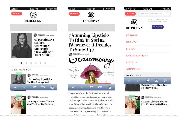
As we saw traffic begin to pick up in Oct/Nov 13 as our desktop redesign efforts were winding down, the decision was made to create a new, modern mobile experience. To do this, we focused on three main values:
- engage the users in a delightful frictionless experience
- allow the company to offer its advertisers to explore new engagement alternatives
- build upon a flexible technology that allowed for faster and more efficient iteration.
Team:
Product Manager: Jon Dobrowolski
Tech Lead: Benjamin Wilson
UX Director: Eben Levy
UX / UI Designer: Juan Sanchez
Discovery
Prior to gathering requirements, a stakeholder analysis was done. As stakeholders were being identified, we pulled together a communication plan and managed expectations and ownership on the project.
Requirements came from everywhere in the company and we made sure to hear out each part of the business’ goals. We did this by touring around the company trying to understand each team’s needs by whiteboarding initial ideas and folding in team initiatives. At the same time, we conducted an initial competitive analysis. We studied a number of other media companies and looked at the sites and apps that our users were engaging with the most. Combined analysis lead us to what we consider best practices as well as areas for improvement within the usability landscape.
We quickly realized the importance of the feed as a new paradigm and the idea of cards as the units that could hold our content. Working with the Product Manager and Tech Lead we started to sketch the product out. We concentrated on content first and began to structure a common behavior pattern given different types of content.

We identified that frictionless social behaviors were critical, a key business objective was to promote our authors as brands. We focused a lot on how to portray the content as something that a friend would publish on one of their favorite channels.
We then paired back to find the smallest scope possible while fulfilling the promise to our readers.
Sketching
As we started to wireframe initial ideas, we explored a flow in which index pages with small sized container cards drove the user to content on new pages or even to different feeds. The main problem with this design direction was that the experience had to accommodate for big ad units. Small cards work well with 300x50 units so often seen in mobile, but we had seen these units as underperforming for a while now. Critically, we had just learned from redesigning our newsletter for mobile that 300x250 ads had a the capacity to perform at a viable level. We started aligning on a bigger card, one that could more than hold it’s own next to a 300x250 ad unit.
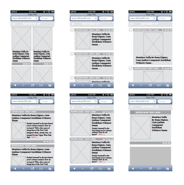
High Fidelity
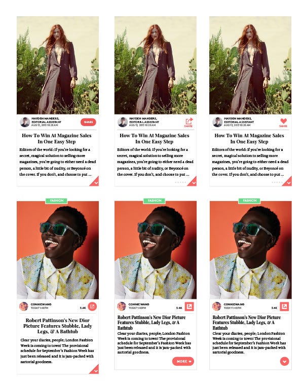
Once a direction was set, we started to create high fidelity wireframes, so we could better understand how our various card designs worked with our content. Our users are overwhelmingly image driven and the custom photo and illustration that Refinery29 does is a key differentiator brand. We know that users click into our content based on the opener image and the title so we focused on highlighting both with the same pride of place.

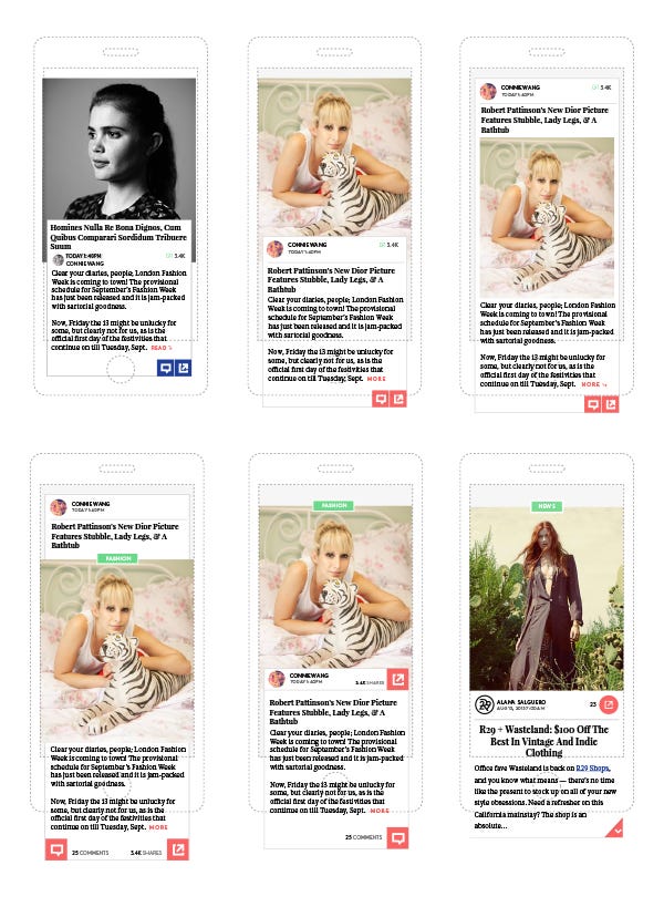
While playing with real content we realized that we were trying to fit a lot into a single view. It felt too much like a straight news experience and not a vehicle for discovery. It wasn’t bold enough to appeal to our users or to display our content. Most important, we saw a problem with our slideshow experience, our biggest performing template. We wanted to remove as much friction as possible to allow users to enjoy the slides, but the idea of an index page was troublesome and required that users went from one pace to the other. We started to explore the idea of a card that contained everything the user needed to see without taking them anywhere else. We knew that our users overwhelmingly consume our content in short bursts. We wanted to keep them engaged for as long as possible. We started to experiment with expanding our cards inline, thereby moving away with the Index page paradigm, and embracing the notion of a true feed.

The Feed
After diagramming how users would flow through a feed we wireframed three basic types of content: Regular (Photo/Text) articles, Slideshows and video articles. We used these wires to start conversations with our stakeholders, and get something in front of our Engineering team so they could start to asses the viability and complexity of a possible build.

Once we had buy-in from our internal teams, we dug deeper into our explorations. The new designs leveraged our style guide. We also relied on best practices and made some adjustments to emphasize the actions we expected from the users. We landed on a card IA that was lead by the category, then the image, social sharing tools and finally the title and preview text. There were differing opinions on the importance of the sharing tools but we felt confident that this proposed structure would prove our hypothesis: that the feed would allow users to see more content and would better serve advertising when compared to the current experience.
Prototyping / Testing
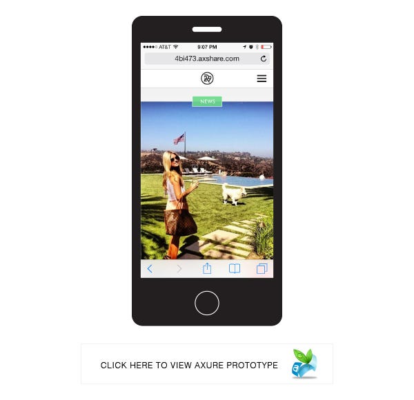
We planned our first user test. We built a complete prototype in Axure. We had a two day session with 24 users made up of current R29 users and people who were new to the brand. We used the sessions to help direct our future iterations and critically to help prove the hypothesis that users were more engaged with this new feed experience. We witnessed deep engagement - to the point where one user failed to hear questions because she was so involved with the site. We also found that some of our proposed icons and information architecture were not working and were confusing users. All told issues involved the sharing functionality, the category and title positioning and the way users expected to engage with the content from the title.
We adjusted the designs with some reinvention and some iteration. We were discovering and iterating the visual language that would guide our users. We wanted to make sure users understood how to share our content and how to expand and engage with cards in the feed. We did a couple of more user test/iteration exercises. Through the process we arrived at a shorter card and a feed that, we felt confident, could perform well for our metrics.
With the hypothesis supported by the qualitative research we got out of our user testing, the engineering team went to work. We decided to immerse the UXer into a tight team with the Developers and Product Manager. This allowed us to be more agile, shorten the feedback loop and make better decisions.
The team challenged each other continuously. UX pushed for a better experience, Engineering pushed back because of technical constraints. We iterated and never settled. This process bore out a shippable product within 3 months.
We launched to 1% of our users so that we could watch the new experience perform against the ‘m.’ site. Seeing success and making some tweaks, we rolled out to 100% of our user base on April 2, 2014.
The process used to launch our mobile feed is now being replicated through the growing R29 product and Engineering team. We didn’t just launch a better product, we launched a better product process.