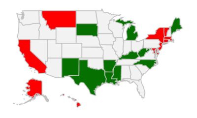
A map of American state stereotypes, generated by Google autocomplete.
In the months before a US Presidential election, the quality of political discourse hits new lows. Blue State/Red State tropes dominate the news cycle as the media gins up outrage over perceived injustices in the culture wars. It’s all about our differences. So I started wondering, how do Americans really think about “those people” in other states? What are the most common stereotypes? For each of the fifty states and DC, I asked Google: “Why is [State] so ” and let it autocomplete. It seemed like an ideal question to get at popular assumptions, since “Why is [State] so X?” presupposes that X is true.
The map above displays the results - just hover over the states. Most of the terms are about what we’ll call “culture,” or about the weather. Politics and economics also figure prominently.
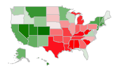
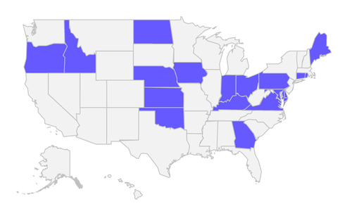
A fair number of queries were factual inquiries: “Why is Iowa so important in the presidential election?” “Why is Delaware so business friendly?” Terms dealing with cost of living (“expensive”,“cheap”, etc.) showed up in a number of states. Weight was also a common query; people wonder why Alabama and Oklahoma are so obese, while Colorado and Vermont apparently have a reputation for being healthy. I compared some of those search terms to actual data in the images below.
| Cheap (green) vs Expensive | Cost of Living |
|---|---|
 |  |
| Healthy (green) vs Overweight | Obesity Ranking |
 |  |
The qualitative searches were most interesting to me. There are 12 unique terms that are classifiable as “culture/sentiment” queries, of which ten are negative: backwards, bad, boring, crazy, dangerous, hated, racist, stupid, trashy, weird. There were a few redeeming positive results; Colorado, Minnesota, Texas, and Vermont are “awesome,” and Montana, New Hampshire, and New York are “great." But for the most part, it doesn’t seem like we think very nice things about each other…at the very least, we’re more inclined to search for articles supporting (or related to) negative biases.
Boring.
The single most common result of all was "boring,” which appeared for 18 states with no particular regional concentration. Other popular terms (returned for >10 states) were “humid”, “windy”, “expensive”, and “liberal”. Strangely, Connecticut and Pennsylvania both returned “haunted”; apparently there are a lot of ghost sightings (and related walking tours). My favorite result of all was “enchanting”: New Mexico is beautiful.
State pride!
Only a few states returned suggested results for demonym queries. People search specificially for New Yorkers (so rude! so arrogant!), Californians (so weird), and Texans (so proud), but no one asks about Iowans or Kansans. I thought this was interesting; the states that returned results for demonyms are the ones that seem to be most outspoken about state pride, but that could be my own New York bias showing. In the handful of states that do return demonym results, “rude” and “stupid” are the most common queries. Obesity concerns appear a number of times as well (and were rolled into the obesity map above). “Orange” appears exactly once - I’ll let you guess which state.
Anyway, I thought the results were interesting…so there they are.
If you liked this post and want to see some other data viz about Americans and Autocomplete, here’s a new post and interactive chart I just did on what swing state voters are searching for.
Rigorous methodology: The data set is Google auto-complete results for “Why is [insert state] so ”. I took up to four results per state - one or two states didn’t even have four results - then grouped the results by term. I categorized the terms into buckets: economic, geographic, health, history, political, population, sports, weather, and “culture/sentiment”. The latter was a bit of a catch-all for ‘judgey terms’, ranging from “awesome” to “boring” to “racist.” Sometimes the classification wasn’t immediately obvious; for example, “Why is Alabama so good?” is pretty vague, so I followed the query through to the results, and determined it was most likely sports-related. (“Why is New Jersey so bad?”, however, was not about sports.) Your search results may vary (due to past search history, region, autocomplete results changing due to news events, and other factors). I did run these in both Incognito mode and regular mode, and the vast majority of results were identical. If you’d like the raw data, contact me.
Thank you to my husband, Justin, for all of the help w/the Charts API.


