Instapaper Pro 2.2.3 now available
Changes:
iPad, iPhone, and iPod touch:
- Added left/right pagination tap zones
- Fonts now scale after rotation
- Improved pagination scroll indicator’s accuracy
iPad:
- Redesigned reading screen with controls moved to the top
- Added Hoefler Text, Baskerville, Palatino fonts
- Added brightness control
- Added dark-mode toggle in font popover
- Increased size of inline images
- Fixed landscape orientation bugs after moving items to folders
- Fixed login, “No internet connection” issues
iPhone, iPod touch:
- Restored OS 3.0 compatibility
- Fixed “Clear pending posts” text alignment
Some rationale for the major changes, since I got a lot of positive feedback when I last discussed the design process:
The iPad reading interface
…has been completely redesigned:

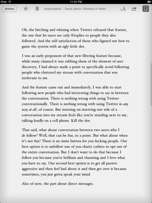
All controls are now at the top. I’m following Apple’s lead again: I’m not completely satisfied with control placement yet, but this is how most other iPad apps do it, and I think it’s at least better than having them at the bottom.
The Star and Archive buttons are on the left for a few reasons:
- Archive needed its own button because it’s conceptually strange to select the “delete” action from the Actions/Send-To menu (the swoop-arrow icon). There’s not enough room on the iPhone toolbar, but on the iPad, I found a spot.
- I really wanted to fit the article title in the middle, and it looks ridiculous if it’s not centered. With too many controls on the right, there wasn’t enough room for a centered title label.
- It made sense to put Star and Archive on the left, next to the Back button, because those are the actions you’re most likely to take after reading an article when you’re ready to go back.
The scroll indicator on the right side is now much thicker and more noticeable, and it has also been made much more accurate, although there’s still room for improvement.
The huge margins
The iPad screen is actually too large for comfortable text reading spanning the entire width unless you move to multiple columns, which is a technical challenge that I’m not ready to tackle yet (especially since I don’t particularly like multi-column reading).
In 2.2.3, the minimum and default margins are both much thicker, and I’ve added a slight gradient around the edges (thanks to the Kindle app designers who came up with that) to help frame the content area and draw your eyes in.
Brightness adjustments
This was an easy decision to include: the iPad is far too bright to comfortably read text with a white background in a dark room, even at its lowest brightness setting.
I wish I could do it the way iBooks does, with actual hardware backlight-level control, but that’s not available to app developers. So mine’s done by putting a giant translucent overlay on the main reading and list areas. It’s a hack, but it’s the best that app developers can do for now. (Amazon’s Kindle app does the same thing.)

The darkest and brightest settings in Light mode.
I can’t dim the popovers easily (or well), so for now, they remain un-adjusted. (Sorry about that.)
I find that I now rarely use Dark mode, preferring instead to keep it in Light mode at very low brightness when reading in bed.
Pagination tap zones
After more usage, I’ve changed my mind about these (previous zones) and decided that left/right zones made sense in addition to top/bottom zones.
The new zone arrangement is a hybrid of both. (I’ll do a lot to avoid making yet another preference in the Settings panel.)
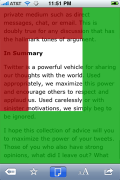
The goals on the iPhone were to provide as much tappable area as possible, and accommodate casual thumb taps on the mid-right section when holding it in your left hand. Furthermore, the larger the pagination area, the easier it is to tap while avoiding linked items in the page.

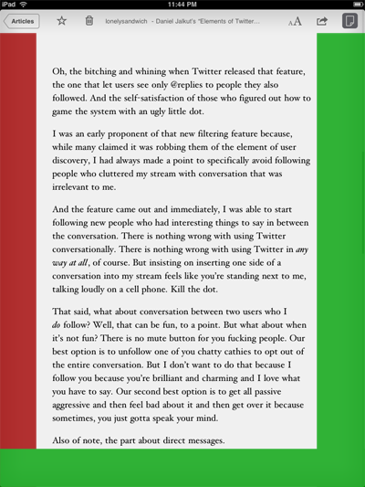
Red is previous page, green is next page.
On the iPad, the usage is very different: it’s usually held two-handed by its sides, and the margins are so thick that there’s no need to avoid hitting linked elements (because there aren’t any in the margins).

Additionally, the top zone didn’t make sense the way most people hold the iPad, and would be too likely to cause conflicts with the controls, so it was removed.
The way I most often hold the iPad, I tap the middle of the left margin for “previous page”, and the bottom-right corner area for “next page”.
Fonts, Dark mode in articles
The font panel has been significantly expanded:

In addition to the aforementioned brightness control, there are now three new fonts (Hoefler Text, Baskerville, and Palatino), and you can now toggle Light/Dark mode without leaving the article or opening the Settings panel. In a future version, I’ll probably remove the Dark-mode toggle from the Settings panel, as it’s now redundant.
While the in-article Dark-mode toggle isn’t on the iPhone version yet, I’ve laid the groundwork for it with this, so I’ll try to fit it into a future update. Unfortunately, I can’t add the new fonts to the iPhone, as they’re only available on the iPad. And I don’t think the brightness control is necessary on the iPhone since it does much better job of regulating its own brightness.
The future
One major addition coming soon is recognition of swipe gestures for page-turning. On the iPad, this is essential, because it’s how all other page-turning apps behave.
I have a lot of ideas for interface designs and improvements that didn’t make it into this release, plus the usual amount of feature ideas that are slowly getting implemented.
Stay tuned.


