Update 2012-01-08: Spotify has since this blog post changed one of the icons on their tab bar. You can find a post about this here.
The iPhone Tab Bar
Lessons From Reality
Over the last couple of years, the iPhone has greatly popularized the tab bar navigational model for mobile handsets. Apple has put together a design rationale for the tab bar in their Human Interface Guidelines (HIG) along with lots and lots of other information — they do however leave some question unanswered. Having worked with interaction and graphical design for iPhone applications during the last couple of years I’ve managed to pick up some lessons the hard way, and in this post I would like to share my thoughts on a couple of do’s and don’ts.
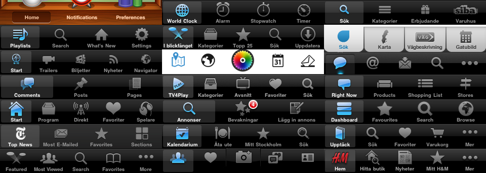
Lesson 1: The magic number is five
This hardly is news to anyone with a bit of insight into iPhone design. Since the screen width of an iPhone is 320 dots (1 dots = 1 or 2 pixels), Apple designed the standard tab bar to contain no more then five tabs to be able to maintain visible iconography and readable copy.
What happens after five? Well, there is of course a way to work around this by resorting to the “More” functionality built into the standard tab bar. But, I would suggest avoiding the “More” tab as far as you can. Why? Well…
- First of all, you constantly lose an extra tab
- You put the burden on the users to remember what is hidden beneath the “More” tab. This becomes especially troublesome if the number of items in the “More” view exceeds 5, since the cognitive load can become to overwhelming for a user to handle (more on cognitive load)
- Testing has revealed that most users don’t know about or the meaning of the “More” feature, and simply doesn’t bother using it (Source: Tapworthy — Designing Great iPhone Apps by Josh Clark)
However, when you are working with perspectives, data sorting and categorization (e.g. like in the iPod), the “More” tab makes more sense then it otherwise should as long as you let the user edit the preferred tabs. Just remember that editing the preferred tabs is the behavior of a somewhat advanced user.
Lesson 2: Ask the users
This should hopefully be covered much earlier in your design process, but the categorization and classification of the activities that the tabs represent should cohere to at least the overall perception of your targeted audience. While doing this kind of research and testing, keep in mind “Lesson 1” and explore if the activities could be categorized into five segments. If not? Ask yourself if you really should use the tab bar as the navigational model.
Lesson 3: Put a lot of time on icons and copy
A couple of points to keep in mind regarding the iconography and copywriting:
- Make sure that the iconography and copy actually depicts the underlying activities of the tabs. Nothing is more frustrating than remembering that an application contains a certain functionality, but not being able to determine under what tab you will find it.
- Avoid creating distracting stimulus through semantic interference, e.g. by having a paintbrush icon with the copy “Reports” underneath it. This is also known as picture-word interference
- If you are creating yet another “Favorites” tab, don’t try to reinvent the star icon or the word “Favorites”. Since recognition is less expensive than recall, you should help your users minimize their cognitive load (Jacob Nielsens Ten Usability Heuristics).
- Avoid recurring words in your copy. For example, imagine that you create a tab bar containing three tabs where the labels read “My Books”, “My Magazines” and “My CDs”. According to the Stroop Effect the meaning of the words is extracted even when participants try not to processes them (i.e. it will be almost impossible for your users to help themselves from reading “My” on every single tab).
- Visually and metaphorically distinguish the iconography so that users immediately knows which tab to tap, instead of having to waste precious time over thinking “Do I find settings beneath the wrench or the cog wheel?”.
- If you have a hard time creating an icon depicting the underlying functionality of a tab, try looking at the content layout of the view it represents for inspiration to create visual cues for your users.
Again, this is a matter of both heuristics and field-testing. Ask the users to get to know their way of reasoning! “What do you think this face icon represent?” “What do you expect to find beneath a tab called ‘Finder’?” “Does it make sense to you that the icon is a face, and the copy is ‘Finder’?”
Lesson 4: Avoid changing tabs automatically
This is a big re-occurring discussion in many of the app projects I have been involved in. In my opinion, you should never change tab from a non-tab-bar navigational action! I know that you might find yourself in a situation where this seems to be the only way to solve some weird information architectural corner case, but try your best to avoid it! Why?
- You are breaking the users sense of control by doing something that to them is unexpected. When a user taps on a table view item they are in 9 out of 10 cases expecting the outcome to be: a) a right to left view transition or b) a bottom to top modal view transition.
- You break the natural back tracing that users are most accustomed to on an iPhone. If they have not noticed the subtle change of tab in the tab bar, you will have a situation of momentary confusion once they start looking for the back button in the navigation bar.
Lesson 5: Don’t make tabs exclusive
Don’t make tabs restricted to a certain type of users (e.g. registered members) if you don’t provide an easy way for the users to get access to it. You will probably create a lot of unnecessary frustration since every first time use of the app will produce x number of frustrating taps (where x represents the number of tabs you chose restrict). This is likely not in line with the overall experience you are trying to design for.
Lesson 6: Customize, but beware
After a couple of iPhone projects where the information architecture has nailed the tab bar as the most fitting navigational model again and again, designers tend to get bored. Speaking as a designer myself: when designers get bored, shit will happen. One way of fixing this urge for change is sometimes to walk down the path of customizing the tab bar.
Now, I’m all for customizing, because it creates personality, memorability, and boosted brand experience. But, along with something that sounds this incredible comes of course a couple of important things to keep in mind.
- It takes time, and sometimes it takes a lot of time. From a developers perspective, customizing the tab bar (the one thing that manages the whole navigational stack of your application) means completely re-writing code that otherwise comes for free.
- There is actually a really good reason why Apple picked the hues for the background of the tab bar and the tool bar; it distinctly separates the visual appearance between levels of navigation. Keep this in mind while creating your own color schemas.
- Sometimes developers and designers forget the fact that if you tap an active tab in a tab bar, you should automatically be taken to the top of the navigation stack or that when you have an ongoing phone call you have to accommodate for the double height status bar. Don’t forget to implement all the functionality that is expected from a standard tab bar.
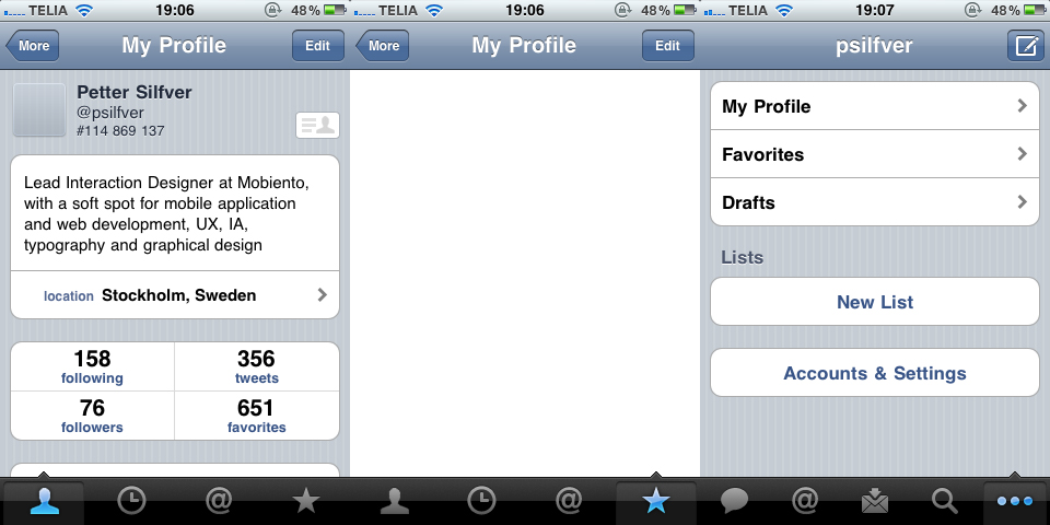
- Some applications uses the custom design pattern with a multiple-layered tab bar (e.g. Twitter for iPhone). If you are considering this approach, be humble enough to realize that you are going to confuse a lot of your users.
Summary
The tab bar is the one thing that is constantly going to be the face of your application to guide the users as they navigate your application. Don’t underestimate the time you need to put into creating a flawless tab bar experience. These lessons are in no way rules, but hopefully an eye opener!
If you have any kind of feedback or input for improvements, just hit me back with an e-mail or via Twitter.