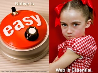
Bootstrap cheat-sheet-websitesetup.org Ali Bakhtiari
50 slides•270 views
The document provides information about Bootstrap, a popular front-end web development framework. It includes definitions of key Bootstrap components like alerts, badges, breadcrumbs, buttons, and cards. It also covers Bootstrap screen sizes, styling essentials, and how to incorporate various Bootstrap classes to customize elements. The cheat sheet is intended to be a concise reference for those looking to learn and implement Bootstrap in their projects.
Building a Great AEM Team: Time Warner Cable's JourneyiCiDIGITAL
23 slides•1.2K views
Learn about the Time Warner Cable journey to building one of the top Adobe Experience Manager teams in the country. See their process to greatness and how you can start building your Adobe Experience Manager team today.
Creating a backlog of user stories is pretty straight forward but it doesn't help you when it comes to decisions like what to build first, how to prioritize and groom the backlog, how to scope and plan the project, and how to visualize progress. The traditional backlog is simply too flat and often too long to help you see the bigger picture and make good decisions. User Story Mapping helps simplify all of these common project issues. By adding a third dimension to your backlog, your team will make better decisions about priorities, scope, and planning while improving your ability to visualize progress.
In this practical session I’ll cover the basics of user story mapping before walking you through case studies of how our teams are using this approach and the results we are achieving. I'll show you the before, during, and after pictures from several projects so that you can understand how our maps progress during the projects and how we use them to influence iterative development, promote good decision making, and visualize priorities, plans, scope and progress.
This document discusses sandboxed solutions in SharePoint and best practices for their use. Sandboxed solutions allow for more secure and stable development within a site collection scope, without requiring full farm access. They enable easier deployment and more iterative development compared to farm solutions. The document provides recommendations such as starting with sandboxed solutions, understanding limitations, spike testing functionality, planning for upgrades, involving IT, and considering the Microsoft App Store for distribution.
An in-depth look at the tools and process design teams use for asset creation, prototype creation, design asset storage, prototype sharing, and challenges in the process.
The document describes different design orientations that software developers can have: simple, powerful, abstract, pragmatic, robust, concrete, idealistic, and technological. It tells a story of two developers, Bob and Sally, who struggle with their different orientations of powerful and simple, respectively, in designing a software project. Their project fails due to a lack of robustness. Two other developers, Jack and Sam, who have abstract and pragmatic orientations, are able to help stabilize the project by refactoring the architecture and focusing on quick implementation. The document concludes by explaining each of the design orientations and how understanding them can help teams work together more effectively.
In my talk at socrates 2011, I descrived why performance is a craft and what to do to ensure great performance. I concluded with a few best practies and wonder if there are more
Open Source: Working in a Glass Walled FactoryStephen James
43 slides•351 views
The document discusses best practices for managing an internally-sponsored open source project, including establishing business goals, facilitating maintenance responsibilities, following semantic versioning, writing tests and integrating with continuous integration tools, monitoring project health, communicating with the community, and planning for eventual sunset of the project. It emphasizes creating a culture of learning and experimentation, being open and humble, and making the "right" way also the easy way through project structure and documentation.
SharePoint App Store - itunes for you businessAndrew Woodward
33 slides•806 views
The SharePoint App Store and how business should consider how the impact of this within their organisation.
This is a non technical presentation and will also be available as a web cast from the SPSEMEA Online Event in Jan 2011
Everything You Know is Not Quite Right Anymore: Rethinking Best Practices to ...Dave Olsen
73 slides•12.9K views
We’re entering a new era where an increasing number of devices with wildly divergent features -- including phones, tablets, game consoles, and TVs -- are connected to the Internet. As the way people access the Internet changes, there is an urgent need to rethink how we use the web to communicate. This doesn't mean creating separate solutions for each device but rather preparing our existing content to meet this increasingly unpredictable future. Dave Olsen and Doug Gapinski will share and examine examples that show how responsive design will help institutions rethink and adjust for the future-friendly web.
Primary topics that are covered are: understanding the reality of web development today, example RWD design patterns, and understanding how to test and optimize the performance of your RWD website.
Mobile First Responsive Web Design — BD Conf Oct 2013Jason Grigsby
173 slides•54.4K views
The document discusses responsive web design and mobile-first approaches. It advocates building responsive designs with a mobile-first mindset, where the mobile version is prioritized and expanded upon for larger screens rather than the desktop version being scaled down. It also emphasizes performance techniques like keeping images out of breakpoints to avoid unnecessary downloads, and using media queries to scope images to only the viewports that need them. The overall message is that responsive design should consider both layout and performance to provide the best experience across devices.
This document discusses user story mapping, an agile technique to help teams visualize and organize user stories from the user's perspective. It begins by introducing the presenter and their experience. It then discusses challenges with traditional product backlogs and how story mapping addresses these. The core of story mapping is described, including collaboratively mapping user activities and stories in a visual workflow to identify gaps and logical releases. Benefits are that it fosters shared understanding from the user viewpoint and helps ensure an end-to-end system view. Instructions are provided on how to frame ideas and conduct an actual story mapping session to plan a product.
Supercharge your application with the best UX practicesGercek Karakus
105 slides•4.4K views
I've given this talk as a guest lecturer at Bogazici University Software Design Process graduate class (SWE530) in Spring 2015.
This talk introduces key concepts of user experience design to software engineering graduate students and outlines the process of integrating design and engineering. Starting from ideation, it goes through all the steps including but not limited to user research, sketching, prototyping, user testing, design validation and iteration.
Hand on best practices are also shared as case studies part of this presenation.
Kanban in your daily work - Sebastian SussmannDevDay Da Nang
68 slides•1.4K views
What is Kanban and what does the belt production has to do with software development?
How can we improve our daily work (personally and in my team) and get things done?
How can we reduce pressure and increase the productivity and quality?
Conversionista : Conversion manager course - Stockholm 20 march 2013Craig Sullivan
159 slides•7.5K views
The agenda covers various topics related to conversion optimization and user experience including recommended tools, project styles, analytics tips, best practices, and opportunities for site reviews. Key learning points from 6 years of optimization experience will also be discussed. The session will be led by an experienced director of optimization with past experience at several large companies.
The document provides an overview of user story mapping, which is a technique used to help product teams understand user needs and plan product development. It discusses the limitations of a traditional flat user story backlog and how user story mapping addresses these by visualizing the overall user journey and relationships between stories. The key steps of user story mapping involve framing the product, mapping the big picture of user tasks and activities, exploring stories in more detail, and slicing the map into prioritized product releases.
The document summarizes key techniques for responsible responsive web design, including building mobile-first responsive designs, keeping CSS images in their place, conditionally loading JavaScript based on screen size and capabilities, delivering different sized images at different screen sizes, and handling high-density images carefully. It also discusses debates around whether a one-size-fits-all responsive approach can compete with a tailored experience and ensuring responsive designs are optimized for performance.
This document discusses mobile device usage and online conversion rates. It provides statistics showing that the majority of users now spend several hours per day on their smartphones. Conversion rates are significantly lower for mobile visitors compared to desktop. Common mobile conversion roadblocks include websites not being mobile-friendly and slow loading times, with 53% of users abandoning a page if it takes over 3 seconds to load. The document recommends ways to improve mobile performance, such as optimizing images, prioritizing content loading, and reducing server requests.
Usability for everyone : Google I/O Extended 2018Jagriti Pande
57 slides•133 views
In this talk, I tell the audience how Usability can help create a more inclusive world while helping businesses grow. I also shared ways in which companies can make usability a part of their product development culture
This document provides information about adding usability testing to your skill set. It discusses why usability testing is important, what rapid usability testing entails, different testing methods, and the preparation and process for conducting an unmoderated usability study. Key steps include defining goals, preparing materials like tasks and recruitment, setting up the test environment, observing and analyzing participant videos, and reporting findings to stakeholders. Conducting even a small number of tests can uncover major usability issues.
Do you want to be a Cloud Architect ? Are you stuck in a Sysadmin / DBA job ,and want to transition into the Cloud? Are you interested , but do not know how/where to start ? Then, you are in the right place . This is Part 1 of a 3-Part series , where I share the secret sauce how best to get started on the journey to become a Cloud Architect , and enhance your career.
Effective specifications for agile teamsgojkoadzic
35 slides•1.2K views
The document discusses effective specification for agile teams. It provides various links to resources about requirements, testing, and agile practices. The document also includes a section about earning continuing education credits for attending a webinar hosted by Neuri Ltd.
Este documento describe los números hemimperfectos, los cuales son números que pueden expresarse como la suma de la mitad de sus divisores propios. Explica que un número es hemimperfecto si se puede dividir repetidamente entre dos hasta llegar a un número primo impar, y luego restar dos a ese número primo y sumarlo con los otros divisores encontrados. Proporciona ejemplos de números hemimperfectos como 544 y sus divisores correspondientes. También señala algunas características distintivas pero no exclusivas de los números hemimperfectos,
The document is a product catalogue for Carlo Sessa S.p.A., an Italian company that has been operating since 1909. It provides an overview of the company's profile and three main product lines: active pharmaceutical ingredients, medicinal and aromatic plants, and bee products. The catalogue then lists over 200 herbal ingredients and plants traded by the company under these categories, organized alphabetically by scientific name. It aims to inform customers of Carlo Sessa's extensive product offering and areas of expertise in the natural products industry.
"OSS in Public Administrations - A short Report from the European Level" by B...eLiberatica
31 slides•624 views
The document summarizes a presentation on open source software (OSS) activities in European public administrations. It discusses the OSS strategies of different departments of the European Commission, including IDABC, DIGIT, and DG Information Society and Media. It also outlines initiatives like the Open Source Observatory and Repository (OSOR) to promote collaboration and professionalism around OSS use.
Dariusz Łukawski - ekspert szkoleń medialnych Jerzy Ciszewski
8 slides•343 views
Profesjonalny kontakt z mediami elektronicznymi
Indywidualny trening medialny
Szkolenia dla rzeczników prasowych
Zasady konstrukcji materiałów filmowych do wewnętrznych portali internetowych
Profesjonalny kontakt z mediami elektronicznymi
Indywidualny trening medialny
Szkolenia dla rzeczników prasowych
Zasady konstrukcji materiałów filmowych do wewnętrznych portali internetowych
Profesjonalny kontakt z mediami elektronicznymi
Indywidualny trening medialny
Szkolenia dla rzeczników prasowych
Medialne konsultacje specjalistyczne
Zasady konstrukcji materiałów filmowych do wewnętrznych portali internetowych
Este blog enseña cómo elaborar cenefas decorativas paso a paso utilizando materiales como radiografía, bisturí y pintura. Explica cómo cortar moldes de modelos de cenefas continuas o deparadas y pegarlos y pintarlos en las paredes para mejorar la decoración del hogar.
Sobre Hombros de Gigantes: Desarrollo de tecnología y la historia secreto de...Rabble .
113 slides•1.2K views
Este documento resume la historia secreta del desarrollo de Twitter. Comenzó como experimentos con SMS y podcasting en Odeo.com, pero el sitio no tuvo éxito. Evan Williams y sus colegas crearon Twitter como un experimento basado en SMS durante un hackathon. Aunque tuvo pocos usuarios al principio, se hizo popular rápidamente gracias a su simplicidad y abierta API. Esto permitió que otros desarrollaran aplicaciones, lo que impulsó su crecimiento. El documento también promueve ideales de tecnología abierta y
Comités Nacionales de Agricultura Familiar: Experiencia de UNAG y la importan...FAO
14 slides•808 views
Presentación realizada por el Sr. Álvaro Fiallos, en el marco la XIII CODEGALAC Mesoamérica realizada los días 26 y 27 de Noviembre de 2015 en Santo Domingo, República Dominicana.
This document discusses key principles of effective marketing and communication. It emphasizes the importance of understanding customer needs, emotions, and facilitating dialogue. Specifically, it recommends identifying the right customer needs through experience and innovation. It stresses feeling the emotions of your target audience by seeing how your brand is perceived and adapting accordingly. Finally, it emphasizes that all businesses are in the customer service business and effective communication is two-way dialogue. The document provides perspectives from marketing experts to support focusing on authenticity, empathy, brand promise, and understanding one's impact.
Awesome Social Customer Service - Social Media Night - Nürnberg Web Week 2014J. R.
77 slides•2.3K views
Vortrag zum Thema "Ausgezeichneter Kundenservice ist der USP der Zukunft" auf der Social Media Night der Nürnberg Web Week 2014.
Wie können Unternehmen Social Media sinnvoll einsetzen?
Social media als reines Marketing Instrument zu verwenden, führt den Kern von Social Media ad absurdum.
Großartiger Kundenservice ist der USP der Zukunft.
Kundenservice Anfragen über Social Media steigen rapide an.
Unternehmen können diese Chance nutzen und sich positiv vom Wettbewerb abheben.
El documento presenta un proyecto de restaurante saludable llamado Il Piacere. Su misión es satisfacer las necesidades de los clientes velando por su salud y buena alimentación. El restaurante ofrecerá asesoría sobre hábitos alimenticios saludables. El proyecto busca formar un restaurante reconocido que influya en la conciencia sobre una buena alimentación e innove en la presentación de alimentos. También se analizan trastornos alimenticios comunes y se proponen alimentos permitidos y beneficios
Responsive webdesign presentatie - Nederlandse Plone gebruikersdag 2012Kim Chee Leong
11 slides•1.1K views
This document discusses responsive web design, which involves making websites render well on a variety of devices and screen sizes. It recommends using a flexible grid layout with fluid fonts and margins, CSS3 media queries, and responsive add-ons for older browsers. It provides links to resources on responsive web design techniques and testing tools to help designers get started with this approach.
Victoria Treyger - Ring Central - Mobility for Growing BusinessesRamon Ray
33 slides•2.2K views
Victoria Treyger from RingCentral gave a presentation on how small and medium sized businesses can leverage mobile technology. She outlined that mobile devices are now mainstream, with over 5 billion subscribers and app downloads. She then discussed how businesses are increasingly using mobile phones and tablets. Some key points included:
1) Tablets and smartphones can increase productivity for businesses and some report tablets replacing paper. Popular business apps include documents and PDF management apps.
2) Mobile apps can save SMBs time and money. 70% use apps for their business and 40% say they couldn't survive without them.
3) The cloud and mobile devices give SMBs powerful capabilities typically only available to large enterprises, like accessing applications anywhere
El documento proporciona información sobre diferentes tipos de puertos y conectores utilizados en computadoras. Define términos como conector, interfaz y puerto. Luego describe varios puertos comunes como USB, VGA, serial, paralelo y audio, detallando sus usos y características. Finalmente, explica otros puertos como Firewire, DVI, HDMI y RJ11.
Para brindar servicios de fibra óptica, se instalan equipos GPON en la central de ANTEL y ONT en el cliente. La ONT modula y demodula la señal de fibra para proveer servicios de datos, video y telefonía a través de interfaces LAN, FXS y WiFi. Actualmente solo se ofrece servicio de internet de alta velocidad, pero se proyecta agregar otros servicios. La guía explica el procedimiento de instalación, configuración y puesta en servicio de la ONT.
El documento describe las responsabilidades y cualidades de un profesional en el desarrollo de recursos humanos. Debe conseguir que los empleados se identifiquen con los objetivos de la organización. También debe ser receptivo, honesto, justo, respetuoso y digno de confianza. Debe tener conocimientos, actitud emprendedora y capacidad de liderazgo para integrar y coordinar a los empleados.
Este documento describe el programa de inmersión lingüística en inglés para los estudiantes de educación infantil en el Colegio Salesianos Triana. El objetivo es acercar el idioma inglés a los estudiantes de forma lúdica y constructiva a través de distintas sesiones y actividades impartidas por el personal docente y especialistas. El método se basa en una educación bilingüe que introduce a los estudiantes en un aprendizaje del 100% tanto en español como en inglés.
Walmart proves the obvious, devknob wonders why people don't understand why page speed matters. This has been true and known to be true since the beginning of the internet. Do you think people won't get distracted easily and bounce when they're surfing on 2g, 3g and even 4g connections? Page speed matters, devknob is probably the best page speed optimizer in the world so if you need conversion optimization, you may want to visit devknob online at devknob.com
Responsive Design is the buzz in design, but as we all know, design is only part of the story. With the arrival of the HTML5, CSS3 and javascript triumvirate we can no make truly immersive mobile and desktop browser experiences. Coupled with modern PHP web application practices, your web app will feel and act closer to a native app, at a fraction of the cost. In this presentation, we'll dive into designing your modern web application to take advantage of as much of the platforms' limitations and advantages. Sure, you can't use the camera, but in many cases can use the accelerometer, and it'll always be granted to look right, any angle you look at it! These days, there's no excuse for not having a "mobile version" when all you need is one site that can transform itself to suit the device!
The challenges of building mobile HTML5 applications - FEEC Brazil 2012 - RecifeCaridy Patino
82 slides•1.1K views
Caridy Patiño presented on the challenges of building mobile HTML5 applications. Some key challenges include browser fragmentation across devices, network failures, and the need to optimize applications for different runtime environments and adapt them for varying screen sizes and features. Patiño advocated writing applications using a single language, JavaScript, and customizing output per runtime and context while adapting the UI per form factor and feature detection. The goal is to build flexible applications that can run on multiple platforms.
Recent advances in Web technologies across the IT environment, gets a big paradigm shift, and Web 2.0 has started changing with the advent of the Web service beyond just information technology as a platform of expression has led to the evolution. In particular, the HTML5 known as the next generation of mark-up languages, led to revolutionary changes of the environment and the new media era is expected to be the future core platform. This lecture will introduce the implications of Web technologies, history of HTML5 and its main features and the role of HTM5 as Smart Media.
Here are the top responsible & cross-platform compatible HTML5 frameworks 2016 that may help developers to develop responsive web applications in all possible categories.
This document provides an overview of IT and digital technologies including web development, mobile apps, software as a service (SaaS), and .NET. It discusses key topics such as:
- Web development terms like HTML, CSS, APIs, and content management systems.
- The differences between native mobile apps and web apps, and their respective advantages. Native apps have more features but web apps can work across devices.
- An explanation of Software as a Service (SaaS) and how software is delivered as an online service.
- An overview of the .NET framework for building web apps, desktop apps, mobile apps and games on Windows, Linux and Mac.
HTML5 allows developers to create mobile apps that can be accessed across platforms without needing separate development for each device type. It has advantages over native apps such as lower development and maintenance costs since only one codebase needs to be created and updated. HTML5 also allows for rich multimedia content and has the potential to access native device features through APIs. As HTML5 adoption increases, it will help reduce platform fragmentation issues and provide a way for content to be more easily shared and accessed across different devices.
10 Reasons to Adopt HTML5 for Mobile AppsDoug Robinson
19 slides•704 views
HTML5 offers several advantages over native mobile apps, including the ability to write code once and deploy it on any device, lower development and maintenance costs, and easier updating of apps without app store approval. HTML5 apps can also take advantage of rich media capabilities and may soon integrate with device hardware features through open standards and APIs. The multimedia and app capabilities of HTML5 are underrated despite examples that showcase interactive graphics and games.
The document discusses developing mobile web applications. It notes that the mobile market is growing rapidly and that web apps can target many devices without requiring installation. It recommends targeting iOS and Android platforms and considering other platforms like Windows Phone. It outlines technologies like HTML5, CSS3 and JavaScript that are well-supported on mobile. The document also provides resources and tools to help with mobile development and things to consider like lower screen resolution and bandwidth limitations for mobile users.
Best Practices in Mobile Development: Building Your First jQuery Mobile AppSt. Petersburg College
43 slides•3.2K views
By the end of 2012, it is expected that more than 80% of the world’s population will have access to a smartphone. Your library users will assume that your library can be accessible from anywhere, at any time, and on any device. Now is the time to be ready! During this hands-on webinar, you will:
- learn the differences between native and web apps.
- understand the various technologies (HTML, CSS, JavaScript) and how they work together to build mobile web apps.
- gain hands-on experience using jQuery Mobile to develop a fully functional mobile-optimized web app.
- have access to a free Web server so you can continue to work/test your project live on the Web.
- continue to work with Jason and Chad so you can have a mentor during and after your project.
Here Today, Here Tomorrow: Mobile Devices - Northwestern University Web Steer...Lee Roberson
50 slides•949 views
This document discusses mobile strategies and developments, including:
- Growth in mobile usage, with 40% of tweets sent via mobile and 16% of new users starting on mobile.
- Differences between native apps and mobile web, with native providing commerce, OS integration and speed advantages.
- Approaches to mobile web, including media queries to adapt existing sites or building separate mobile sites, with advantages in speed and implementation.
- Examples of mobile strategies at universities, including Northwestern's native and mobile web applications.
What Are Progressive Web Application DevelopmentApp Verticals
8 slides•24 views
Progressive web application development using the latest web technologies can provide both a website and app-like experience for users. Recent browser developments have enabled features like installing web apps to the home screen, push notifications, and offline functionality. Developing progressive web apps has advantages over traditional apps like using open web standards, larger ecosystems, and not requiring app store approval. As attention to apps grows, progressive web applications are a good solution developed using web application frameworks.
This study will give mobile app editors the insights they need to fathom the performance of HTML5 - quoted as the new standard of the web - and adjust their multi-platform strategy accordingly.
Web development is a broad term that includes various activities involved in developing websites and web applications. It involves web design, content development, scripting, security configuration, and e-commerce applications. Web design encompasses skills like graphic design, interface design, coding, search engine optimization and more. The history of web development began in 1989 with Tim Berners-Lee's proposal to create the World Wide Web. Many technologies were developed throughout the 90s and 2000s that shaped the modern web, including HTML, CSS, JavaScript, browsers, servers, smartphones and more.
Web development is evolving at a breakneck speed every passing year. New website technologies are being discovered regularly as developers explore new ways of innovation.
To make it easier for you, I have analyzed the shifts across industries and created an ultimate list of some of the latest web development trends in 2022.
Do you have a monolith? If so, is it majestic? Or is it broken and preventing you from scaling your application and your business?
Monoliths have earned a bad reputation in software architecture design circles for being difficult to maintain and operating on silos of knowledge. However, they aren't all bad. The key is knowing when to use a monolith, and when it is time re-factor and scale up by going small.
This document discusses responsive web design and frameworks like Bootstrap. It explains that responsive design allows sites to adapt to different devices like mobile versus desktop. It provides an overview of Bootstrap, including that it is an open source framework for building responsive sites using HTML, CSS and JavaScript. Popular frameworks like Bootstrap have pre-built components that save development time compared to building sites from scratch.
Web application development in 2023 is expected to focus on cutting-edge technologies like AI, AR/VR, blockchain, and cloud computing. The integration of these technologies will enable businesses to create more engaging and personalized web applications that offer a seamless user experience. In addition, the emphasis on security and accessibility will be even greater in 2023, driving the development of secure and accessible web applications that can be used by people with disabilities.
Trends are the natural changes in behaviours or proceedings. We like to be aware of those indicators for inspiration and guidance. At the beginning of every year we look at UX, UI trends and emerging technologies to get that guidance from.
Presented at Web Directions Code, Melbourne
If you have a website—particularly one that generates revenue for your organization—you need a Progressive Web App. So where do you begin? How do you decide which features of a Progressive Web App make sense for your users? What tools can make the process easier (or harder)? In this practical session, Jason will guide you through the key design decisions you’ll need to make about your Progressive Web App and how those decisions impact the scope of your project. He'll also teach you how to avoid common pitfalls and help you take full advantage of Progressive Web App technology.
The document discusses progressive web apps (PWAs) and outlines key considerations for creating a PWA. It addresses questions around what a PWA is, how to make a website feel like an app, offline functionality, push notifications, and creating a roadmap. Examples from companies that implemented PWAs successfully are provided. The conclusion recommends developing a progressive roadmap that starts with baseline PWA features and builds out functionality over time based on priorities and initiatives.
Why Progressive Web Apps will transform your websiteJason Grigsby
85 slides•687 views
Progressive web apps (PWAs) can transform websites by making them more like native apps through the use of service workers, web app manifests, and other modern web capabilities. Some key benefits of PWAs include providing fast and reliable experiences even on slow mobile networks, working regardless of a network connection, and engaging users through web app banners and push notifications. Early results show that PWAs can significantly reduce data usage and increase user engagement, conversion rates, and sales compared to mobile websites. While PWAs work across browsers, including on iOS, their full capabilities are still progressively being adopted.
Is the buzz around Progressive Web Apps real or are they simply the latest fad? In this talk, you’ll learn exactly what Progressive Web Apps are, what problems they solve, and what new design challenges they present. Jason will show how organizations are using Progressive Web Apps to provide better and faster user experiences.
Adapting to Input — Smashing Conference NYCJason Grigsby
171 slides•942 views
Input is constantly evolving and expanding beyond traditional keyboard and mouse. The document discusses 7 principles for adapting web design to different inputs:
1. Design for the largest target by default.
2. Design for modes of interaction instead of specific inputs.
3. Make designs accessible to all inputs.
4. Support multiple concurrent inputs.
5. Abstract baseline inputs like tap, click, and point.
6. Progressively enhance with new inputs like gestures and sensors.
7. Include different inputs in testing plans.
The key message is that input cannot be detected, is a continuum, and is always changing. Web design needs to be adaptable and not assume certain inputs based on device properties.
The document discusses responsive images and issues around their implementation. It begins by outlining the new <picture> element and srcset/sizes attributes that allow images to adapt based on screen size and resolution. It then discusses challenges like managing many images, the need for image breakpoints to determine appropriate file sizes, and the tension between responsive images and the browser's lookahead parser. Overall, the document examines both the promise and difficulties of responsive images on the modern web.
When responsive web design meets the real worldJason Grigsby
157 slides•4K views
The document discusses responsive web design and some of the challenges it faces. It recommends adopting a mobile first approach where the mobile styles are defined first before desktop styles, allowing for a progressive enhancement. It also emphasizes the importance of performance and ensuring responsive designs are not just focused on layout but also on optimizing for speed. Key techniques discussed include building mobile first, reordering media queries, keeping basic styles outside queries, and scoping images within media queries to avoid unnecessary downloads.
Adaptive Input — Breaking Development Conference, San DiegoJason Grigsby
170 slides•2.5K views
Windows 8. Chromebook Pixel. Ubuntu Phone. These devices shatter another consensual hallucination that we web developers have bought into: mobile = touch and desktop = keyboard and mouse.
We have tablets with keyboards; laptops that become tablets; laptops with touch screens; phones with physical keyboards; and even phones that become desktop computers. Not to mention new forms of input like cameras, voice control, and sensors.
We've learned how to respond to screen size. Our next challenge is learning how to adapt to different forms of input.
No matter how much we try to put ourselves into a mobile first mentality, it is hard for us to do so fully. Our access to PCs prevents us from experiencing mobile the way many in the world do.
We're currently fighting for parity among experiences. We're arguing that the mobile version shouldn't be a dumbed down version of the desktop site.
But we've set our sights too low. In a true Mobile First world, the mobile version should be the best experience. Mobile shouldn't just match the desktop experience, it should exceed it.
Presented at Mobilism.nl
Device diversity is about to get an order of magnitude worse. SmartTVs are hitting the market in mass this year. Sony, LG, Vizio, and Samsung are all shipping televisions with Google TV built in.
And if the rumors that Apple will release a TV this year are true, 2012 will turn out to be the year web developers start to tackle the glass screen hanging on our walls.
Why should web developers focused on mobile learn about the web on TVs? Because TVs represent the next challenge in device proliferation. They share common characteristics with their smaller brethren. They create new challenges and opportunities we haven't encountered yet. And most importantly, learning how to build for TVs helps inform our practices of building for mobile devices.
Mobile: The Market, The Web and Windows Phone’s Future Jason Grigsby
102 slides•1.9K views
1. Mobile internet usage is growing exponentially, surpassing traditional internet usage.
2. Smartphone apps represent a huge opportunity, but mobile web apps can also be very powerful if designed well for the mobile context.
3. There is no consensus on whether native apps or mobile web apps have an advantage, and the debate touches on issues like user experience, business models, and platform lock-in.
Where 2.0 -- Get me a mobile strategy or you’re fired!Jason Grigsby
77 slides•14.3K views
Mobile is a disruptive technology that requires companies to develop a mobile strategy or risk losing customers. Companies should understand the mobile context including what devices customers use and not assume everyone has downloaded their app. They should look beyond just native apps to also use mobile web, SMS and MMS to reach customers. Apps should be focused on serving the most loyal customers and adding real value through mobile capabilities. Developing products specifically for mobile, not just porting desktop products, is key to success.
The document discusses how mobile technology is transforming journalism and media. Some key points:
- Mobile devices are the most important communication technology since the printing press.
- Mobile is the 7th mass media, with over 4.6 billion mobile subscribers worldwide, more than half the planet.
- Mobile represents a disruptive technology that is changing how media companies operate and distribute news/content.
- Usage of mobile internet and apps like Opera Mini are growing dramatically, showing people increasingly consuming media on mobile.
Why You Should Make Mobile Your Career | Clark CollegeJason Grigsby
114 slides•1K views
A variation of my talk on mobile strategy given to Clark College to encourage students to pursue mobile and to encourage the college to adopt mobile curriculum.
Google Talk: DOs and DON'Ts of Mobile StrategyJason Grigsby
147 slides•10.9K views
Presented at Google on October 8, 2010 as part of the Google Talks series.
Updated from previous presentations to talk about legacy content management systems and more ways our iPhone lens skews our perception of the world.
Get Me a Mobile Strategy or You're FIRED!Jason Grigsby
133 slides•2.7K views
Pitching in to help cover for a speaker who was unable to make it to Design4Mobile so I've modified a version of my Mobile Strategy slides for the afternoon session.
Covers DOs and DONTs of Mobile Strategy for businesses.
Mobile Web vs. Native Apps | Design4MobileJason Grigsby
104 slides•1.7K views
This document provides an overview of a presentation on native mobile apps versus mobile web apps. It includes slides on why developers were fighting over the two approaches, Apple's announcement allowing third-party apps on the iPhone, and the surprise success of the iPhone App Store. It also discusses factors that contributed to the App Store's success like its openness, revenue split, and fewer restrictions compared to mobile carriers. The document debates questions around whether apps create platform lock-in, if app stores are essential to a platform's success, and challenges of developing for multiple mobile platforms. It suggests that HTML5 and WebKit may become the dominant mobile platform.
The Death of the Browser - Rachel-Lee Nabors, AgentQLAll Things Open
36 slides•85 views
Presented at All Things Open AI 2025
Presented by Rachel-Lee Nabors - AgentQL
Title: The Death of the Browser
Abstract: In ten years, Internet Browsers may be a nostalgic memory. As enterprises face mounting API costs and integration headaches, a new paradigm is emerging. The internet's evolution from an open highway into a maze of walled gardens and monetized APIs has created significant challenges for businesses—but it has also set the stage for accessing and organizing the world’s information.
This lightning talk traces our journey from the invention of the browser to the arms race of scraping for data and access to it to the dawn of AI agents, showing how the challenges of today opened the door to tomorrow. See how technologies refined by the web scraping community are combining with large language models to create practical alternatives to costly API integrations.
From the rise of platform monopolies to the emergence of AI agents, this timeline-based exploration will help you understand where we've been, where we are, and where we're heading. Join us for a glimpse of how AI agents are enabling a return to the era of free information with the web as the API.
Find more info about All Things Open:
On the web: https://www.allthingsopen.org/
Twitter: https://twitter.com/AllThingsOpen
LinkedIn: https://www.linkedin.com/company/all-things-open/
Instagram: https://www.instagram.com/allthingsopen/
Facebook: https://www.facebook.com/AllThingsOpen
Mastodon: https://mastodon.social/@allthingsopen
Threads: https://www.threads.net/@allthingsopen
Bluesky: https://bsky.app/profile/allthingsopen.bsky.social
2025 conference: https://2025.allthingsopen.org/
Leveraging Pre-Trained Transformer Models for Protein Function Prediction - T...All Things Open
23 slides•21 views
Presented at All Things Open AI 2025
Presented by Tia Pope - North Carolina A&T
Title: Leveraging Pre-Trained Transformer Models for Protein Function Prediction
Abstract: Transformer-based models, such as ProtGPT2 and ESM, are revolutionizing protein sequence analysis by enabling detailed embeddings and advanced function prediction. This talk provides a hands-on introduction to using pre-trained open-source transformer models for generating protein embeddings and leveraging them for classification tasks. Attendees will learn to tokenize sequences, extract embeddings, and implement machine-learning pipelines for protein function annotation based on Gene Ontology (GO) or Enzyme Commission (EC) numbers. This session will showcase how pre-trained transformers can democratize access to advanced protein analysis techniques while addressing scalability and explainability challenges. After the talk, the speaker will provide a notebook to test basic functionality, enabling participants to explore the concepts discussed.
Find more info about All Things Open:
On the web: https://www.allthingsopen.org/
Twitter: https://twitter.com/AllThingsOpen
LinkedIn: https://www.linkedin.com/company/all-things-open/
Instagram: https://www.instagram.com/allthingsopen/
Facebook: https://www.facebook.com/AllThingsOpen
Mastodon: https://mastodon.social/@allthingsopen
Threads: https://www.threads.net/@allthingsopen
Bluesky: https://bsky.app/profile/allthingsopen.bsky.social
2025 conference: https://2025.allthingsopen.org/
TrustArc Webinar: Strategies for Future-Proofing Privacy for HealthcareTrustArc
16 slides•199 views
With increasing attention to healthcare privacy and enforcement actions proposed with the HIPPA Privacy Rules Changes planned for 2025, healthcare leaders must understand how to grow and maintain privacy programs effectively and have insights into their privacy methods.
Indeed, the healthcare industry faces numerous new challenges, including the rapid adoption of virtual health and other digital innovations, consumers’ increasing involvement in care decision-making, and the push for interoperable data and data analytics. How can the industry adapt?
Join our panel on this webinar as we explore the privacy risks and challenges the healthcare industry will likely encounter in 2025 and how healthcare organizations can use privacy as a differentiating factor.
This webinar will review:
- Current benchmarks of privacy management maturity in healthcare organizations
- Upcoming data privacy vulnerabilities and opportunities resulting from healthcare’s digital transformation efforts
- How healthcare companies can differentiate themselves with their privacy program
Artificial Intelligence Needs Community Intelligence - Sriram Raghavan, IBM R...All Things Open
8 slides•48 views
Presented at All Things Open AI 2025
Presented by Sriram Raghavan - IBM Research AI
Title: Artificial Intelligence Needs Community Intelligence
Find more info about All Things Open:
On the web: https://www.allthingsopen.org/
Twitter: https://twitter.com/AllThingsOpen
LinkedIn: https://www.linkedin.com/company/all-things-open/
Instagram: https://www.instagram.com/allthingsopen/
Facebook: https://www.facebook.com/AllThingsOpen
Mastodon: https://mastodon.social/@allthingsopen
Threads: https://www.threads.net/@allthingsopen
Bluesky: https://bsky.app/profile/allthingsopen.bsky.social
2025 conference: https://2025.allthingsopen.org/
This is session #5 of the 5-session online study series with Google Cloud, where we take you onto the journey learning generative AI. You’ll explore the dynamic landscape of Generative AI, gaining both theoretical insights and practical know-how of Google Cloud GenAI tools such as Gemini, Vertex AI, AI agents and Imagen 3.
Making GenAI Work: A structured approach to implementationJeffrey Funk
3 slides•68 views
Richard Self and I present a structured approach to implementing generative AI in your organization, a #technology that sparked the addition of more than ten trillion dollars to market capitalisations of Magnificent Seven (Apple, Amazon, Google, Microsoft, Meta, Tesla, and Nvidia) since January 2023.
Companies must experiment with AI to see if particular use cases can work because AI is not like traditional software that does the same thing over and over again. As Princeton University’s Arvind Narayanan says: “It’s more like creative, but unreliable, interns that must be managed in order to improve processes.”
Open-Source GenAI vs. Enterprise GenAI: Navigating the Future of AI Innovatio...All Things Open
26 slides•54 views
Presented at All Things Open AI 2025
Presented by Dr. Ruth Akintunde - SAS Institute Inc.
Title: Open-Source GenAI vs. Enterprise GenAI: Navigating the Future of AI Innovation
Abstract: This talk explores the critical differences between Open-Source Generative AI and Enterprise Generative AI, highlighting their respective strengths and challenges. Open-Source GenAI fosters innovation through community collaboration, accessibility, and adaptability, while Enterprise GenAI prioritizes security, scalability, and reliability. Key aspects such as cost, ethical considerations, and long-term sustainability are examined to understand their impact on AI development and deployment. Ultimately, the talk advocates for a hybrid approach, leveraging the best of both worlds to drive AI innovation forward.
Find more info about All Things Open:
On the web: https://www.allthingsopen.org/
Twitter: https://twitter.com/AllThingsOpen
LinkedIn: https://www.linkedin.com/company/all-things-open/
Instagram: https://www.instagram.com/allthingsopen/
Facebook: https://www.facebook.com/AllThingsOpen
Mastodon: https://mastodon.social/@allthingsopen
Threads: https://www.threads.net/@allthingsopen
Bluesky: https://bsky.app/profile/allthingsopen.bsky.social
2025 conference: https://2025.allthingsopen.org/
Packaging your App for AppExchange – Managed Vs Unmanaged.pptxmohayyudin7826
22 slides•24 views
Learn how to package your app for Salesforce AppExchange with a deep dive into managed vs. unmanaged packages. Understand the best strategies for ISV success and choosing the right approach for your app development goals.
Dev Dives: Unleash the power of macOS Automation with UiPathUiPathCommunity
16 slides•110 views
Join us on March 27 to be among the first to explore UiPath innovative macOS automation capabilities.
This is a must-attend session for developers eager to unlock the full potential of automation.
📕 This webinar will offer insights on:
How to design, debug, and run automations directly on your Mac using UiPath Studio Web and UiPath Assistant for Mac.
We’ll walk you through local debugging on macOS, working with native UI elements, and integrating with key tools like Excel on Mac.
This is a must-attend session for developers eager to unlock the full potential of automation.
👨🏫 Speakers:
Andrei Oros, Product Management Director @UiPath
SIlviu Tanasie, Senior Product Manager @UiPath
In this Security Policies in MuleSoft meetup, we’ll dive into the different security mechanisms available to protect your APIs. We’ll cover out-of-the-box policies, custom policy development, OAuth 2.0 integration, API Gateway security, and best practices for securing MuleSoft APIs. Whether you're new to MuleSoft or an experienced developer, this session will provide practical insights and live demonstrations to enhance your API security strategy. Don’t miss out on this opportunity to level up your MuleSoft security expertise!
Hands-on Tutorial: Building an Agent to Reason about Private Data with OpenAI...Zilliz
49 slides•64 views
In this tutorial, we build an agent from scratch to reason over the Milvus documentation and Discord server history. We demonstrate fundamental agentic concepts such as long-term memory, tool use, reflection, conditional execution flow, and reasoning models. Our agent’s design is informed by recent open-source attempts to reproduce Deep Research.
Don't just talk to AI, do more with AI: how to improve productivity with AI a...All Things Open
19 slides•95 views
Presented at All Things Open AI 2025
Presented by Sheng Liang - Acorn Labs
Title: Don't just talk to AI, do more with AI: how to improve productivity with AI agents
Find more info about All Things Open:
On the web: https://www.allthingsopen.org/
Twitter: https://twitter.com/AllThingsOpen
LinkedIn: https://www.linkedin.com/company/all-things-open/
Instagram: https://www.instagram.com/allthingsopen/
Facebook: https://www.facebook.com/AllThingsOpen
Mastodon: https://mastodon.social/@allthingsopen
Threads: https://www.threads.net/@allthingsopen
Bluesky: https://bsky.app/profile/allthingsopen.bsky.social
2025 conference: https://2025.allthingsopen.org/
Safer’s Picks: The 6 FME Transformers You Didn’t Know You NeededSafe Software
56 slides•226 views
With over 500 transformers in FME, it’s easy to stick to your favourites – but what about the hidden gems that could help you achieve more than you thought possible in your workspaces?
In this lightning talk-style webinar, our Safe team panel of FME Experts will highlight underutilized transformers and clever techniques that can make your workflows more powerful, efficient, and dynamic. Whether it’s a transformer you’ve never explored before or an unexpected way to use an old favourite, you’re sure to walk away with new ideas to enhance your FME skills.
Transformers they’ll cover include:
Donal, the MapnikRasterizer: Learn how to generate high-quality raster outputs from vector data with precise control over symbolization and labelling
Crystal, the SchemaScanner: Detect schema drift on the fly and dynamically set your output schema based on incoming data.
Mark, the ModuloCounter: Discover how to group features efficiently using the number of groups, rather than group size.
Evie, the Aggregator: See how versatile it can be for concatenating, listing, and joining data as an alternative to other transformers.
Natalie, the RasterExpressionEvaluator: Simplify raster expressions using presets to make them repeatable and easy to manage.
Dave, the ChangeDetector: Fine-tune output configurations to pinpoint exactly what’s changed in your data.
Join us for this fast-paced, insight-packed session and uncover the FME transformers you didn’t know you needed!
EaseUS Partition Master Crack 2025 + Serial Keypiolttruth25
24 slides•70 views
https://ncracked.com/7961-2/
Note: >>👆👆 Please copy the link and paste it into Google New Tab now Download link
EASEUS Partition Master Crack is a professional hard disk partition management tool and system partition optimization software. It is an all-in-one PC and server disk management toolkit for IT professionals, system administrators, technicians, and consultants to provide technical services to customers with unlimited use.
EASEUS Partition Master 18.0 Technician Edition Crack interface is clean and tidy, so all options are at your fingertips. Whether you want to resize, move, copy, merge, browse, check, convert partitions, or change their labels, you can do everything with a few clicks. The defragmentation tool is also designed to merge fragmented files and folders and store them in contiguous locations on the hard drive.
IObit Driver Booster Pro Crack 12.2.0 with License Key [2025]jamesfolkner123
1 slide•61 views
COPY & PASTE LINK👉👉👉https://serialsofts.com/dl/ IOBIT Driver Booster Pro is an application that can update all the drivers and game components present on the computer.
5. Expert Web and Mobile
design, development and strategy
Home About Us Services Blog Accolades Contact Us
Cloud Four Blog
« Mobile operating systems and browsers More on CSS Media Queries for Mobile »
are headed in opposite directions
Search
CSS Media Query for Mobile is Fool’s Gold
August 3rd, 2010 by Jason Grigsby
Ethan Marcotte’s article Responsive Web Design has caught the imagination of web Subscribe
developers. Several subsequent articles have touted the CSS media query feature as RSS Feeds
a way to build mobile-optimized web sites. All posts
All comments
Enter your email address:
Subscribe
Delivered by FeedBurner
April 2011
M T W T F S S
1 2 3
4 5 6 7 8 9 10
Even I’m guilty of contributing to this meme with my article on CSS orientation.
6. e way in which CSS media queries have been
promoted for mobile hides tough problems and
gives developers a false promise of a simple
solution for designing for multiple screens.
11. 1. Native is Easier to Sell
http://www.flickr.com/photos/vegaseddie/2668299674/
12. Get a lot of email from this guy...
http://www.flickr.com/photos/corbett3000/2327165138/in/set-72157604094629546/
13. Mobilism 2011, 12th and 13th of May, Amsterdam
Compatibility
QuirksBlog Page last changed 3 months ago sitemap contact
Mobile Search QuirksMode.org Search
About
show site navigation HTML5 apps show page contents
Right now nobody’s interested in a mobile solution that does not
contain the words “iPhone” and “app” and that is not submitted to Written on 8 March 2010
a closed environment where it competes with approximately 2,437 Categorized in HTML5, HTML5 apps
similar mobile solutions. Previous entry: Fronteers 2010
Compared to the current crop of mobile clients and developers, lemmings Next entry: The payment argument is
marching off a cliff follow a solid, sensible strategy. Startling them out of this nonsense
obsession requires nothing short of a new buzzword.
Therefore I’d like to re-brand standards-based mobile websites and This is the blog of Peter-Paul Koch, mobile
applications, definitely including W3C Widgets, as “HTML5 apps.” People platform strategist, consultant, and trainer.
outside our little technical circle are already aware of the existence of You can also follow him on Twitter.
HTML5, and I don’t think it needs much of an effort to elevate it to full
buzzwordiness.
Atom RSS
Technically, HTML5 apps would encompass all websites as well as all the
myriads of (usually locally installed) web-standards-based application
Categories:
systems on mobile. The guiding principle would be to write and maintain one
single core application that uses web standards, as well as a mechanism that Homepage
deploys that core application across a wide range of platforms.
Archives (1)
Browsers (7)
What are HTML5 apps? Coding techniques (14)
Conferences (80)
HTML5 apps
Content (51)
1. have one single core application; HTML5 (6)
Linkbait (1)
2. are written with web standards, primarily HTML, CSS, and JavaScript;
Mobile (23)
3. and are deployed on more than one mobile platform. Site (23)
Theory (18)
17. Email Gallery Free Email Templates Email Marketing Companies Submit
Advertise Here Advertise Here
Column Type of Email Type of Business Color POPULARITY RESET
Hyundai USA Newsletter 3 Alertful Newsletter 2 Divine Chocolate Newsletter 2
Does your company send email to customers?
http://www.email-gallery.com
18. Does your company participate in social media?
http://www.flickr.com/photos/intersectionconsulting/5177773774/
19. Links
don’t
open
apps
http://www.flickr.com/photos/mattimattila/4001221570/
20. The ‘U’ in URL stands
for Universal*
* it actually stands for
‘uniform.’ close enough ;-) http://www.flickr.com/photos/laughingsquid/255852260/sizes/o/
28. Even Most Successful Developers Face
the Challenge of Testing on Enough Devices
From the beginning, we have wanted to make Angry
Birds available for every feasible Android device... We
tested the game extensively on a large number of
devices, and gathered all the feedback we received
from our beta testing to address every possible issue.
So far, we have hesitated to create multiple versions
of Angry Birds for the Android platform. But judging
by the feedback we have received, we feel that by
providing a lightweight solution, we are doing a favour
for our fans.
http://www.rovio.com/index.php?mact=Blogs,cntnt01,showentry,
0&cntnt01entryid=47&cntnt01returnid=58
29. Mobile web developers face:
OS fragmentation
Webkit fragmentation
Browser fragmentation
Inconsistent standards support
Carrier transcoding and other issues
Thousands of devices
30. No. ARTICLES TOPICS ABOUT CONTACT CONTRIBUTE FEED
320
DECEMBER 14, 2010 Search ALA
Smartphone Browser Landscape include discussions
by P E T E R - P A U L K O C H
Published in: User Interface Design , Mobile , Mobile Design , Mobile Development
Topics
Discuss this article » | Share this article » Code
Content
Culture
Design
Mobile
Process
User Science
Snapshot
Most web designers and
developers (not to
mention the entire
blogosphere) fall
squarely in the high-end
market. A cultural bias
Users expect websites to work on their mobile phones. In two to three years, mobile support
exists against OSs aimed
will become standard for any site. Web developers must add mobile web development to their at any other market. As
skill set or risk losing clients. a result, most people
focus on the struggle
How do you make websites mobile compatible? The answer is obvious: By testing them on all between iOS and
mobile phones, and by solving the problems you encounter. But, that’s a useless answer. It’s Android, and ignore the
rest. This has to change.
impossible to test your designs on every mobile phone out there. Within the mobile phone
landscape, there are at least ten operating systems (OSs) and fifteen browsers that require
consideration. Mobile devices are expensive, and not every web developer can afford to buy
five to ten of them. Testing “on all mobile phones” is impossible for most web developers.
In this article, I’ll give you an overview of the mobile web market, as well as phone platforms
and their browsers, so that you can decide which mobile devices to test on. Then, we’ll look at
how to set up a mobile test bed. Stay in better touch with
customers with
31. “Testing on as many devices as possible is a great
idea in theory, but in practice it is untenable. Even if we
buy a few devices to try to cover more ground, they will be
outdated in just a few months or a year at most. So are we
supposed to buy multiple devices per year?”
posted at 11:32 am on December 14, 2010 by klayon
“If that’s the mobile landscape, I want no part of it.”
posted at 07:22 am on December 15, 2010 by Polsonby
http://www.alistapart.com/comments/smartphone-browser-landscape/
32. Mobile Portland Community Device Lab
• Dedicated location within mobile community in
central, downtown Portland.
• Adjacent event space to be used for hosting
Mobile Portland events and other user groups.
Also available for developer training sessions.
• Free and open to anyone. Run as a non-profit.
Building Lobby
• Located in 25,000 sq. ft. building leased by
VC-funded mobile start up Urban Airship
• Other tenants in building include mobile
developers Cloud Four, Uncorked Studios and
Bank Simple.
• We’re creating a central hub for mobile activity
in the Portland area. The building is already
Device Lab Glass Office becoming a magnet for mobile developers.
33. 4. Native is Easier to Build
http://www.flickr.com/photos/dunechaser/134672123/
34. We often compare checklists of
technical features.
http://www.flickr.com/photos/mattcarman/1573507091/
53. We’ve Become Bandwidth Gluttons
Since 2003:
• Web Page Size Tripled
•# of Objects Doubled
Since 1995:
• Web Page Size: 22x
•# of Objects: 21x
Source: http://www.websiteoptimization.com/speed/tweak/average-web-page/
54. Yes, given more time, we would address some issues on
the back-end to keep large images from downloading for
mobile users in the rst place, but our site is fairly
lightweight to begin with, so it wasn’t really worth the
time it would take to mess around with that stuff. We
may revisit the issue in the future, however.
Also, just to play devil’s advocate, Jeremy Keith pointed
out that it’s a bad assumption that mobile devices always
have limited bandwidth and desktops always have plenty.
55. at site took 53.8 seconds to
download over WiFi on an iPhone 4.
56. 17% will wait no longer than 5 seconds for a site to load
http://www.gomez.com/wp-content/downloads/GomezWebSpeedSurvey.pdf
57. Can we simply agree that:
On average mobile is slower than desktop?
61. Comparison of Mobile & Desktop RWD Views
9%
4% 25%
21%
4%
38%
Mobile is Larger Same Size
Less than 10% Savings 11 to 50% Savings
51% to 100% Savings Greater than 100% Savings
There are four good examples of mobile first RWD. Total.
62. Mobile First RWD is Difficult
How do we handle img tag src?
How to handle embedded video?
How do we eliminate unnecessary assets?
How can we be smart about image and
video resizing and converting?
How do we integrate with content
management systems?
63. Contact Us
What we do What we've done What we're thinking Who we are
Responsive Images: Experimenting with Context- Enjoy our blog?
You'll love our book.
Aware Image Sizing
For info and pre-order:
Posted by Scott on 12/14/2010
Topics: javascript mobile progressive enhancement usability Visit the book site
Responsive Web Design has been a
very hot topic this year, inspiring
developers who long for a “one
codebase serves all” future. But
critics of the technique have pointed Subscribe to our Lab
out several issues that need to be Atom
addressed before it can scale RSS 2.0
perfectly from handheld to desktop
— specifically, while HTML, CSS
and JavaScript can be light enough Recent Articles
to share across all experiences, desktop-optimized images are often too Corresponding on Responsive Design
heavy for mobile connections, and mobile-optimized images are too low Building with jQuery Mobile: Slides from
quality for desktop viewers. a talk by Todd Parker and Scott Jehl
Recently, we began work on a large-scale responsive design Respond.js: Fast CSS3 Media Queries
for Internet Explorer 6-8 and more
(collaborating with the incredibly talented Mr. Ethan Marcotte, who
notably got this whole "responsive" party started), in which we've set out Responsive Images: Experimenting with
Context-Aware Image Sizing
to address this shortcoming of responsive design with a technique that
requests an appropriate image size for a given context without resorting Dingbat Webfonts: Great potential, but
we see (and hear) accessibility issues
64. yiibu articles projects search... go
Are we there yet?
This site is a proof of concept for many of the ideas described in Rethinking the Mobile Web. Over the coming
months, we will release articles covering our approach in detail. In the meantime why not discover how these
ideas came to be and how this site was developed.
This site works beautifully on most modern and legacy smartphones, tablets, and of course desktop browsers. Find out how we did it.
Mobile Web Reference A Practical Guide to Nokia Workshops and Conferences
Browsers
65. Home Store About Contact abookapart on Twitter
Brief books for people who make websites
RESPONSIVE WEB DESIGN CART
0 items $0.00
by E T H A N M A R C O T T E
From mobile browsers to netbooks and tablets, users are visiting your View Cart Checkout
sites from an increasing array of devices and browsers. Are your
designs ready? Learn how to think beyond the desktop and craft
beautiful designs that anticipate and respond to your users’ needs.
Ethan Marcotte will explore CSS techniques and design principles, HAVE A QUESTION?
including fluid grids, flexible images, and media queries, Read our FAQs
demonstrating how you can deliver a quality experience to your users
no matter how large (or small) their display.
FEATURED BOOK
This book will be released in Spring 2011.
The Elements of Content
Strategy
“This brief,
brilliant treatise is
the guidebook
the industry has
clamored for.”
— Jeffrey
Zeldman
ABOUT THE AUTHOR
Ethan Marcotte is a web designer & developer who
cares deeply about beautiful design, elegant code,
and the intersection of the two. Over the years, Ethan
has enjoyed working with such clients as the
Sundance Film Festival, Stanford University, New York
Magazine , and The Today Show. He swears profusely on Twitter, and
would like to be an unstoppable robot ninja when he grows up. Beep.
NEWSLETTER
Keep up to date with new book releases and announcements with our newsletter. Email address Subscribe
66. If responsible responsive web
design means mobile rst
responsive web design, then
we’re all on the same team
facing the same challenges.
70. Content
& Services
Car sketch: http://www.flickr.com/photos/cloppy/5081768461/
71. HTML
HTML
HTML
HTML
Content HTML
& Services
HTML
HTML HTML
Car sketch: http://www.flickr.com/photos/cloppy/5081768461/
72. HTML
HTML
NATIVE
HTML
HTML
Content NATIVE
HTML
& Services
NATIVE
HTML
HTML HTML
Car sketch: http://www.flickr.com/photos/cloppy/5081768461/
73. Features of New Platforms
Integrated image resizing
Video conversion and resizing
Separation of content from markup so
content can be used in native apps
Prioritization of content based on context
Full-featured APIs
New Ways to Enable Content Editors
http://www.flickr.com/photos/expressmonorail/3046970004/sizes/l/
74. What does WYSIWYG
mean to multiple devices?
WYSIWTF
http://www.flickr.com/photos/ndm007/171398958/
82. One Possible Bridging Solution
example.com/products/[productID]
Internet
Desktop
Web Server
83. One Possible Bridging Solution
example.com/products/[productID]
Internet
Desktop or
Desktop Mobile
Web Server
84. One Possible Bridging Solution
example.com/products/[productID]
Desktop Web m.example.com/
Redirect
Internet Page products/[productID]
Desktop Mobile
Desktop or
Desktop Mobile
Web Server
85. One Possible Bridging Solution
example.com/products/[productID]
Desktop Web m.example.com/ Internet
Redirect
Internet Page products/[productID]
Desktop Mobile Device Class
Template A
Device Class
Template B
Desktop or Cloud Four
Desktop Mobile Mobile Web
Web Server Server Device Class
Template C
Device Class
Template D
86. One Possible Bridging Solution
example.com/products/[productID]
Desktop Web m.example.com/ Internet
Redirect
Internet Page products/[productID]
Desktop Mobile Device Class
Template A
Device Class
Template B
Desktop or Cloud Four
Desktop Mobile Mobile Web
Web Server Server Device Class
Template C
Device Class
Template D
Web Services
APIs
87. One Possible Bridging Solution
example.com/products/[productID]
Desktop Web m.example.com/ Internet
Redirect
Internet Page products/[productID]
Desktop Mobile Device Class
Template A
Device Class
Template B
Desktop or Cloud Four
Desktop Mobile Mobile Web
Web Server Server Device Class
Template C
Device Class
Template D
Web Services
APIs
APIs Necessary to Support App Development
88. One Possible Bridging Solution
example.com/products/[productID]
Desktop Web m.example.com/ Internet
Redirect
Internet Page products/[productID]
Desktop Mobile
Desktop or Mobile Web
Desktop Mobile Server w/ RWD
Web Server Platform
Web Services
APIs
APIs Necessary to Support App Development