Pragmatic responsive design
676 likes214,865 views

Presented by Stephanie Rieger in Nashville for Breaking Development 2011


More Related Content
More from yiibu (15)
Recently uploaded (20)


Pragmatic responsive design
- 1. pragmatic responsive design making the best of old and new techniques http://www.flickr.com/photos/dwonderwall/3341419492
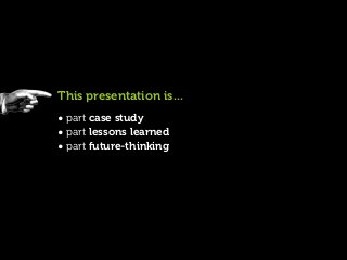
- 2. This presentation is... • part case study • part lessons learned • part future-thinking
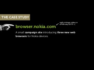
- 3. THE CASE STUDY sadly no longer online as of February 2013 :-( browser.nokia.com A small campaign site introducing three new web browsers for Nokia devices.
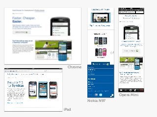
- 4. Chrome Opera Mini Nokia N97 iPad
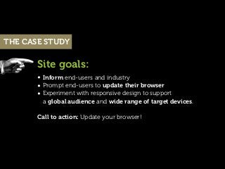
- 5. THE CASE STUDY Site goals: • Inform end-users and industry • Prompt end-users to update their browser • Experiment with responsive design to support a global audience and wide range of target devices. Call to action: Update your browser!
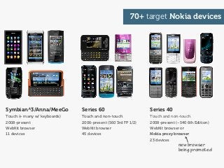
- 6. 70+ target Nokia devices Symbian^3/Anna/MeeGo Series 60 Series 40 Touch (+ many w/ keyboards) Touch and non-touch Touch and non-touch 2008-present 2006-present (S60 3rd FP 1/2) 2008-present (~S40 6th Edition) WebKit browser WebKit browser WebKit browser or 11 devices 45 devices Nokia proxy browser 23 devices new browser being promoted
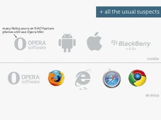
- 7. + all the usual suspects many Nokia users on S40 feature phones still use Opera Mini v 6.0+ mobile v. 7+ desktop
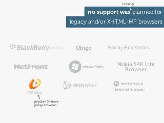
- 8. initially no support was planned for legacy and/or XHTML-MP browsers < v 5.0 Obigo Windows Mobile Nokia S40 Lite Browser Internet Browser UC Web popular Chinese proxy browser
- 9. Part 1: The design process http://www.flickr.com/photos/jordanfischer/63832583
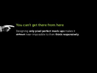
- 10. You can’t get there from here Designing only pixel perfect mock-ups makes it difficult near-impossible to then think responsively.
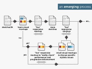
- 11. an emerging process etc... sketches/IA basic visual “live” more “live” mockups responsive sketches responsive mockup mockup no ok? “live” responsive small visual mockups yes mockup to “reality check” to discuss specific performance and stylistic issues progressive enhancement
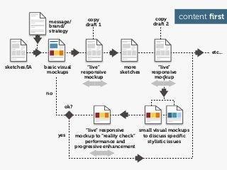
- 12. message/ copy copy content first draft 1 draft 2 brand/ strategy etc... sketches/IA basic visual “live” more “live” mockups responsive sketches responsive mockup mockup no ok? “live” responsive small visual mockups yes mockup to “reality check” to discuss specific performance and stylistic issues progressive enhancement
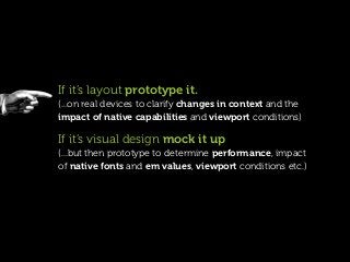
- 13. If it’s layout prototype it. (...on real devices to clarify changes in context and the impact of native capabilities and viewport conditions) If it’s visual design mock it up (...but then prototype to determine performance, impact of native fonts and em values, viewport conditions etc.)
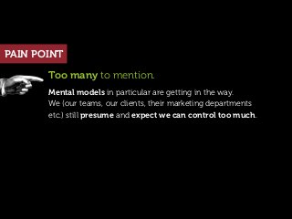
- 14. PAIN POINT Too many to mention. Mental models in particular are getting in the way. We (our teams, our clients, their marketing departments etc.) still presume and expect we can control too much.
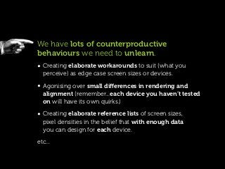
- 15. We have lots of counterproductive behaviours we need to unlearn. • Creating elaborate workarounds to suit (what you perceive) as edge case screen sizes or devices. • Agonising over small differences in rendering and alignment (remember...each device you haven’t tested on will have its own quirks.) • Creating elaborate reference lists of screen sizes, pixel densities in the belief that with enough data you can design for each device. etc...
- 16. Part 2: The CSS strategy http://www.flickr.com/photos/wscullin/3770015203
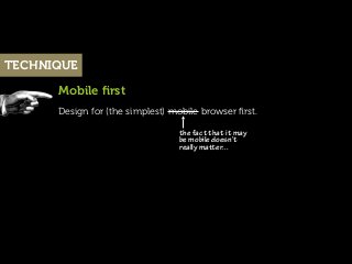
- 17. TECHNIQUE Mobile first Design for (the simplest) mobile browser first. the fact that it may be mobile doesn’t really maer...
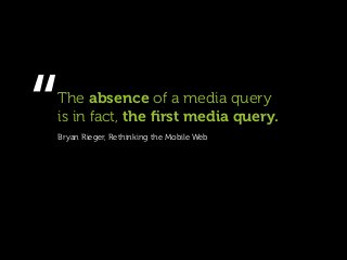
- 18. “ The absence of a media query is in fact, the first media query. Bryan Rieger, Rethinking the Mobile Web
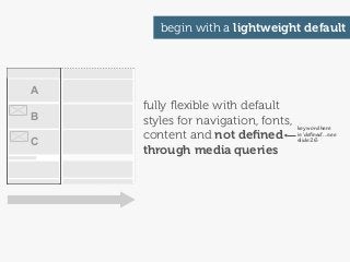
- 19. begin with a lightweight default A fully flexible with default B styles for navigation, fonts, key word here content and not defined is ‘defined’...see C slide 26 through media queries
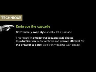
- 20. TECHNIQUE Embrace the cascade Don’t merely swap style sheets...let it cascade. This results in smaller subsequent style sheets, less duplication in declarations and is more efficient for the browser to parse (as it’s only dealing with deltas).
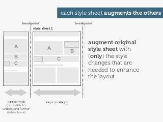
- 21. each style sheet augments the others breakpoint breakpoint style sheet 1 augment original A A B style sheet with B C (only) the style C changes that are needed to enhance the layout < xx px wide xx px to xxx px (or unable to understand further instructions)
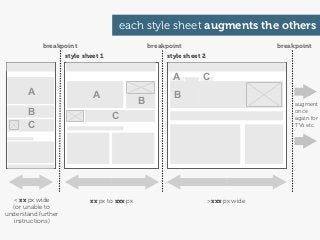
- 22. each style sheet augments the others breakpoint breakpoint breakpoint style sheet 1 style sheet 2 A C A A B B augment B C once again for C TVs etc. < xx px wide xx px to xxx px >xxx px wide (or unable to understand further instructions)
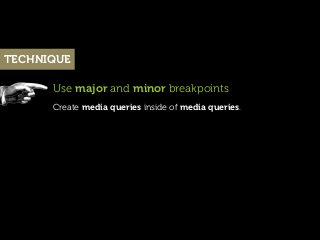
- 23. TECHNIQUE Use major and minor breakpoints Create media queries inside of media queries.
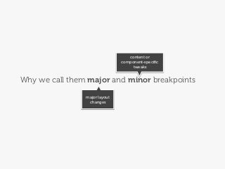
- 24. content or component-specific tweaks Why we call them major and minor breakpoints major layout changes
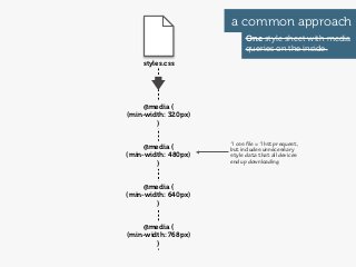
- 25. a common approach One style sheet with media queries on the inside. styles.css @media { (min-width: 320px) } 1 css file = 1 hp request, @media { but includes unnecessary (min-width: 480px) style data that all devices } end up downloading @media { (min-width: 640px) } @media { (min-width: 768px) }
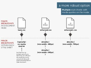
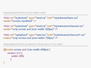
- 26. a more robust option Multiple style sheets with media queries on the inside. MAJOR BREAKPOINTS @ @ IN DOCUMENT 320px 720px HEAD basic.css enhanced.css enhanced+.css MINOR (typically) @media { @media { BREAKPOINTS no media (min-width: 480px) (min-width: 768px) WITHIN EACH queries } } STYLE SHEET @media { but feel free to (min-width: 640px) include some if you } feel they can enhance the experience and are sure (!) they will graciously degrade on older browsers
- 27. MAJOR BREAKPOINTS IN DOCUMENT HEAD <link rel="stylesheet" type="text/css" href="stylesheets/basis.css" media="screen, handheld" /> <link rel="stylesheet" type="text/css" href="stylesheets/enhanced.css" media="only screen and (min-width: 320px)" /> <link rel="stylesheet" type="text/css" href="stylesheets/enhanced+.css" media="only screen and (min-width: 720px)" /> MINOR BREAKPOINTS AS NEEDED WITHIN EACH STYLE SHEET @media screen and (min-width: 640px) { section ul li { width: 20%; } }
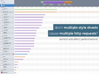
- 28. don’t multiple style sheets cause multiple http requests? (which will affect performance)
- 29. Yes!...but (as we will see) we have bigger issues...
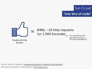
- 30. but it’s just “one line of code” = 84Kb, ~10 http requests (or 1.340 Seconds) I’m wondering if he ran this test on a Facebook Like PC with broadband? Button Source: Matthew Ogborne, Facebook Like Button = 84Kb or 1.340 Seconds? More great examples on Steve Souders’ P3PC project site
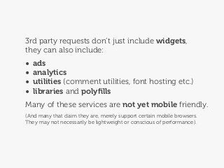
- 31. 3rd party requests don’t just include widgets, they can also include: • ads • analytics • utilities (comment utilities, font hosting etc.) • libraries and polyfills Many of these services are not yet mobile friendly. (And many that claim they are, merely support certain mobile browsers. They may not necessarily be lightweight or conscious of performance).
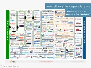
- 32. everything has dependencies Otherwise known as everyone has ‘partners’ Source: Luma Partners
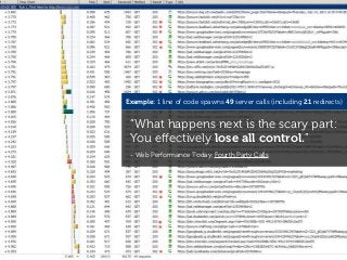
- 33. Example: 1 line of code spawns 49 server calls (including 21 redirects) “What happens next is the scary part: You effectively lose all control.” - Web Performance Today, Fourth Party Calls
- 34. Conclusion Each http request should add value! If a few well chosen http requests enable you to improve the experience-go for it. (then take a long hard look at other requests that may be lurking)
- 35. TECHNIQUE choosing breakpoints
- 36. Disclaimer There is no “perfect set” of breakpoints. Set your breakpoints based on the needs of your layout and (the legibility, weight and nature of) your content. Cross-check these choices on your key devices. (...80% of traffic in your analytics will often come from 20% of devices...seems a shame not to ensure the site looks and works especially well on these devices).
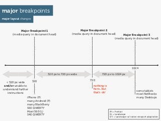
- 37. major breakpoints major layout changes Major Breakpoint 1 Major Breakpoint 2 (media query in document head) (media query in document head) Major Breakpoint 3 (media query in document head) 1024 320 px to 720 px wide 720 px to 1024 px 320 720 < 320 px wide and/or unable to nothing is understand further here...but some tablets instructions that’s ok! most NetBooks iPhone (P) many Desktops many Android (P) many BlackBerry S60 QWERTY Most S60 (L) (P) = Portrait S40 QWERTY (L) = Landscape (L*) = Landscape w/ native viewport adaptation
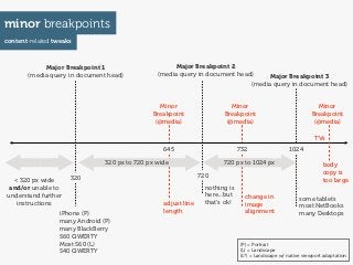
- 38. minor breakpoints content-related tweaks Major Breakpoint 1 Major Breakpoint 2 (media query in document head) (media query in document head) Major Breakpoint 3 (media query in document head) Minor Minor Minor Breakpoint Breakpoint Breakpoint (@media) (@media) (@media) TVs 645 732 1024 320 px to 720 px wide 720 px to 1024 px body copy is 320 720 < 320 px wide too large and/or unable to nothing is understand further here...but change in some tablets instructions adjust line that’s ok! image most NetBooks iPhone (P) length alignment many Desktops many Android (P) many BlackBerry S60 QWERTY Most S60 (L) (P) = Portrait S40 QWERTY (L) = Landscape (L*) = Landscape w/ native viewport adaptation
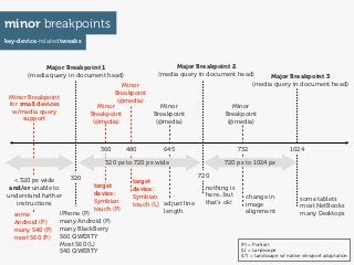
- 39. minor breakpoints key-device-related tweaks Major Breakpoint 1 Major Breakpoint 2 (media query in document head) (media query in document head) Major Breakpoint 3 Minor (media query in document head) Breakpoint Minor Breakpoint (@media) for small devices Minor Minor Minor w/media query Breakpoint Breakpoint Breakpoint support (@media) (@media) (@media) 360 480 645 732 1024 320 px to 720 px wide 720 px to 1024 px 320 720 < 320 px wide target and/or unable to target device: nothing is understand further device: Symbian here...but change in Symbian some tablets instructions touch (L) adjust line that’s ok! image touch (P) most NetBooks iPhone (P) length alignment many Desktops some Android (P) many Android (P) many S40 (P) many BlackBerry most S60 (P) S60 QWERTY Most S60 (L) (P) = Portrait S40 QWERTY (L) = Landscape (L*) = Landscape w/ native viewport adaptation
- 40. OMG... ” http://www.flickr.com/photos/richardmoross/1413692087
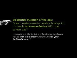
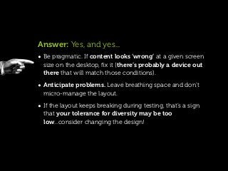
- 41. Existential question of the day: Does it make sense to create a breakpoint if there is no known device with that screen size? (...or put more bluntly is it worth setting a breakpoint just so stuff looks pretty when you resize your desktop browser?)
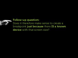
- 42. Follow-up question: Does it therefore make sense to create a breakpoint just because there IS a known device with that screen size?
- 43. Answer: Yes, and yes... • Be pragmatic. If content looks ‘wrong’ at a given screen size on the desktop, fix it (there’s probably a device out there that will match those conditions). • Anticipate problems. Leave breathing space and don’t micro-manage the layout. • If the layout keeps breaking during testing, that’s a sign that your tolerance for diversity may be too low...consider changing the design!
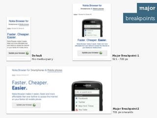
- 44. example real-world major and minor breakpoints primarily content-focussed but with a pragmatic eye on our project’s target devices
- 45. major breakpoints Default Major Breakpoint 1 No media query 321 - 720 px Major Breakpoint 2 721 px onwards
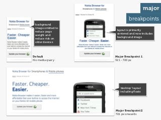
- 46. major breakpoints background image omitted to layout is primarily reduce page centered and now includes weight and background image reduce risk on older devices Default Major Breakpoint 1 No media query 321 - 720 px ‘desktop’ layout including floats Major Breakpoint 2 721 px onwards
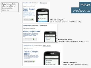
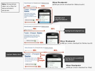
- 47. Note: Screenshots taken on a Mac for minor demonstration purposes. breakpoints Minor Breakpoint @360 px (cross-checked for Nokia touch) Minor Breakpoint @480 px (cross-checked for Nokia touch) Minor Breakpoint @768 px (cross-checked for iPad)
- 48. Minor Breakpoint Note: Screenshots @360 px (cross-checked for Nokia touch) taken on a Mac for 50% 50% demonstration purposes. background 45% aligned bottom 70% 30% background aligned top Minor Breakpoint 50% @480 px (cross-checked for Nokia touch) 55% 45% custom Nokia font 3em line background x-position height adjustment Minor Breakpoint 30% @768 px (cross-checked for iPad)
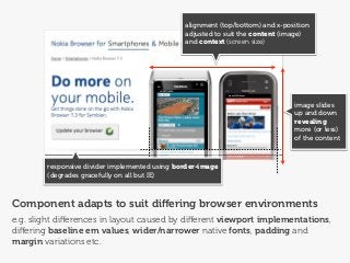
- 49. alignment (top/bottom) and x-position adjusted to suit the content (image) and context (screen size) image slides up and down revealing more (or less) of the content responsive divider implemented using border-image (degrades gracefully on all but IE) Component adapts to suit differing browser environments e.g. slight differences in layout caused by different viewport implementations, differing baseline em values, wider/narrower native fonts, padding and margin variations etc.
- 50. ...but remember Media queries are wonderfully versatile but screen size is only one factor to consider. Screen size rarely aligns with browser (or device) capabilities.
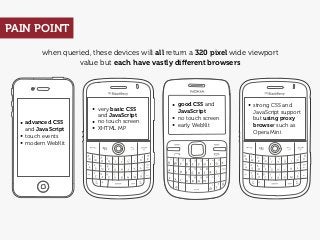
- 51. PAIN POINT when queried, these devices will all return a 320 pixel wide viewport value but each have vastly different browsers • good CSS and • strong CSS and • very basic CSS JavaScript JavaScript support and JavaScript • no touch screen • no touch screen but using proxy • advanced CSS • early WebKit browser such as and JavaScript • XHTML MP Opera Mini • touch events • modern WebKit
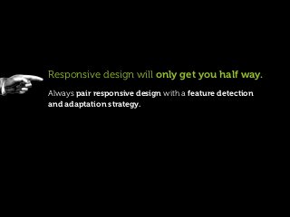
- 52. Responsive design will only get you half way. Always pair responsive design with a feature detection and adaptation strategy.
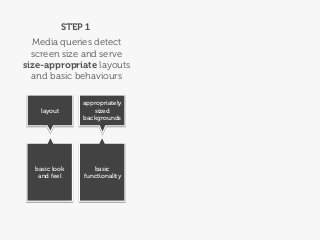
- 53. STEP 1 Media queries detect screen size and serve size-appropriate layouts and basic behaviours appropriately layout sized backgrounds basic look basic and feel functionality
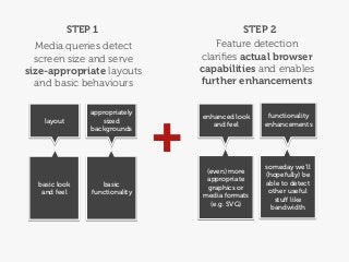
- 54. STEP 1 STEP 2 Media queries detect Feature detection screen size and serve clarifies actual browser size-appropriate layouts capabilities and enables and basic behaviours further enhancements + appropriately enhanced look functionality layout sized and feel enhancements backgrounds someday we’ll (even) more (hopefully) be appropriate basic look basic able to detect graphics or and feel functionality other useful media formats stuff like (e.g. SVG) bandwidth
- 55. TIP The more (accurate) information you can detect, the more intelligently you can adapt. Client-side feature detection is only one of the tools you can use. Others include device databases, user agent strings and your own (domain and region-specific) tacit knowledge.
- 56. TIP Why should we need our own tacit knowledge when we can detect browser capabilities using JavaScript or libraries such as Modernizr? Because ‘support’ is rarely a binary thing. Also....some browsers lie.
- 57. TIP More information about feature detection, can be found in Bryan’s Breaking Development presentation: Adaptation
- 58. Part 3: responsive content & media http://www.flickr.com/photos/mrs_logic/4548681436
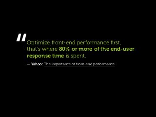
- 59. “ Optimize front-end performance first, that's where 80% or more of the end-user response time is spent. — Yahoo: The importance of front-end performance
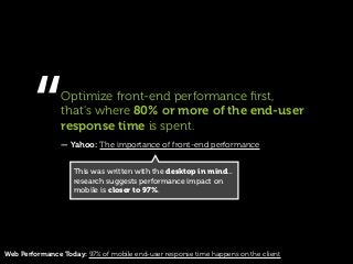
- 60. “ Optimize front-end performance first, that's where 80% or more of the end-user response time is spent. — Yahoo: The importance of front-end performance This was written with the desktop in mind... research suggests performance impact on mobile is closer to 97%. Web Performance Today: 97% of mobile end-user response time happens on the client
- 61. and yet...
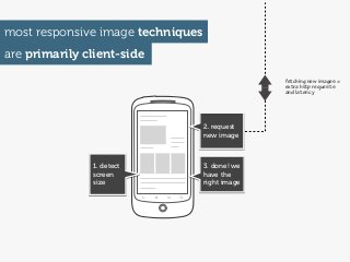
- 62. most responsive image techniques are primarily client-side fetching new images = extra hp requests and latency 2. request new image 1. detect 3. done! we screen have the size right image
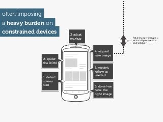
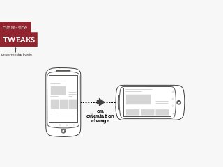
- 63. often imposing a heavy burden on constrained devices 3. adapt markup fetching new images = extra hp requests and latency 4. request new image 2. spider the DOM 5. repaint, reflow as needed 1. detect screen size 6. done! we have the right image
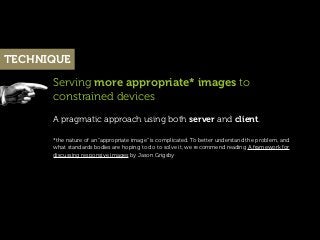
- 64. TECHNIQUE Serving more appropriate* images to constrained devices A pragmatic approach using both server and client. *the nature of an “appropriate image” is complicated. To better understand the problem, and what standards bodies are hoping to do to solve it, we recommend reading A framework for discussing responsive images by Jason Grigsby
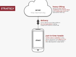
- 65. heavy-lifting STRATEGY server determine basic device capabilities then choose/adapt and conditionally load most http://domain.org appropriate mark-up... delivery server-side pre-processing delivers the most appropriate markup, images and scripts on initial load just-in-time tweaks clarifies device capabilities (using feature detection) and adapts on the client fly as needed (e.g. on reorientation, new data, dynamic components)
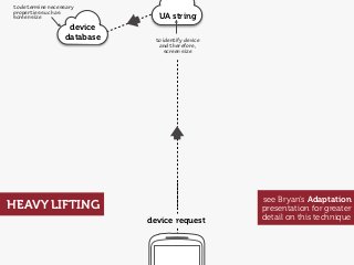
- 66. to determine necessary properties such as screen size UA string device database to identify device and therefore, screen size see Bryan’s Adaptation HEAVY LIFTING presentation for greater device request detail on this technique
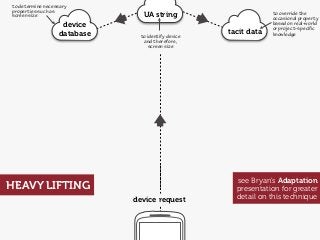
- 67. to determine necessary properties such as screen size UA string to override the occasional property device based on real-world or project-specific database to identify device tacit data knowledge and therefore, screen size see Bryan’s Adaptation HEAVY LIFTING presentation for greater device request detail on this technique
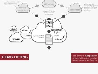
- 68. to determine necessary properties such as screen size UA string to override the occasional property device based on real-world or project-specific database to identify device tacit data knowledge and therefore, screen size data application video logic generate final cookie markup images see Bryan’s Adaptation HEAVY LIFTING presentation for greater detail on this technique
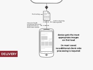
- 69. final markup cookie containing resource bundle device profile containing references needed for future client-side tweaks device gets the most appropriate images on first load (in most cases) no additional client-side processing is required DELIVERY
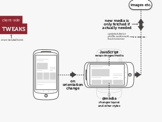
- 70. client-side TWEAKS on as-needed basis on orientation change
- 71. images etc. client-side new media is only fetched if TWEAKS actually needed updated device profile cookie sent on as-needed basis back to server JavaScript swaps images/media on orientation change @media changes layout and other styles
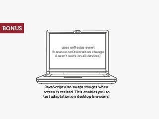
- 72. BONUS uses onResize event (because onOrientation change doesn’t work on all devices) JavaScript also swaps images when screen is resized. This enables you to test adaptation on desktop browsers!
- 73. Demo...
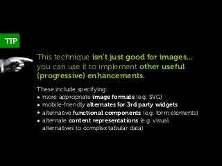
- 74. TIP This technique isn’t just good for images... you can use it to implement other useful (progressive) enhancements. These include specifying: • more appropriate image formats (e.g. SVG) • mobile-friendly alternates for 3rd party widgets • alternative functional components (e.g. form elements) • alternate content representations (e.g. visual alternatives to complex tabular data)
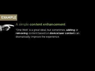
- 75. EXAMPLE A simple content enhancement “One Web” is a great ideal, but sometimes, adding or removing content based on device/user context can dramatically improve the experience.
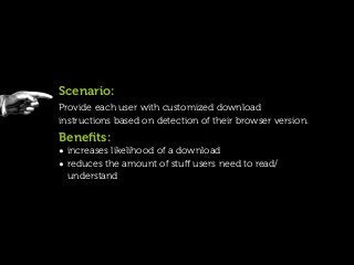
- 76. Scenario: Provide each user with customized download instructions based on detection of their browser version. Benefits: • increases likelihood of a download • reduces the amount of stuff users need to read/ understand
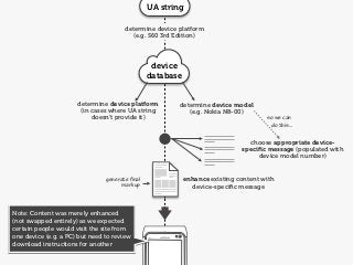
- 77. UA string determine device platform (e.g. S60 3rd Edition) device database determine device platform determine device model (in cases where UA string (e.g. Nokia N8-00) doesn’t provide it) so we can do this... choose appropriate device- specific message (populated with device model number) generate final enhance existing content with markup device-specific message Note: Content was merely enhanced (not swapped entirely) as we expected certain people would visit the site from one device (e.g. a PC) but need to review download instructions for another
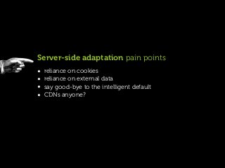
- 78. Server-side adaptation pain points • reliance on cookies • reliance on external data • say good-bye to the intelligent default • CDNs anyone?
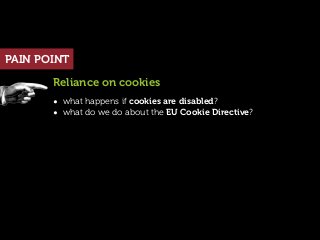
- 79. PAIN POINT Reliance on cookies • what happens if cookies are disabled? • what do we do about the EU Cookie Directive?
- 80. PAIN POINT What about unknown devices? • what happens to new devices that are not yet in a device database or your collection of tacit knowledge? (...the reality is, no method is perfect, combining server-side and client-side detection helps plug the gaps)
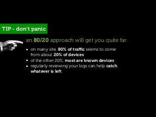
- 81. TIP - don’t panic an 80/20 approach will get you quite far • on many site, 80% of traffic seems to come from about 20% of devices • of the other 20%, most are known devices • regularly reviewing your logs can help catch whatever is left
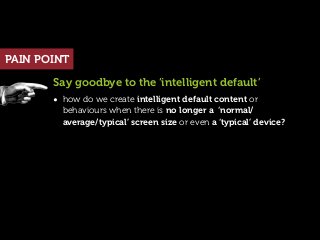
- 82. PAIN POINT Say goodbye to the ‘intelligent default’ • how do we create intelligent default content or behaviours when there is no longer a ‘normal/ average/typical’ screen size or even a ‘typical’ device?
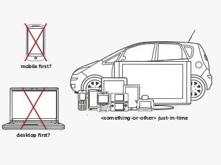
- 83. mobile first? <something-or-other> just-in-time desktop first?
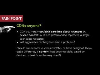
- 84. PAIN POINT CDNs anyone? • CDNs currently couldn’t care less about changes in device context. A URL is presumed to represent a single, cacheable resource. • Will aggressive caching turn into a problem? (Would we even have created CDNs, or have designed them quite differently if content had been variable, based on device context from the very start?)
- 85. Part 4: design workflows http://www.flickr.com/photos/jurvetson/5201796697
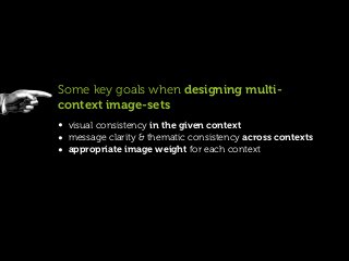
- 86. Some key goals when designing multi- context image-sets • visual consistency in the given context • message clarity & thematic consistency across contexts • appropriate image weight for each context
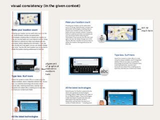
- 87. visual consistency (in the given context) not so much here alignment of graphical elements maers here
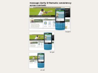
- 88. message clarity & thematic consistency across contexts largest larger small
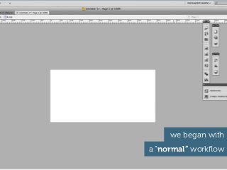
- 89. we began with a “normal” workflow
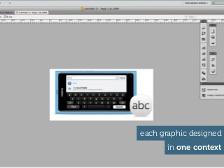
- 90. each graphic designed in one context
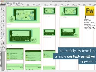
- 91. Adobe Fireworks enables you to design and export different sizes from one single artboard but rapidly switched to a more context-sensitive approach approach
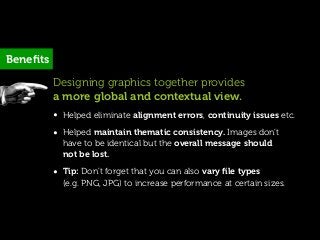
- 92. Benefits Designing graphics together provides a more global and contextual view. • Helped eliminate alignment errors, continuity issues etc. • Helped maintain thematic consistency. Images don’t have to be identical but the overall message should not be lost. • Tip: Don’t forget that you can also vary file types (e.g. PNG, JPG) to increase performance at certain sizes.
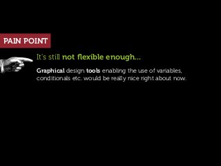
- 93. PAIN POINT It’s still not flexible enough... Graphical design tools enabling the use of variables, conditionals etc. would be really nice right about now.
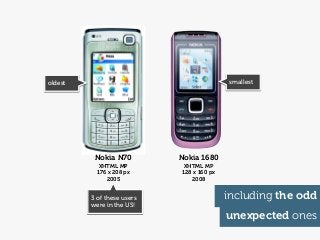
- 94. Part 5: embrace opportunities http://www.flickr.com/photos/ganesha_isis/4439563089
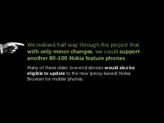
- 95. We realised half way through the project that with only minor changes, we could support another 80-100 Nokia feature phones. Many of these older, low-end devices would also be eligible to update to the new (proxy-based) Nokia Browser for mobile phones.
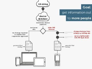
- 96. UA string Goal: get information out device database to more people determine device platform everyone older S40 else devices change doctype from no change required HTML5 to XHTML MP to mobile first responsive approach serve a lightweight CSS MP style sheet generate final generate final markup markup
- 97. Reminder User agent strings are not evil. User agent strings can be incredibly useful so long as you understand their limitations and use them to enhance rather than exclude.
- 98. So how did it go?
- 99. So how did it go? Within five days of our (soft) launch...
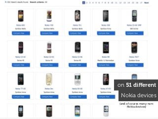
- 100. the site had been visited by people from 133 countries
- 101. on 51 different Nokia devices (and of course many non- Nokia devices)
- 102. oldest smallest Nokia N70 Nokia 1680 XHTML MP XHTML MP 176 x 208 px 128 x 160 px 2005 2008 3 of these users including the odd were in the US! unexpected ones
- 103. So far...the most popular page (just behind the home page) is the page with instructions to update your browser :-)
- 104. a few final words... http://www.flickr.com/photos/dwonderwall/3341419492
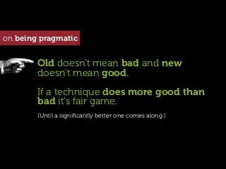
- 105. on being pragmatic Perform a cost-benefit analysis for every technique you use.
- 106. on being pragmatic Old doesn’t mean bad and new doesn’t mean good. If a technique does more good than bad it’s fair game. (Until a significantly better one comes along.)
- 107. on being pragmatic ...develop your mobile strategy but in the meantime...there are useful things you can do today
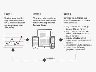
- 108. STEP 1 STEP 2 STEP 3 Review your traffic Test your site on those Develop an action plan logs and determine devices and determine to address common issues what mobile devices where the experience such as these: are accessing your breaks down site today • key content that is only accessible on hover • key controls that are too small to manipulate on touch screens • modal windows that become unusable on small screens • unnecessary http requests • unnecessarily heavy graphics and media repeat...
- 109. @yiibu s contact u at hello@yiibu.com thank you many thanks to the amazing photographers on http://www.flickr.com/creativecommons/by-2.0 http://creativecommons.org/licenses/by/2.0 http://www.flickr.com/photos/tinou/453593446