Responsive Web Design Techniques, Tools and Design Strategies

Email Newsletter
Weekly tips on front-end & UX.
Trusted by 200,000+ folks.


 Flexible CMS. Headless & API 1st
 Register!

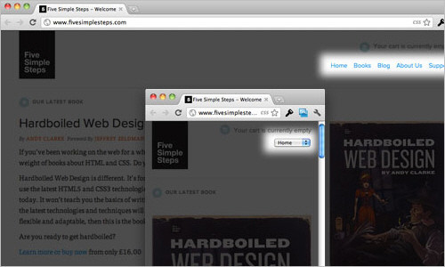
Back in January, we published an article on responsive design, “Responsive Web Design: What It Is and How to Use It.”
Responsive design continues to get a lot of attention, but considering how different it is from the “traditional” way of designing websites, it can be a bit overwhelming for those designers who have yet to try it.
To that end, we’ve compiled this round-up of resources for creating responsive website designs. Included are tutorials, techniques, articles, tools and more, all geared toward giving you the specific knowledge you need to create your own responsive designs.
Responsive Design Techniques
CSS Transitions and Media Queries
Elliot Jay Stocks provides insight into the combination of CSS media queries and CSS transitions. The basic premise is this: you use media queries to design responsive websites that adapt in layout according to browser width, and you constantly resize your browser to see how the website performs, but every time a query kicks in, there’s a harsh jump between the first style and the second. Why not use some simple CSS transitions to smooth the jump by animating the resize? A nice case study.

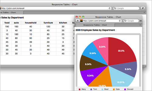
Responsive Data Tables
Chris Coyier and Scott Jehl are experimenting with responsive design techniques for displaying data tables. By default, data tables can be quite wide, and necessarily so. You could zoom out and see the whole table, but then the text size would be too small to read. You could zoom in to make it readable, but then you’d have to scroll both vertically and horizontally (sad face) to browse the table. One solution is to reformat the table for better readability. Another is to display a pie graph from the data. Yet another is to adapt the table into a mini-graphic for narrow screens (rather than interfering much with the content when the full table is displayed).
Responsive Navigation Menus: Convert a Menu to a Dropdown for Small Screens
Chris Coyier describes another technique for converting a regular row of links into a dropdown menu when the browser window is narrow. When the user is on a small screen and clicks the dropdown, they’ll get an interface to select an option that is nice and big and easy to choose. Obviously much better than displaying a tiny link.
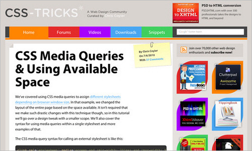
CSS Media Queries and Using Available Space
A tutorial from CSS-Tricks that discusses how to make subtle changes with media queries and how to use media queries in a single style sheet. For instance, if you have a fluid-width design in which the sidebar is 35% of the width of the page, depending on the width of the browser window, you could say, “If the browser is really narrow, do this. If it’s wider, do this. If it’s really wide, do this.” In the article, you’ll learn how to modify a list of links according to the browser’s viewport.
Responsive Images, Responsive Videos
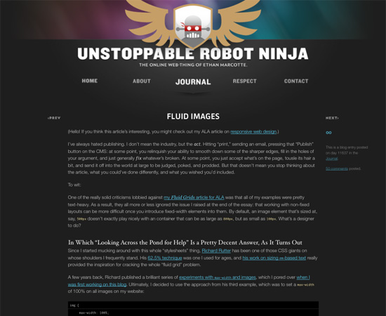
Fluid Images
Fluid images are a central aspect of a responsive design. This article by Ethan Marcotte gives a thorough overview on creating them using the classic img { max-width: 100%; } code snippet, as well as details to get you started.
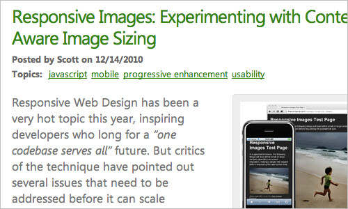
Responsive Image: Experimenting With Context-Aware Image Sizing
An alternative approach to fluid images by Filament Group. This technique allows designers to create responsive layouts that serve different image sizes at different resolutions. Effectively, it allows designers to create mobile-optimized images for smaller screens, and then serve higher-resolution versions to larger screens. Filament Group has developed this technique that uses .htaccess files and JavaScript to serve up different sized images based on the screen width. An alternative solution is to use tools like TinySrc which allows you to merely prefix all large images in your source code with a TinySrc URL, and the tool does the rest.
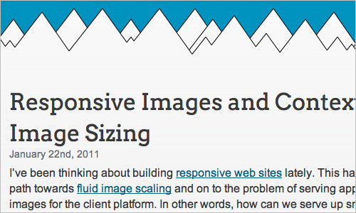
Responsive Images and Context-Aware Image Sizing
Craig Russell has developed a technique that uses a server-side script (in PHP) to serve up images of several different resolutions. The idea is that within the PHP script, a nested array is used that lists image files and their relative percentage scales. In HTML, the image’s src attribute would be set to get the requested image’s id, but with no scale specified. A JavaScript calculates the percentage width of the image relative to the maximum width of the container, and this figure is then appended to the end of the src attribute as the scale parameter. The comments in the article contain some nice ideas and suggestions on how the technique could be improved.
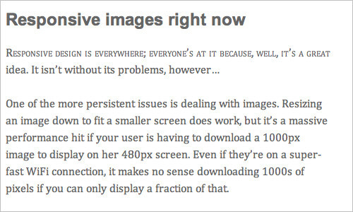
Responsive Images Right Now
Harry Roberts’ idea is to use the img element for the smaller of the two images, the image that you want mobile users to download. You would also have a containing div to which you apply the large version of the image as a background through CSS. You then hide the img from desktop users, and show them the large CSS background, and hide the background image from mobile users and just serve them the smaller inline image.
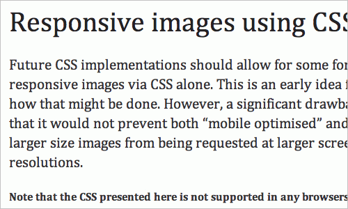
Responsive Images Using CSS3 Nicolas Gallagher’s method relies on the use of @media queries, CSS3-generated content and the CSS3 extension to the attr() function. By combining the content property with the CSS3 extension to attr(), you are able to specify that an attribute’s value should be interpreted as the URL part of a url() expression. In this case, it means you will be able to replace an image’s content with the image found at the destination URL, stored in a custom HTML data-* attribute.
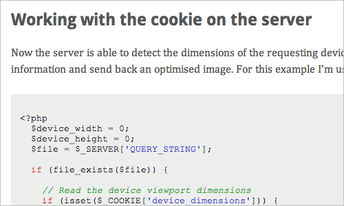
Responsive Images Using Cookies
Keith Clark suggests using cookies to serve smaller images to mobile users. Whenever a browser requests a file from a server, it automatically forwards any cookie data along with the request. If we use JavaScript to populate a cookie with the current screen’s dimensions, all subsequent requests made by the browser will pass this data to the server. In other words, the server would know the screen size of the device that is asking for the file.
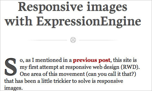
Responsive Images With ExpressionEngine
John Faulds presents a technique for responsive images that is different from the techniques presented above. It involves querying the device’s user agent string to determine whether it is mobile, and then setting a global variable that can then be used in templates to modify the size of the image output. Basically, only one image gets sent to the browser, but that image is different depending on whether you’re viewing the page on a mobile or desktop device.
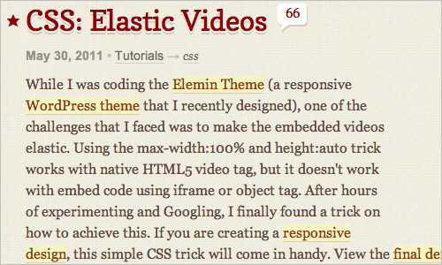
CSS: Elastic Videos
Nick La applies the max-width: 100%; snippet to videos and presents techniques that make HTML5 videos and object- and iFrame-embedded videos responsive. For the latter, the trick is very simple. Just wrap the embedding code in a div container, and specify a 50% to 60% padding-bottom. Then, specify the child elements (iFrame, object embed) and a 100% width and 100% height, with absolute positioning. This will force the embedded elements to expand full width automatically. Initially discovered by Thierry Koblentz.
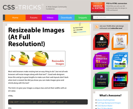
Resizeable Images (At Full Resolution!)
A quick tutorial from CSS-Tricks on resizing images while maintaining resolution.
Responsive Email Newsletters
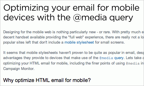
Optimizing Your Email for Mobile Devices With the Media Query
Wide emails often require horizontal scrolling, especially when there’s a large image. This case study by Campaign Monitor explains how emails can be optimized for mobile devices using media queries and offers a couple of useful techniques and snippets to be used right away.
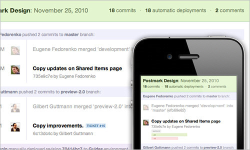
Responsive Design for Email, the Largest Mobile Audience
Another interesting case study that shows how the development team behind Beanstalk applied screen-size-specific media queries to target styles, and what design decisions were made to make the mobile email experience better.
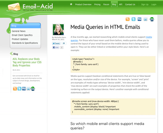
Media Queries in HTML Emails
This article covers using media queries to target specific mobile email clients.
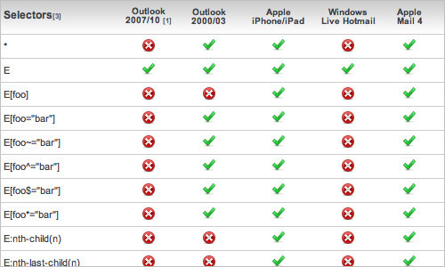
Guide to CSS Support in Email
Designing an HTML email that renders consistently across major email clients can be time-consuming. Support for even simple CSS varies considerably between clients, and even different versions of the same client. Campaign Monitor has put together a guide to save you the time and frustration of figuring it out for yourself. With 24 different email clients tested, it covers all of the popular applications across desktop, Web and mobile email.
Responsive Design Tools
You can build a responsive design from scratch, or you can use some of the tools listed below to speed up and smooth out the process.
WebPutty: Scientific Progress CSS Editing
This tool is a Web-based CSS editor with auto-save feature and a real-time preview of your website. WebPutty also has CSS selector highlighting and SCSS support (for Sass and LESS), as well as Compass support. To use the tool, just embed a link tag at the end of your website’s head tag.
Debugging CSS Media Queries
In responsive Web design, we’re working with different states, widths and viewport sizes. Johan Brook shares a quick tip for indicating (with pure CSS) which media query has kicked in. The article also provides a mixin for developers using Sass. A demo is available as well.
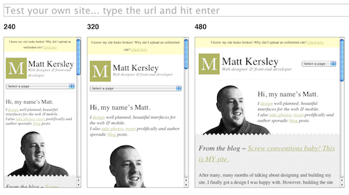
Responsive Design Testing
This tool is for everyone who needs a quick and easy way to test their website design in multiple screen widths. Change the defaultURL variable at the top of the responsive.js file to your own site and navigate your website from within the frames.
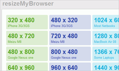
Resize My Browser
If you need your browser to display content in a certain window size this is what you have been looking for. Just click on the size you need and check out what your size looks like. Does not work in Chrome and Opera due to issues with the “ResizeTo” event.
Media Query Bookmarklet
A handy tool that shows you exactly what size the viewport has and which media query just fired. Drag it to your bookmarks bar and have it ready when needed.

Responsivepx
Use the information this little gadget provides in your media queries to create responsive designs.
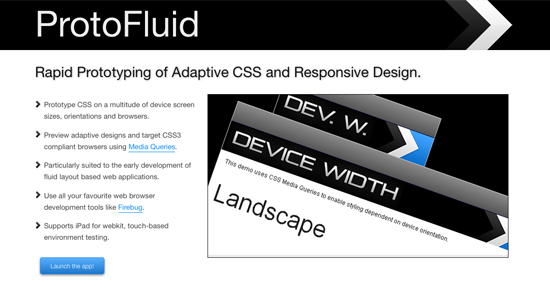
ProtoFluid
A tool for rapid prototyping of responsive design. You can prototype CSS on a variety of popular device sizes, orientations and browsers, be they phones (BlackBerry Torch, Google Nexus One, iPhone, Motorola Droid), tablets (BlackBerry Playbook, iPad, Samsung Galaxy Tab, Dell Streak), monitors or televisions (720p, 1080p). You can preview designs right in the browser and use your development tools like Firebug. You might want to check an alternative tool ScreenFly as well.
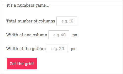
Fluid Grid Calculator
Harry Roberts has developed a calculator and generator of fluid grids for your responsive designs. Just provide the number of columns, the width of one column and the width of the gutters, and the tool will generate a fluid grid system in CSS for you. Handy!
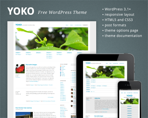
Free HTML5/CSS3 WordPress 3.1+ Theme With Responsive Layout: Yoko
Yoko is a modern and flexible WordPress theme. With the responsive layout based on CSS3 media queries, the theme adjusts to different screen sizes. The design is optimized for big desktop screens, tablets and small smartphone screens. To make your blog more individual, you can use the new post formats (like gallery, aside or quote), choose your own logo and header image, customize the background and link color.
Scherzo, a Responsive WordPress Theme
This WordPress theme is a fine example of responsive design, displaying nicely on almost all devices and screens.
Responsive Design Templates
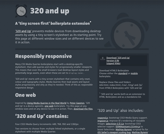
320 and Up
320 and Up works on the “tiny screen first” principle, whereby designs are created for mobile screens first, and then expanded for tablets, desktops, and large screens. It works well as an extension to HTML5 Boilerplate and as a standalone kit.
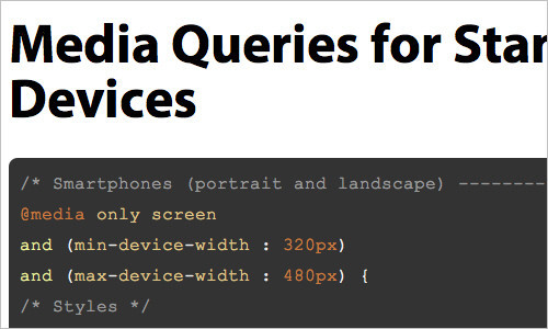
Media Queries for Standard Devices
Here is a useful template for media queries for standard devices: empty placeholders for targeting devices and attributes that you might be interested in when making responsive designs.
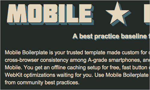
Mobile Boilerplate
Here is a customizable template for creating rich, high-performance mobile Web apps. You’ll get cross-browser consistency among A-grade smartphones, and fallback support for legacy BlackBerry, Symbian and IE Mobile. You’ll also get offline caching for free, fast button clicks, a media query polyfill and many common mobile Webkit optimizations.
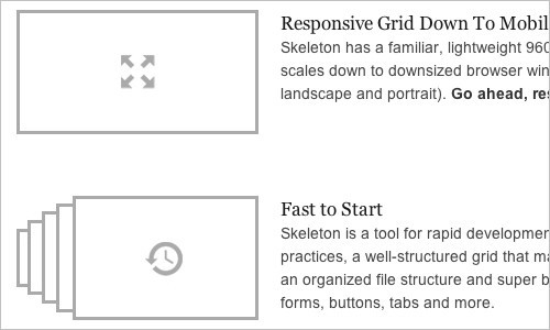
Skeleton: Beautiful Boilerplate for Responsive, Mobile-Friendly Development
Skeleton is a small collection of CSS and JavaScript files that can help you rapidly develop websites that look beautiful at any size, be it a 17-inch laptop or an iPhone. Skeleton is a grid that is responsive right down to mobile. It is well organized and well structured and provides most basic styles as a foundation.
Responsive Design Frameworks
inuit.css
This CSS framework is built to provide a solid foundation for designs on smaller screens (such as tablets) and tiny screens (such as phones) straight out of the box with minimal effort. It also has a custom grid system builder for creating fluid grid systems.
Flurid
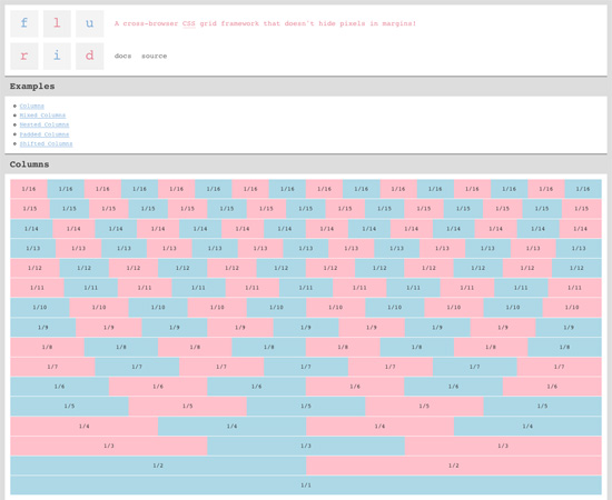
Flurid is a liquid grid layout with up to 16 columns.
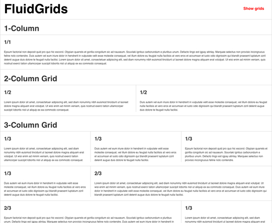
FluidGrids
FluidGrids is a fluid grid framework that creates layouts based on 6, 7, 8, 9, 10, 12 or 16 columns.
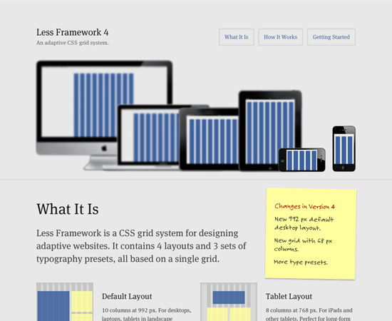
Less Framework 4
A CSS grid system for creating adaptive layouts. It includes four basic layouts (including tablet, mobile and wide mobile), with three sets of typography presets.
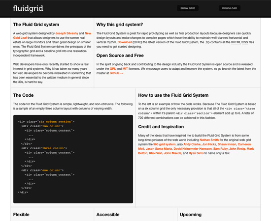
Fluid Grid System
This fluid grid framework includes a typographic grid and baseline grid.
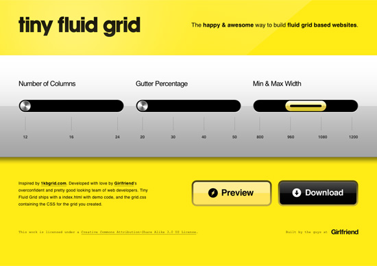
Tiny Fluid Grid
Tiny Fluid Grid helps you generate your own fluid grid with 12, 16 or 24 columns, minimum and maximum widths, and percentage-based gutters.
Responsive Design Workflow and Strategies
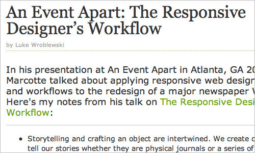
The Responsive Designer’s Workflow
Luke Wroblewski’s conference notes on Ethan Marcotte’s presentation about applying responsive Web design principles and workflows to the redesign of a major newspaper website. Among other things, Ethan explains how he approaches the responsive design methodology, what the design process looks like and how prototyping is done in the context of responsive design.
The Goldilocks Approach to Responsive Web Design
The Goldilocks Approach stresses device-independent layouts that look perfect regardless of the device they’re viewed on.
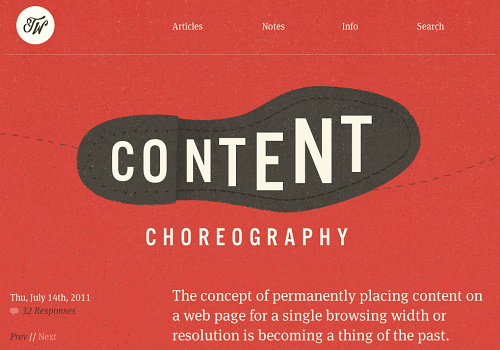
Content Choreography
Read up on how to properly plan your site to live up to todays standards. Begin to choreograph content proportional to size to serve the best possible experience at any width.
Structured Content First
In this presentation, Stephen Hay discusses a couple of troubles you might run into when structuring your content and argues that properly structured content is portable to future platforms. Stephen suggests that we think about creating and designing structured content first that caters to the lowest common layout denominator, whether this be a small screen or a text browser. This content should be able to go anywhere.
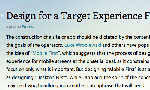
Design for a Target Experience First
Another interesting perspective on a responsive designer’s workflow; Nathan C. Ford focuses on experience of its users first and then derives user scenarios and media queries from it. “There are goals for sites that reach beyond simple readability, where a lack of features can actually diminish the experience. I am working on such a project now. Our approach has been to peruse the research and tailor an optimal experience for the most likely user scenarios. Working out from there, we judicially edit and hone for each media query.”
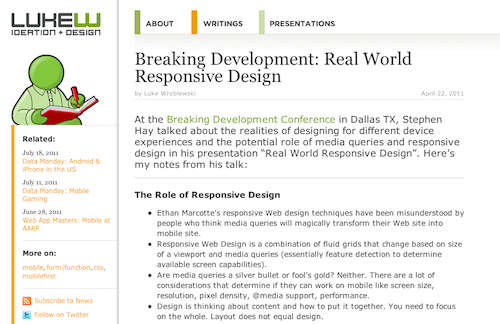
Breaking Development
Luke Wroblewski took notes at the Breaking Development Conference while Stephen Hay talked about the realities of designing for different device experiences.
Patterns for Multiscreen Strategies
Have a look at this simple but effective slideshow to get an idea of which core factors play a role in multiscreen concepts.
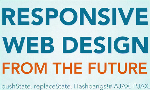
Responsive Web Design from the Future
According to Kyle Neath, responsive web design is about a lot more than the size of your screen. This talk is about about how GitHub handles links, the url bar, partial page updates, and explains why Kyle thinks the HTML5 history API is the most important thing to happen to front end development since Firebug. An inspiring presentation.
Developing a Progressive Mobile Strategy
In this presentation, Dave Olsen presents a progressive mobile strategy that consists of audience strategy, content strategy and platform strategy. Dave argues that to develop a sustainable and scalable mobile strategy, you need to answer the questions, “What value will the targeted audiences get from this content?” and “How do we develop solutions to handle both mobile and native now, as well as the devices of the future?” An interesting presentation.
How to Use CSS3 Media Queries to Create a Mobile Version of Your Website
In this Smashing Magazine article, Rachel Andrew explains how, with a few CSS rules, you can create an iPhone version of your website using CSS3 — one that will work now. You’ll see a very simple example and learn the process of adding a small device style sheet to a website to show how easily we can add mobile-specific style sheets to existing websites. You may want to consider reading Aaron Gustafson’s article “Adaptive Layouts With Media Queries” and Emily Lewis’ piece “Respond to Different Devices With CSS3 Media Queries” as well.

Discussions And Points Of View On Responsive Design
While not tutorials per se, the articles here give you valuable insight into why you should use responsive design techniques (and when you maybe shouldn’t use them).
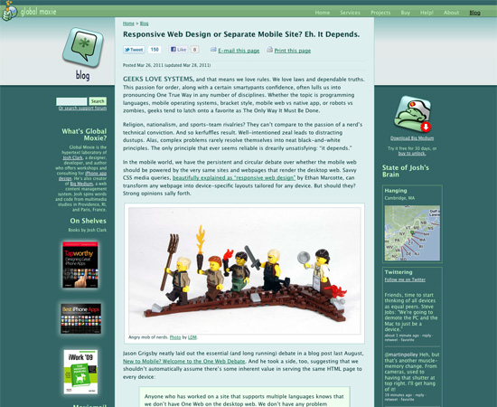
Responsive Web Design or Separate Mobile Site? Eh, It Depends
An interesting article discussing the pros and cons of responsive designs vs. dedicated mobile websites.
A Responsive Mind
A discussion on Jeremy Keith’s blog about the necessary parts of a responsive design and how to effectively create different layouts based on different screen sizes. Examples are included.
Responsive Enhancement
An excellent introduction to responsive design as a way of thinking rather than as a tool or technique. Jeremy Keith argues that responsive Web design can’t be tacked on to the end of an existing workflow. Instead of pixel perfection, we should be thinking of proportion perfection. An inspiring read.
Mobile-First Responsive Web Design
Mobile First Responsive Web Design is a combination of philosophies and strategies with the aim to achieve a wider application of best practices in the area.
Further Resources
Here are some additional resources for creating responsive designs that don’t fit neatly into the categories above.
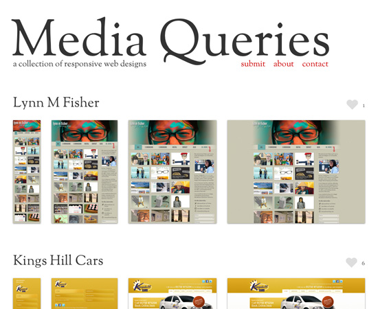
Media Queries
A growing collection of websites that use media queries.
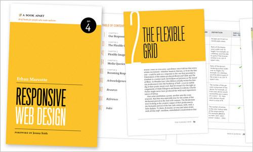
Responsive Web Design, by Ethan Marcotte
This book, written by Ethan Marcotte and published by A Book Apart, is a fantastic resource for learning how to design responsive websites. It covers the basics of the responsive Web, flexible grid systems, flexible images and media queries, and it gives insight into how to create responsive designs.
The Big Web Show Episode #9: Responsive Web Design
Jeffrey Zeldman and Dan Benjamin sit down with Ethan Marcotte for episode 9 of The Big Web Show to discuss responsive design, among other topics.
Last Click
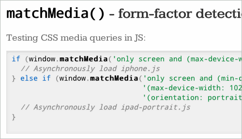
The Latest in HTML5
This slideshow covers some techniques and lesser-known HTML5 gems that could get implemented in browsers in the near future: among other things, server-side media queries with JavaScript and form-factor detection.
Further Reading
- Responsive Web Design: What It Is And How To Use It
- Responsible Considerations For Responsive Web Design
- Photoshop Etiquette For Responsive Web Design
 (al, mrn)

