
My husband manages a coffee shop, and we actually met in a coffee shop. As you can imagine, our kitchen has an espresso machine, an industrial grinder, a home grinder, two coffee pots, an iced coffee maker, a french press, a pour over kit... Needless to say, we're well-equipped in case there is an apocalypse and the new currency is coffee beans.
My first introduction to the merits of latte art was through him. I actually dislike recognizable shapes in my cups, but I have come to love the pen and ink McSweeney's quality of rosettas (the shapes you see etched below). Not quite flower, not quite feather, just a Rorschach blot crowning my morning cappuccino.
When he started judging latte art competitions, I obliged by glancing over his shoulder and rambling things about line quality, since of course I felt this was in my area of expertise as a designer. But I had no idea how extensive the actual criteria are. For instance, at the World Latte Art Competition, there's both a technical judge and a style judge. (Perhaps design competitions could employ a similar model.)
The main judging criteria are summarized as:
- Balance and Symmetry (dividing lines are even and show no hesitation)
- Harmony (between the size of the cup and the size and position of the design)
- Clarity of Design (contrast)
- Quality of Milk Texture (yes, it takes a lot of practice to perfectly texture milk)
Over time, I began to be able to spot the signature style of many baristas around Boston. There was one barista in particular who had a very whimsical line quality I grew to love, similar to the initial cap at the beginning of a book of Aesop's Fables I remember reading as a child. Yes, there are technical reasons for variations from barista to barista like how quickly they pour the milk through the espresso or the size of the cup; but in the end, it's the rhythm of their hand, just like any artist's hand, that makes the difference. No two are alike and personal style can be your best friend or something you fight in the quest for perfection.
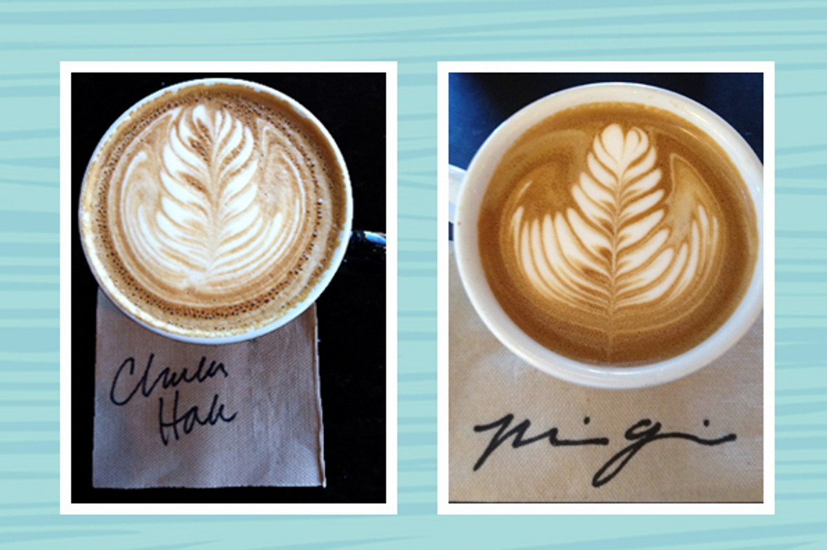
Here are 12 delicious cups poured by talented hands across Boston. I have included their signatures to give additional insight into their personal line quality.

1st column top to bottom:
Charles Hale, Render
Joe Smith, Blue State Coffee
Ryan Ludwig, Blue State Coffee
Ryan Soeder, Counter Culture
Daria Whalen, Pavement/ERC
Markus McVay, Render
2nd column top to bottom:
Mia Govoni, Pavement/ERC
Dylan Evan, Cafe Fixe
Scot Blevins, Cafe Fixe
Wolfie Barn, Untastable
Calin Robinette, Voltage
Nate DeRuvo, Blue State Coffee
Copyright F+W Media Inc. 2012.
Salon is proud to feature content from Imprint, the fastest-growing design community on the web. Brought to you by Print magazine, America's oldest and most trusted design voice, Imprint features some of the biggest names in the industry covering visual culture from every angle. Imprint advances and expands the design conversation, providing fresh daily content to the community (and now to salon.com!), sparking conversation, competition, criticism, and passion among its members.
Shares