As Egyptian protesters battled police this week in an uprising to depose President Hosni Mubarak, authorities quickly choked off any means of call to arms. Cell phone text messaging, Blackberry messaging, Facebook, and Twitter had their services disrupted in the country to head off the dissidents’ coordination.
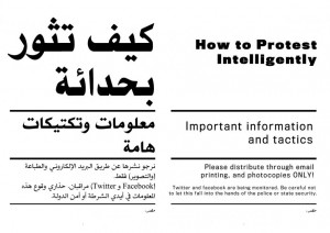
When modern means failed, protesters turned to the classic method of spreading ideas and messages: print. In this case, a 26-page document called “How to Protest Intelligently.”
These leaflets, circulated anonymously through photocopy and email, are more than a manifesto of revolution. They read like a crisply illustrated manual that you find inside a newly opened box of electronics. As an illustrator, designer, and one who delights in the contexts achieved through juxtaposing word and image, I was tickled by the subversive handout. There’s something cheeky about a document that uses the adverb “intelligently” while advising to use spray paint to blind helmet visors and security cameras.
It is important to remember the ideology behind the dissemination of these papers—democracy, freedom of speech, and the right to mobilize against oppression. This is an artifact of a people’s struggle and their refusal to be silenced. That said, let’s take a look at how design reflects the context of the creation of such a document. For the purpose of this article, we will reference the 9-page abridged English translations from online news sources. One cannot fully appreciate it without seeing it next to its original Arabic script.
These leaflets, circulated anonymously through photocopy and email, are more than a manifesto of revolution. They read like a crisply illustrated manual that you find inside a newly opened box of electronics.
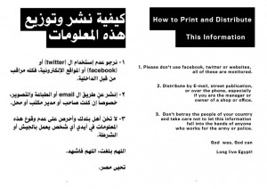
Note the warning: “Twitter and Facebook are being monitored. Be careful not to let this fall into the hands of the police or state security.” This is an interesting remark on the failure of modern media to keep the fire alive, so to speak, in an oppressive regime. We’ve always thought Tw-FB were the purest, freest forms of speech, so it’s interesting to note how the protesters returned to print in an acknowledgement of the limits of digital. Print is cheap, easy to reproduce, and best of all, places the ideas in your hands.
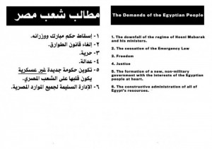
The brevity of the text and illustrations reflect a mind whizzing at top speeds, preoccupied with sharing the ideology but impatient for action. The “Demands of the Egyptian People,” “Strategic Goals of Civil Disobedience,” and “Steps for Carrying Out the Plan” are brief but bold.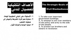
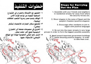
“Head toward important government buildings – while shouting positive slogans – in order to take them over.” Who wouldn’t feel their nationalistic balls swell from reading that decisive phrase? The top-down sketch of the Cairo is also well done. There is a serious effort to make the buildings recognizable, to execute actions the red markings display.
My favorites are pages 5 to 7. These are the instructions for how to mix it up with the authorities.
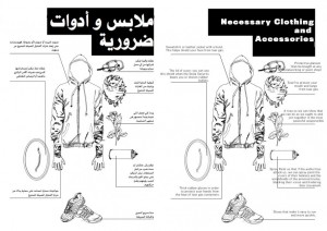
First, there’s your party clothes.
See how crisp that hoodie drawing is, and how detailed the sneakers and goggles are. Easily recognizable. What I enjoy most is how the uniform is attached to practical bits of rabble-rousing. Sneakers for speedy escape. Rubber gloves for protection from tear gas canisters. Goggles you can find in Ace Hardware to screen against tear gas and the smoke of battle. A “lid of a pot” to shield against rubber bullets. And a flower to make sure that everyone is still friends.
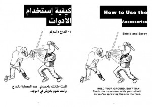
Look at the art on page 6. That protester is pernicious. The expression on his face says he doesn’t give a damn that he’s not spray-painting the helmet visor, like “How to Protest Intelligently” stresses, but actually the cop’s face. Where have I seen this composition before though?
Hmm. It’s not coming back to me. Anyway—
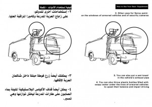
What I like about page 7 is that at this point, the artist couldn’t be bothered with detail. The thought behind this seems to be, “You’ll know it when you see it.” Going back to the bold tone of this manifesto, the writing is absolutely fearless. “You can also throw plastic bottles filled with soapy water under the tires of armored vehicles to upset their balance and impair driving.” Read that sentence one more time, and realize just how ballsy that must make someone feel. I’m curious if any of the protesters managed to topple a police truck with what is essentially and old American prison joke.
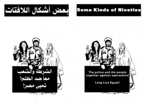
Page 8 is simply delightful because it looks like a punchline, like the flower on the homemade battle-hoodie. After giving instructions on how to take over urban centers and kick police ass, we have a page whose header reads “Some kinds of niceties.” We have two women smiling gamely at the camera (note the peace sign being waved). Though it probably says a lot of the artist’s opinion of the police that, even though it says “police and people together against oppression,” that policeman holding the sign still looks like he wants to truncheon some pot lids. So while Egyptian protesters struggle against authority, they still call for diplomacy against the armed sector. I’m pretty sure this is a sincere call for unity on the part of the protesters.
On the other hand, that admonition to not “betray the people of your country” by letting this document “fall into the hands of… the army or police” isn’t very encouraging. Again, we have the precautions against using the Internet, as they are being monitored. This document has guerilla origins and will continue to be distributed guerilla style.
As an artist, I find myself admiring the simple lines and crosshatching of the art. There’s an elegance to the sparseness of the document’s illustrations. It reminds me of Alan Moore’s comment on Dave Gibbon’s chiaroscuro art in V for Vendetta. For Moore, the black-and-white look added a layer of intrigue to a story that was essentially shades of gray. Having a black-and-white document written to work against a regime is just another brain-tingling exercise in symbolism.


ah, civil protest in the 21st century
the level of detail is impressive, and written in a very concise bullet-point manner any corporate denizen would appreciate. its almost like they were handing out event briefings for a convention.
they've got the flower-power thing going too, but one thing they have to learn from People Power is to also have a catchy, inspiring soundtrack that everyone will be singing on the streets, hold candlelight vigils, invite celebrities, and gain the sympathy of the media
[…] This post was mentioned on Twitter by Tonyo Cruz and Benjamin Espina, FilipinoFreethinkers. FilipinoFreethinkers said: NewPost: The Dissidents' Manual http://j.mp/gAXNm3 […]